Please see the sub-pages for maps showing each step before the final multi-criterion analysis.
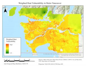
After the final multi-criterion analysis was performed, we obtained the following maps:
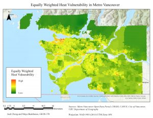
To visualize and analyze the results, the weighted and equal analyses were compared by using a raster calculator to find the differences between the two analyses.
Difference = Weighted % – Equal %
Positive differences mean the vulnerability value in the weighted map is greater. Negative differences mean the vulnerability value in the equal map is greater. We noticed that the equally weighted suitability map had lower overall values than the weighted suitability map, so the difference map centres at a positive value, indicated in white. The values in white indicate small differences between the two models.

From this map, we can see certain trends. For instance, Downtown Eastside is shown in negative difference values because it is more influenced by the population sensitivity factors, which were weighted at a higher value in the equal analysis compared to the weighted analysis.
The next step is to identify future locations for potential cooling centres. We next overlaid the weighted suitability map with the cooling centre buffers. For this analysis, we are only considering the weighted case.
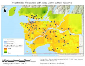
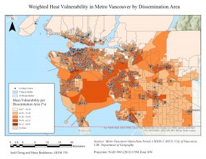
We can tell that existing cooling centres align well with the areas with the most vulnerability. To decide on locations for future cooling centres, we aggregated the mean suitability into DAs using zonal statistics. Using DAs, which are larger spatial units, helps us visualize vulnerability.
Note: All map layouts were created December 14, 2021