
It was intriguing to learn this week how technology can be used to represent complex historical data that would traditionally not lend itself to being represented in this manner. The development of Palladio represents the future of merging the arts and technologies in innovative ways. In saying that, I also found it extremely challenging to navigate the platform and understand what was being communicated by the data. I did, however, make a few observations.
While this platform can be used to represent historic data, it is definitely “incomplete in unpredictable ways” (Stanford Humanities & Design, n.d.). The various facets could be used to examine commonalities, but the data doesn’t tell the story behind the choices. For instance, Valerie and I had an astonishing number of common selections (7/10). While this correlation is revealed by the data, the next step would be to unpack why this occurred, which requires further investigation and analysis.
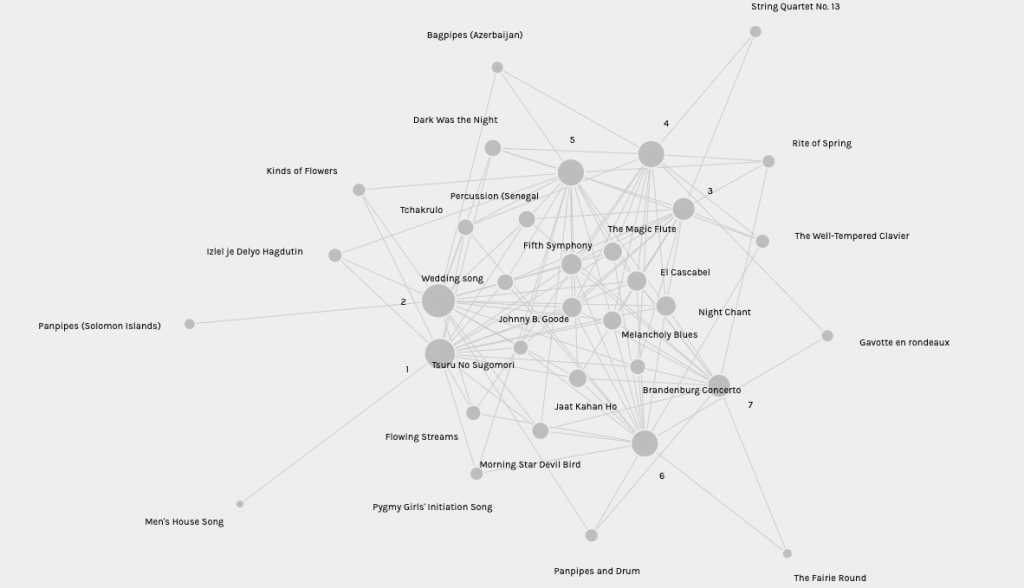
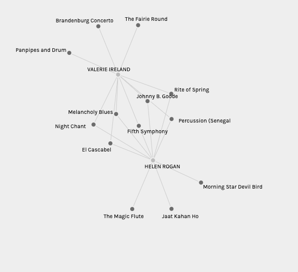 Palladio is able to track and represent an enormous amount of data and present it in a variety of ways. Users can view results represented in a variety of forms. Maps and charts can highlight certain connections, users can change the size of nodes, there are endless options users can select to display the information. These features may reflect our desire to engage with text and technology in unique ways, and while one way of organizing the data may speak to one individual, it may not work for another. This flexibility is one of the creative advantages of this application.
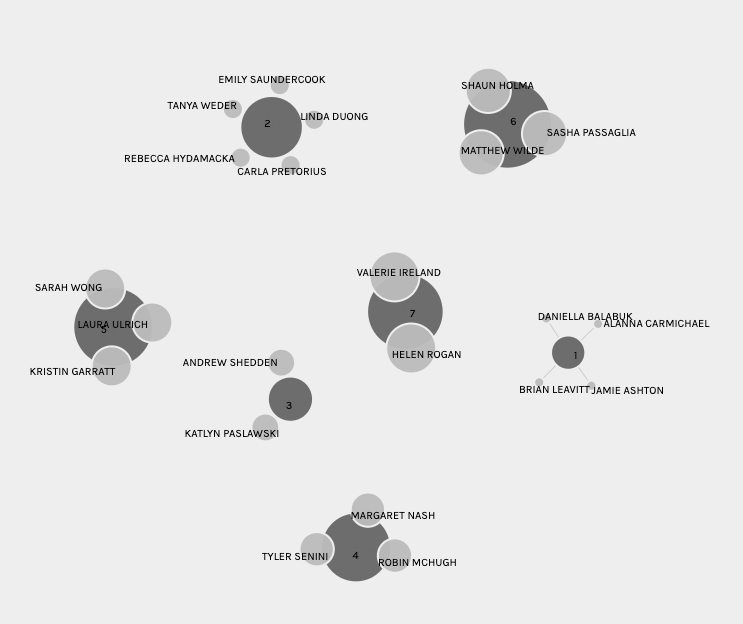
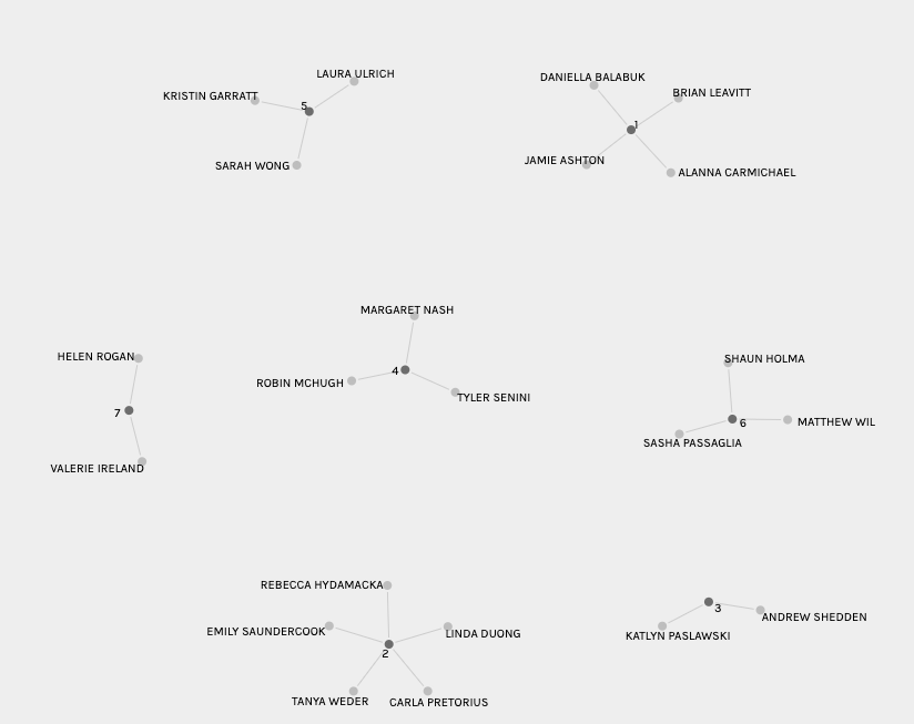
Palladio is designed to show relationships, represented through communities of individuals who shared similar responses. It was interesting to go through the different groups and see which tracks they had in common and which were outliers. Even after spending a fair bit of time reviewing the groups and tracks, I still struggled to see exactly which criteria the program was using to make the groups. I realize the main theme was was common selections, but there was a constant overlap of tracks selected by members of different groups. I’m curious exactly how the program selected the members of each group, which may be obvious to those with a background in programming but seemed unclear to me.
This task also reminded me of the differences between qualitative and quantitative research, and that in the fields like education and humanities, research is often based on qualitative methods. I feel like Palladio could be a valuable tool in a mixed-methods approach, sorting data gathered in quantitative fashion, and using qualitative methods to unpack the meaning.
Finally I thought this exercise was an interesting analogy to the information provided this week on how the web is structured. The nodes that connected our choices are not unlike the node connectivity that takes place on the web when we are browsing vast sources of information. Much like the popular tracks, the pages most visited are ranked higher, making these pages more significant, in terms of the traffic they will likely have due to increasing popularity. Based on this analogy it would have been interesting if the creators of the Golden Record actually had access to this technology to help them decide which songs to include and which songs to leave out.
Overall, I’m intrigued by this technology, and will be interested to see if it plays a significant role in research and becomes a “tool for reflective practice” (Stanford Humanities & Design, n.d.) as the creators intended.
References
Stanford Humanities & Design, (n.d.). Palladio. Visualize complex historical data with ease. Retrieved from http://hdlab.stanford.edu/palladio/about/