
I was very intrigued by Tristan Harris’ discussion of Humane Technology, so this compelled me to attempt the task for this week. After playing this game I thought it was a fascinating example of Harris’ statement that technology is not neutral. While Harris focused on social media, and its unethical manipulation of our attention, the game represents another aspect of unethical web design, which is to create what Brignall (2011) describes as “dark patterns.” In the most extreme examples, these interfaces take advantage of customers, and use the wording of contracts and placement of features in a way that is definitely deceptive, but doesn’t necessarily cross the line to illegal activity. Several examples of these “tricks of trade” are part of the User Inyerface activity. While this site was an exaggeration of some of these strategies, it is a great example of the far from neutral, manipulative nature of technology. Ironically, this very technology is what allows users and consumers to be more informed, and therefore have the ability to protect themselves from some of these negative marketing/business strategies. Sites like Centre for Humane Technology are a powerful way to promote a more critical look at multimedia technology.
As for the game, below are a few examples of some of the most obvious misuses of technology:
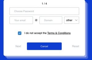
The wording of the conditions statement is intentionally misleading, as the user has to uncheck the box to accept the terms and conditions. The double negative is definitely confusing.
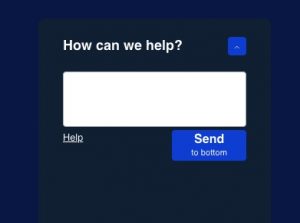
The floating “How can we help” box is a constant distraction, making the experience both frustrating and annoying!
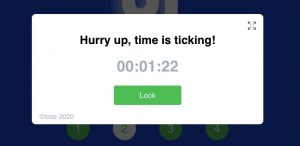
The timer added to the anxiety of the experience. Every time that popped up I could actually feel the physical symptoms of stress. Even though I knew I could take as much time as I wanted, everything felt so urgent. This is a familiar tactic on so many sites, where reservations or items in the cart can only be held for 5 min. etc... giving the consumer less time to think, making it more likely they will rush into a purchasing decision.
Other annoying tactics were the ridiculous password parameters, the links that didn’t work when clicked, and of course the infamous Captcha exercises. I fail miserably on these in the best of circumstances, so this was probably the most frustrating part of the whole experience. After multiple failed attempts I basically started clicking almost at random, recognizing of course that the tiny dot that had to be selected was not in the logical place. Fortunately, my stubbornness was rewarded, and I finally arrived at the end of the game!

17:41 minutes of torture…but I did it!
References
Brignull, H. (2011). Dark patterns: Deception vs. Honesty in UI design. Retrieved from https://alistapart.com/article/dark-patterns-deception-vs-honesty-in-ui-design/
Harris, T. (2017). How a handful of tech companies control billions of minds every day. Retrieved from https://www.ted.com/talks/tristan_harris_the_manipulative_tricks_tech_companies_use_to_capture_your_attention?language=en