Volunteer Mapping Project at the UBC Botanical Garden

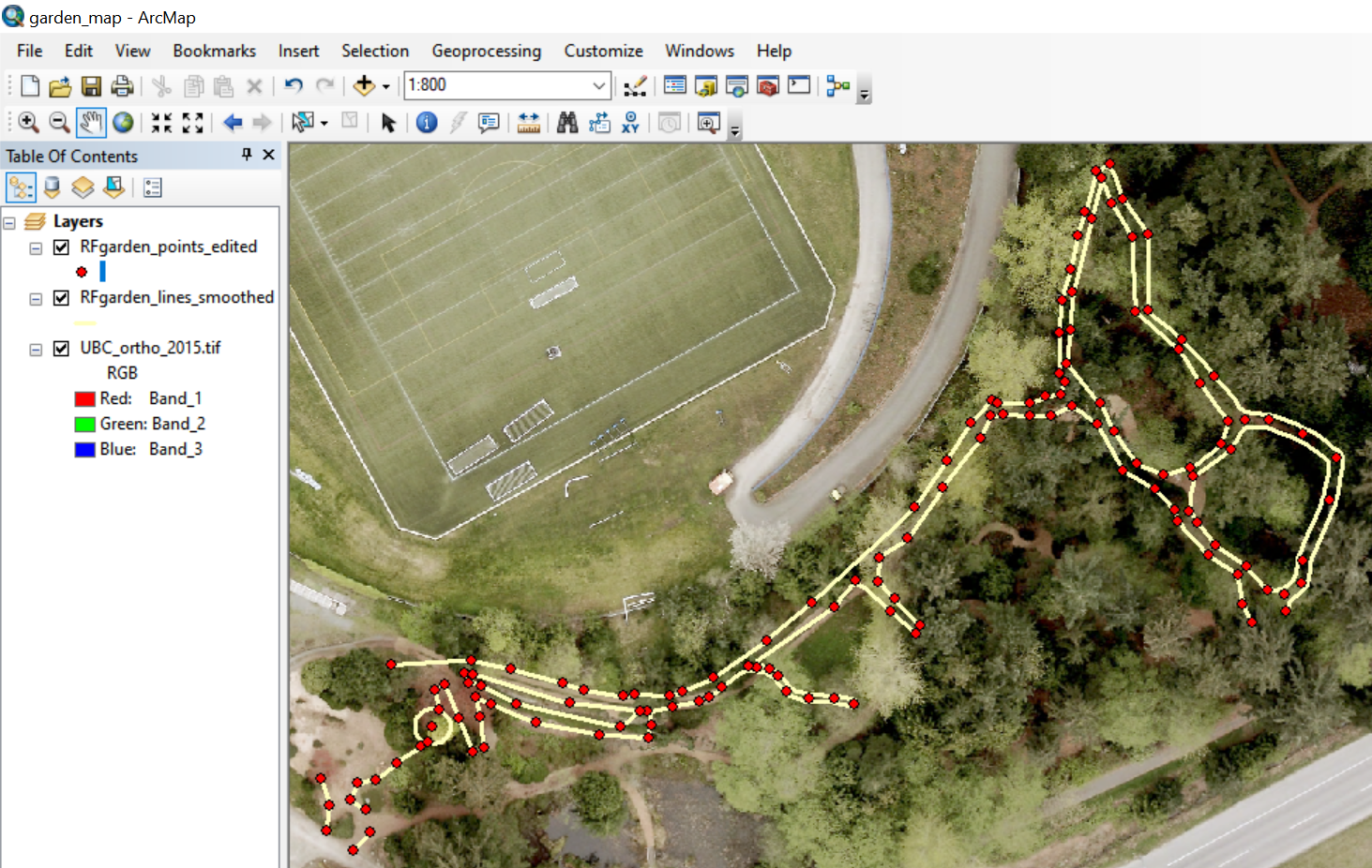
While studying in the MGEM program during 2018 and 2019, I joined a volunteer team at the University of British Columbia Botanical Garden to work on mapping the footpaths in a section of the garden. Due to the small size of the paths and the canopy cover, the paths could not be mapped accurately using aerial imagery or smartphone GPS applications. Our team learned how to use a high-accuracy handheld GPS receiver with a mobile antenna that was able to provide sub-meter accuracy. In addition to collecting points using the receiver, we used a laser rangefinder to derive additional point locations using distance and azimuth relative to the GPS points. After collecting the field data in early 2019, we entered the handwritten field data into a spreadsheet and then created a Python script to generate new points in a shapefile using the rangefinder data. We then edited the point data in ArcMap by connecting path edges and smoothing the lines to create a usable file that the garden staff could use for mapping.

MGEM Research Project – Final Research Document

For my final MGEM research project, I examined the following question: How are greening and browning trends associated with topography in the boreal forests of the Athabasca Plains Ecoregion?

My final research document can be viewed here as a PDF

Highlights:

  • Annual Landsat data used to derive yearly NDVI for each pixel throughout study area
  • NDVI trend significance and direction assessed with Mann-Kendall test and Sen’s slope
  • 42.8% of unmasked pixels exhibited a significant monotonic NDVI trend
  • 86.9% of pixels with a significant NDVI trend were greening, only 13.1% were browning
  • Areas with higher slope had a greater proportion of greening pixels
  • Increased elevation, more southerly aspect displayed a weaker association with greening

MGEM Research Project – Determining Where Greening and Browning is Occurring in Boreal Forests

After deriving NDVI for each yearly Landsat composite covering my study area, I took several steps to determine where there was a greening (increasing NDVI) and browning (decreasing NDVI) trend. I masked out pixels that had experienced disturbance such as fire and harvest, as well as pixels that contained water. For the remaining pixels, I used Rstudio to perform the Mann-Kendall test on each pixel time series (i.e. a list of the pixel values throughout every year for which I had data). This test returns the probability that their is a monotonic upward or downward trend in a time series, so I used it to assess which pixels had a statistically significant trend in NDVI. The following image shows the R code I wrote to accomplish this task:

I then calculated Sen’s slope for each pixel to determine the average yearly change in NDVI for each pixel. This allowed me to assess which pixels with a significant NDVI trend were greening (positive trend) vs browning (negative trend).

MGEM Research Project – Visualizing Vegetation Productivity Change in Canadian Boreal Forest

For my final research project in the MGEM program, I chose to examine how greening and browning occurred in Canadian boreal forests. My study area consisted of the Athabasca Plains ecoregion, which is located in northern Alberta and Saskatchewan. Greening (increased vegetation productivity) and browning (decreased productivity) are commonly assessed using the Normalized Difference Vegetation Index or NDVI. I acquired preprocessed Landsat data from members of the UBC Integrated Remote Sensing Studio, who created national composite images with spectral values from the best available pixel taken from the growing season in each year from 1984 to present. Using this data, I derived NDVI each yearly dataset using the following formula: (NIR – Red) / (NIR + Red). I created the following gif using 20 NDVI images for each year 1984 – 2003 in ArcMap, where darker green represents a higher NDVI value.

NDVI is clearly variable throughout the region from year to year. This may be due to year-to-year weather patterns like drought/rainfall, longterm processes like climate change, and the impacts of disturbance. The large, well defined patches of decreased NDVI that appear suddenly in the image show areas that experienced wildfires or other disturbances. I masked out these disturbed areas for my later analysis.


Learning How to Work With LiDAR

I was first exposed to LiDAR data through the MGEM program in the course Advanced Earth Observation and Image Processing. In this course we completed several labs where we visualized and analyzed LiDAR data using the FUSION Program, as well as creating scripts for processing LiDAR data using RStudio. We worked with sample airborne LiDAR data taken from one of UBC’s research forests, which came in the form of multiple-return LAS datasets. Using this data, we created a Digital Elevation Model (DEM), a Digital Surface Model (DSM), a Canopy Height Model (CHM), and modeled individual tree crowns. We also calculated a variety of forest metrics and created models to predict above-ground biomass and dominant tree height using other lidar-derived metrics.

I recorded this gif using FUSION to show a visualization of a small subset of the LiDAR return data, and then show the derived DEM and DSM overlaid over the point cloud.

Mapping Project Volunteer for MERS – Cetacean Sightings Near Vancouver Island

As a geography undergraduate student in the Environment and Sustainability program, I had the opportunity to take an introductory cartography class. Rather than choosing my own topic for our final course project, I volunteered to assist the Marine Education and Research Society (MERS) make maps of cetacean sightings using data they had gathered off of Vancouver island. MERS is a Canadian conservation-focused charity that primarily researches whale species in British Columbia. This project offered me a chance to make a map with real applications, as it was used in MERS presentations and other materials. I tried a number of methods for displaying both the type and number of cetacean sightings, as well as representing the path of the research vessel and location of seine nets. I settled on using differently colored proportional symbols to show what species was found and how many were seen at each site. I made the following map using ArcMap and Adobe Illustrator:

Spam prevention powered by Akismet