For the first linking assignment, I am linking to Tyler Graham’s Task 1 (What’s in the Bag).
A Comparison of Experiences
There are two reasons why I chose Tyler’s task for this linking assignment. The first reason is that he was born in 1982, and I was born in 1986. This puts us four years apart and within the same decade; I would classify us as being in the same generation. The second reason why I chose Tyler is because we both teach in a classroom.
Tyler mentioned in his post that he “grew up analog but came of age digital”. Reflecting on my own experiences, I can relate to what Tyler said. However, some of my fondest early memories are of me playing computer games with my dad on his desktop, as well as playing video games on consoles and handhelds (Gameboy, Game Gear, NES, SNES, Sega Saturn, Playstation, etc.). I grew up embracing technology and incorporated it into pretty much every aspect of my life. I would say that I went digital at a pretty young age.
Comparing the contents of our bags, I noticed a huge contrast. First of all, Tyler carried a bag, whereas I almost exclusively use whatever pockets I have available on the clothes I am wearing. Tyler carried numerous items in his school bag – laptop, adaptors, headphones, stationary, books, folders, etc. I can definitely see the “analogue” in there. For a photo of his bag, please visit his blog post, “In my school bag“. From what Tyler described in his post, it sounds like while he does a lot of work on his laptop, he also relies a lot on physical book and folders.
In contrast, I keep very few items in my “bag”. Click here to access my Task 1! While I also use laptops, I leave my personal laptop at home, and my work laptop at work. I keep important files on cloud, and access them via my smartphone if necessary. I actually have my ID’s and credit cards in my digital wallet, so I only carry my wallet with me for nostalgic reasons and for the odd times when my phone is out of battery (my wife insists that I bring it). I also only carry keys because the places I have to access don’t use fobs or passcodes. My workplace uses physical keys, my parents and in-laws use keys, and my wife refuses to let me install smart-locks at our home. Just like Tyler, I also plan my days and record student information; however, I do all that on my smartphone. I either type on the phone or write with the build-in stylus.
Given the differences in the contents of our bags, I would disagree with Tyler that his bag is reflective of our generation. I obviously say this based on my understanding/interpretation that being born in 82 and 86 puts us in the same generation. Also, I don’t know if the contents of his bag really reflect that he “came of age digital”. Aside from the laptop, everything else is pretty analog.
I would also disagree that an archaeologist would find the content of this bag “exemplary of a pretty average person in the year 2020”. Obviously, this claim is based on my own experiences and observations of people around me.
A Comparison of Web Authoring Tool and Literacies
Please click on the links below to access our respective blogs. They should open in new tabs.
Tyler: https://blogs.ubc.ca/monsieurgraham/
Chris: https://blogs.ubc.ca/iamgroot/
Overall Design
For obvious reasons, Tyler and I both used WordPress as the web authoring tool. This WordPress blog is a requirement for this course, so we really had no choice!
In terms of website layout, Tyler’s website was difficult to navigate. It appears that each blog post are individual menu items, which means that his menu will keep growing larger and larger until the end of the course. He also pinned this first task as his homepage; this makes finding more recent blog entries difficult. In comparison, I set up my homepage with tiles view so that it provides a glimpse to all my blog posts, arranged by date with newest appearing first. While this difference may seem insignificant at first, it becomes a critical difference between our two tools if you access our sites using mobile devices (phone, tablet, etc.).
Tyler’s site does not use a responsive design; his site and blog posts appear exactly the same on computer and on mobile devices. This makes texts and images appear very small and difficult to read because of various elements he included in the sidebar. To access the written content and other visuals, readers need to manually zoom in and move the screen around. Using non-responsive designs limits access to content for users on mobile devices. Since he pinned his Task 1 as the first page that visitors see, it makes accessing his newest blog posts very difficult. In contrast, my blog uses a theme with a responsive design. This explains the tiles view because my site adapts to different devices’ screen size/orientation and changes accordingly; the tiles automatically reposition and realign themselves to display optimally based on device information. Responsive design removes barrier to accessing/viewing content by automatically scaling various elements – texts, images, etc., – for optimal viewing on majority of devices.
Comparison of Task 1
Both our blog entries for Task 1 started with an image that invite the readers in with a snapshot of the contents of our respective bags, followed by texts that provide additional details. Both our entries used an informal tone; I assume Tyler did this for the same reason I did, which is to better connect with readers as if we are engaging in a conversation rather than an academic exercise.
Tyler laid out his items nicely on what appears to be grass. I LOVE that the background suggests that Tyler works everywhere, including outdoors! For my image, I decided to put the items on a sharp blue table top to provide a clear contrast so that the items would show clearly. I also included my photo beside my items. I chose to do this to make this more “personal”, so that my readers can link a face to the items.
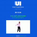
While Tyler used a static photo, I decided to use an interactive photo. Readers can interact with my photo by moving their mouse cursor directly over clearly marked areas in my photo (“i” logo). If readers are accessing my post using touchscreen mobile devices, they can tap each area. The interactive elements allow a somewhat tactile engagement with the reader, allowing the reader to actively “play with” the photo rather than simply look at it then move on to read the text below. In a way, I wanted the image to take center-stage. By using an interactive image, my intention was to incorporate multimodal literacies. In my opinion, I could have used the interactive image alone and could have done away with the detailed description below the image; however, this was a risk I wasn’t ready to take because this was a graded task.
Constraints of Course Design
Task 1 was fairly open ended so course participants are able to personalize their assignment and present learning in unique ways. However, because we are limited to using the WordPress blogging platform hosted through UBC, this limits design choices. Without this limitation, course participants could access countless other designs with more functions. For example, if hosted elsewhere, other custom WordPress themes can be used. Course participants could also consider using other services such as Wix or Squarespace, which offer fantastic designs. One could even consider presenting their learning through Instagram or VSCO. A more ambitious approach could even be to build an app through Mobile App building services like Gappsy, which has a ton of features and works without any coding experiences. There are many different ways to present learning rather than simply through a “written” blog post.
As a way to work with this constraint, I went through the available themes, tested each one on my devices, and picked the ones that used responsive designs. Specific to Task 1, I used an online tool called Genial.ly to create an interactive image that I can embed into the post. This allowed me to incorporate interactivity in an otherwise static image, without needing to code anything.