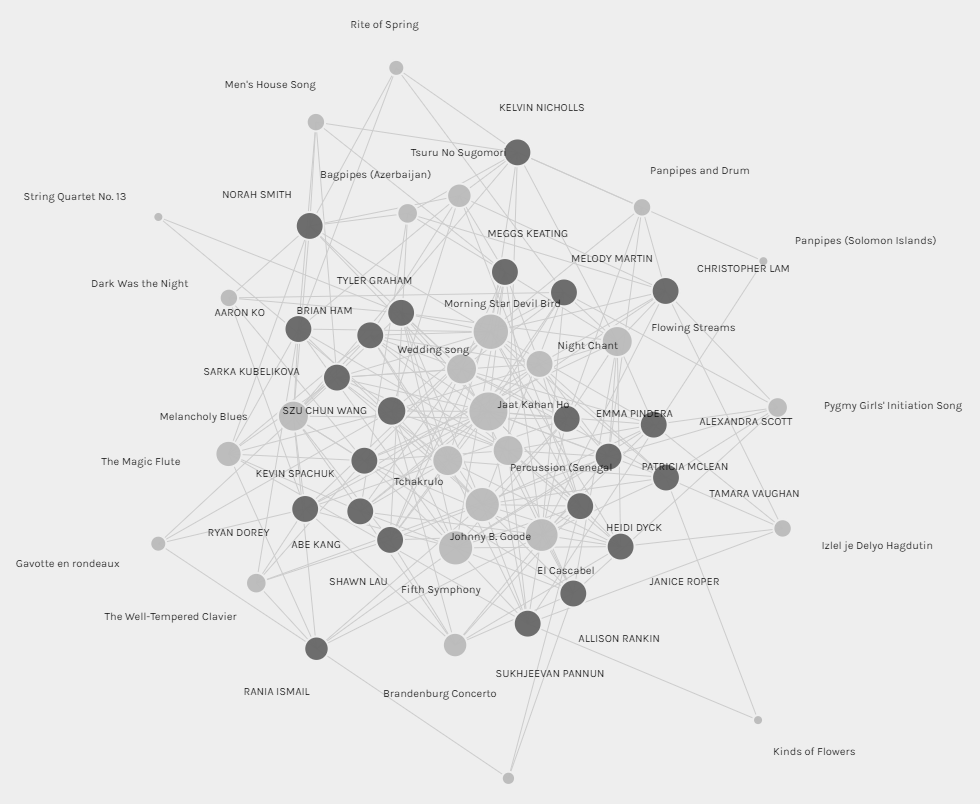
The visual above represents all the data that was collected from participants in the ETEC 540 class (Section 66B). It shows the connections between curators (students) and tracks from the Golden Record. The graph is beautiful and demonstrates that some sort of connections exist.
I found the Palladio app fairly easy to navigate; however, the graph it initially generated, as seen above, is complex but fairly useless. All it shows is that everything is connected somehow. It acted well as a starting point and made me curious about how I might be able to generate visualizations that are more useful. I ended up using filters to generate visualizations in order to examine some connections more closely. I generated visualizations of the following:
- The group I am in (Group 3)
- The 3 most chosen tracks
- Most chosen track vs Least chosen track
- Me and a classmate with whom I share the least track selections
Group 3
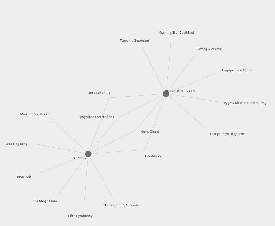
Group 3 consists of Abe Kang and I. From this visualization, it is clear that Abe and I share 4 selections from the Golden Record. The visualization also shows our other 6 selections that are different. From the visualization alone, I believe that it is impossible to extrapolate the reasons behind our choices. Why are 4 of the tracks selected by both of us? Why are the other 6 tracks different?
Since the graph is non-descriptive, one could make assumptions, but they would be inaccurate. For example, one might suggest that from the first names alone, “Abe” and “Chris” suggests we are both “male”; however, this can be far from the truth as Abe or myself might be transgender and not cisgender. Another assumption someone might make in order to make some sort of connection could be to look at our last names. Could it be that “Kang” and “Lam” are both “Chinese” so the 4 identical choices could be cultural? That would also be an inaccurate assumption since “Kang” could be the last name of someone of Korean, Chinese, or biracial or multiracial descent. These examples hopefully illustrate how ridiculous it would be to simply draw conclusions from words in the visual. The visualization generated using Palladio alone cannot possible reveal exactly how we selected the songs nor could it reveal the exact reasons for the connections of 4 overlapping selections. All it reveals is that Abe and I are connected by the 4 choices we share.
Top 3 Most Chosen Tracks
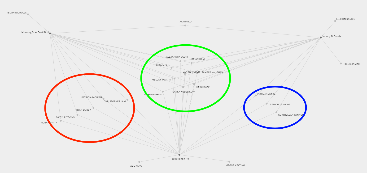
This graph visualizes possible connections of students who selected the top three most popular songs from the Golden Record. The 3 most chosen tracks were Johhny B. Goode, Jaat Kahan Ho, and Morning Star Devil Bird. I added the colored circles to help group students together. From this graph, I believe it is appropriate to conclude that students within each of the colored circles share more connections in their selection criteria with peers within the same colored circle. However, while it shows that students within each circle have something in common, the graph lacks details doesn’t exactly provide explanation as to what the selection criteria were and how they are connected specifically.
However, I believe this is the most useful of all the visualizations I generated. This visualization is a fantastic starting point for shaping additional studies that could be used to determine metrics for predicting which songs might be more or less popular for a future version of the Golden Record.
Most Chosen Track vs Least Chosen Track
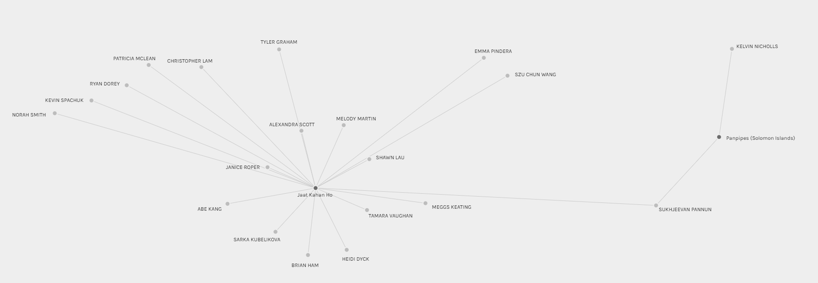
As I engaged in this activity, I was also interested in comparing the most chosen track with the least chosen track. The most chosen track was Jaat Kahan Ho, while the least chosen track was Panpipes. I thought this visualization was quite interesting because it isolated our classmate – Sukhjeevan Pannun – as the ONLY connection between the most popular track and the least popular track. Exactly how his selection criteria differed from others that led to this result is unknown from the visualization. The graph also does not explain why Panpipes was the least popular choice on the Golden Records for our class.
With Whom did I Have The LEAST Connections?
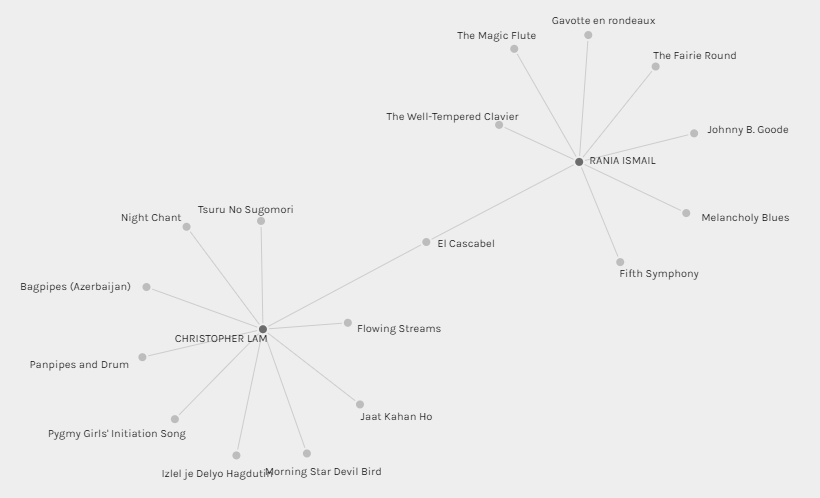
After generating the other visualizations, I was curious about who I have the least amount of connections with. I used the filter to select my name and generated graphs with each classmate one by one. With most classmates, I shared somewhere between 4-6 connections; however, with Rania Ismail, we only shared 1 track selection! I was curious about why our song selections were so different! I dug in and started deeply at this visualization, and I realized that just like the previous visualizations I discussed, there simply isn’t enough information for me to determine the exact causes of the differences. It is also impossible to determine what exactly contributes to both of us selecting El Cascabel. Although this visualization does not reveal any details, this could actually be a good starting point for digging deeper and referencing other sources to find out what exactly makes Rania and I so different in how we selected the songs. A good place to go is probably to our respective entries for Task 8 so that I might potentially be able to identify similarities and differences in our selection criteria.
In the grand scheme of things though, this is likely the least useful of the visualizations as it is only useful for satisfying my own curiosity and not really useful for anything else.
Reflection
The network visualizations I generated only reveal the possibly of connections between the classmates of this course as well as between the various songs. Regardless of what parameters I use to generate the graphs, they all paint incomplete pictures about what contributes to our similarities and differences in our selection process. Are the similarities and differences due to culture? Childhood experiences? Gender? Education? Social classes? The visuals are unable to provide insight into these areas. The visuals generated are quite limited in that they can only adequately show the frequency of songs being selected as well as who selected which songs.
Aside from being able to rank songs based on popularity, the visuals otherwise provide no additional context or details. The stories they tell are incomplete. This reminded me of the activities that we have been doing in this course. Examples include the very first task of telling our personal story using contents in our bags, the voice-to-text activity, as well as summarizing a movie using emojis.
In the “What’s in Your Bag” task, students were initially limited to using a photo and some written text; we attempted to overcome limitations and enrich our storytelling when we were given the opportunity to “mode bend” in a subsequent assignment.
In the voice-to-text storytelling activity, the transcript that is generated lacked non-verbal details, punctuation, as well as included word choice errors; all of these made the story difficult to understand.
When summarizing a movie or book using emojis, words had to be translated to ideas and then represented with whatever emojis are available. It was difficult at times to make connections between an emoji and the idea or word that it was supposed to represent.
With this visualization activity, possible connections are revealed but all other contexts/details are missing. From the data we have so far, I believe it is impossible to identify reasons for why everyone chose the songs they did, as well as why they did not choose the other songs. Further studies will be needed in order to specifically identify details of the connections and disconnections.