This is possibly the MOST ANNOYING game I have ever played, but I did end up finishing. (See screenshot of completion in the gallery above…)
This game was way too frustrating and I had to give up a few times before finally coming back to finish it. In order to finish it, I had to really slow down and read EVERYTHING carefully, since every aspect of design in this game is intended to mislead the user. I included a few screenshots in the gallery above where I highlighted some examples of problematic areas.
I will also summarize these problematic areas below:
- Elements that are highlighted are not actually what users need to click in order to proceed. Super misleading!
- Instructions are hidden and require additional scrolling to find them. Example: Password instructions.
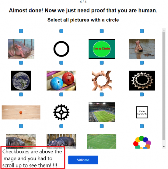
- Instructions are ambiguous. Example: Verification process at the end.
- Extremely not user-friendly way of inputting information. Example: Looking for the correct “country” by choosing from tiny, grayed-out flags, or using up or down arrows to slowly scroll through numbers in order to enter the house number for the address (imagine how long it would take to input a 4-digit house number!)
- Annoying timer that pops up to remind users to hurry up, and the only way to close it is by clicking the word “close”, which is in fine print, and uses the “copyright” symbol in place of the letter “c”…
This game really exemplifies the dark patterns highlighted at DarkPatterns.org.
Here are thumbnails for the scrolling gallery above.