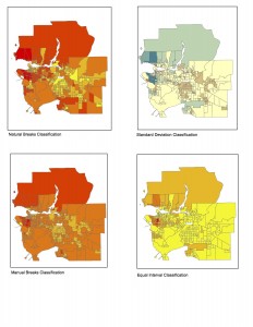
There a number of ways to classify data into categories that make it easier for the reader, each with their own pros and cons in how the data is displayed. An example of this would be showing the affordability of Vancouver housing through a number of different classifications. As a journalist putting together maps of housing cost in Vancouver I would use the Natural Breaks classification method because it has the most census tracts categorized under the most expensive bracket. As a journalist I would want to display data that best supports my story and to show how prices are rising in Vancouver I would want an image that shows a large majority of areas that would be classified as expensive. But if I were a real estate agent I would use the Equal Interval classification to attract potential home buyers in the UBC area as the graph is almost entirely covered in the lowest cost bracket. I would use this graph to try and persuade the buyers that housing in Vancouver isn’t very expensive. Choosing which classification method to use can have ethical implications as depending on the type used, people can be giving out very misleading information to persuade others.
The cartographer has a lot of decision making power when designing these maps. The choices that are made in the way the data is represented can greatly influence the way information is interpreted.
