the diss: techie vs Baggar
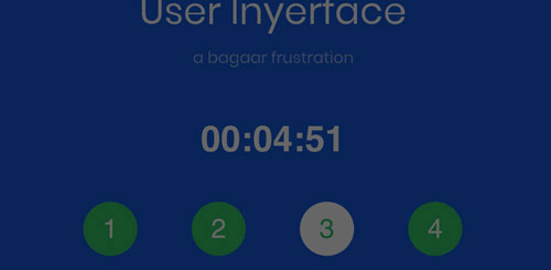
‘UI user inyerface’ taunts the target audience to a head-to-head competition against Baggar, who guarantees to frustrate those who dare to attempt completing an undemanding task. Moreover, the masculine overtone of the challenge reflects that the tech economy is male-dominated (Brookfield Institute, 2016; OCED, 2018). Thus, there is a high likelihood that this contemptuous, confrontational jeer directed at 20-25-year-old males (Harris, 2017) who are competent in web programming will trigger a response. A challenge motivates one to compete as the individual seeks to overcome and taste success’s glory. After all, competition is a fundamental human motive in a hierarchical society (Anderson & Hildreth, 2016; Yildirim, 2015).
“All gets brought back into building a more and more accurate model … once you have it, you can predict the kinds of things that the person does, predict what kind of emotions tend to trigger.” – Tristan Harris
n00b vs boss
The first challenge is to gain access to the game. Baggar misdirects, mislabels, and understates interface designs and conventions to achieve this. The challenge is to look instead of relying on past habits to navigate a web interface (Brignull, 2016). For example, hovering over the large green circle with ‘NO‘ causes it to increase as if linked. The green and increased size invite clicking, even though the NO tells the viewer straight out that this is not the link.

Baggar employs other default stylings for the inline elements of links. For example, most users know and expect that underlining ‘click’ indicates the connection and similarly, colouring the ‘next page‘ suggests that the link has not yet been visited. However, the highlighted ‘click’ and attention-getting ‘next page‘ is meant to mislead and delay.
Even though the all caps are shouting ‘HERE,’ it is virtually invisible. On top of the other misdirections, using block letters makes it difficult to scan and increases the time needed to read and interpret.
A UI programmer’s attention would have been drawn quickly to the uninformative’ click Here,’ since programmers typically avoid its use when designing navigation on a web page. Moreover, navigation links generally are placed at the top, mid-page, or bottom of a page.
TLDR
Once in, Baggar has a red box slip in at the top of the screen to draw attention. Red heightens emotions and creates a feeling that this must be dealt with to advance. Their A/B test found within the red box is puzzling. The question is unusual; the “Yes” choice is evident and apparent like ‘no’; however,’ no’ is paired with ‘Not really,’ suggesting uncertainty. In reality, it does not matter whether one clicks yes or no after many tries later; it became apparent that neither one was required to advance. The box is a red herring meant to confuse and distract. Nevertheless, a competent programmer would be aware of the trick as A/B testing pioneered by Chamath has become standard practice as growth tactics by tech companies (Orlowski, 2020).

“Dark patterns tend to perform very well in A/B and multivariate testing simply because a design that tricks users into doing something is likely to achieve more conversions.” –Harry Brignull
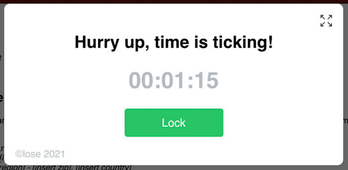
After the red box diversion, the designed loop on the progress indicator solely draws attention to the timer. A timed element acts as an intrinsic motivator in gaming to improve flow, engagement, and enjoyment; however, for others, a timer can negatively impact decision-making competence and performance (Yildirim, 2015). They add variability to the timer: the time it takes to lock the system fluctuates from just over one minute to nearly five minutes. As a result, the emotional state quickly heightens as one races against an unknown cutoff time.
Other distractions and miscues employed on subsequent pages:
Form
- The complicated password requires a bizarre Cyrillic element.
- There is no overwrite function, so one has to remember to delete the box category labels.
- One needs to uncheck the auto-fill.
- The standard domain name needs to be accessed through “Other” instead of typing it in.
- Help is unaccessible.
Terms and Agreement
- One can only reach the ‘Accept” located at the bottom of the page by sluggish scrolling.
- Keyboard browsing shortcuts are disabled.
- Clicking ‘Accept’ redirects back to the home page because it is infinitely looped.
- Term and agreement’s times out so that the lengthy content cannot be scanned.
GTG

Disabling the timer increases option visibility.
Simple access: valid password and email.
Click ‘Next.’
FTW
This is Me:
- While the blue button with ‘Download image” jumps out, all that is needed is to click on another seemingly disabled greyed function link, ‘upload.’
- All the autofill choices needed to be unselected to choose three interests.
- The ‘Unselected all’ option is buried at the bottom.

Verifying humanness

This page appears complete, yet the anchor points cut off the top layer of the required boxes to be checked. It simply requires scrolling up on the page, easy to execute, but it took time to imagine this visual illusion.
A competent tech designer would have been able to sidestep the misdirection, mislabelling quickly, and understated elements, thereby making this an elegant way to pre-screen potential tech candidates for skill competency.
A game like UI User Inyerface is by far a fairer way to recruit employees than some algorithmic solutions. For example, some human resources are using algorithms to predict potential “social capital” or “longevity” to a company of a candidate (O’Neil, 2016). Other hiring algorithms run the 37% Rule, where one is rejected not on evidence or competency but on a statistical formula to optimize the probability of selecting the best candidate (Rainie & Anderson, 2017).
– the fastest solution –
concluding thoughts
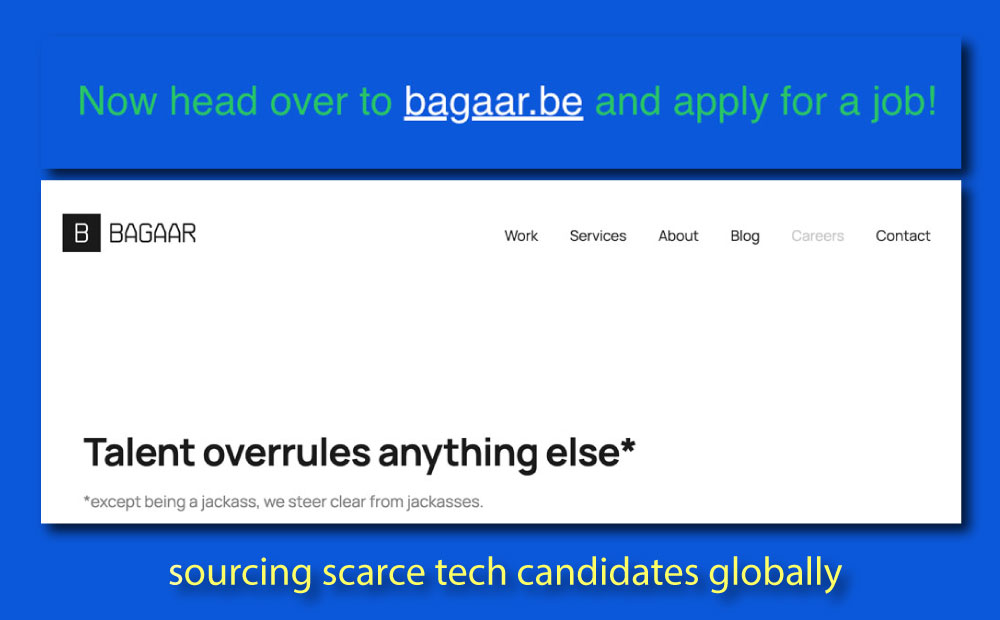
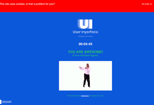
As Harris (2017) stated, “the best way to get people’s attention is to know how someone’s mind works. Baggar is not an inadept design company but a commercial enterprise that seeks clients’, skilled tech programmers and engineers, and perhaps tech writers’ attention. With this game, the company picked up free promotion through posts like Slashdot, technewstube.com, fossbytes.com and chatter of the players/programmers. However, by digging deeper into Baggar’s website, it is easy to recognize a sophisticated Belgium tech company focused on guiding corporate clients towards digital transformation with creative design. UI User Inyerface was not an interface with bad design nor an interface with no clues, rules, and convention, but a reasonably sophisticated design that engaged people to stay on their screens through allusion, tapping into intrinsic human behaviour, and predicting what people would do. It also demonstrated to potential clients the frustration that customers have with lousy interface design.
“A magician understands … some part of your mind that we’re not aware of. That’s what makes the illusion work. People do not know how their mind is vulnerable… from this perspective you can have a very different understanding of what technology is doing… Persuasive technolgy is just sort of design intentionally applied … to modify someone’s behaviour … to take this action we want them to keep doing.” –Triston Harris
References
Brignull, H. (2016, December 23). How do dark patterns work?
Cameron Anderson and John Angus D. Hildreth. (2016). “Striving for superiority: The human desire for status.” IRLE Working Paper No. 115-16. http://irle.berkeley.edu/workingpapers/115-16.pdf
OCED. (2018). Bridging the Digital Gender Divide: Include, upskill, innovate (p. 151). https://www.oecd.org/digital/bridging-the-digital-gender-divide.pdf
Harris, T. (2017, April). How a handful of tech companies control billions of minds every day. https://www.ted.com/talks/tristan_harris_how_a_handful_of_tech_companies_control_billions_of_minds_every_day?utm_campaign=tedspread&utm_medium=referral&utm_source=tedcomshare
O’Neil, C. (2016, September 1). How algorithms rule our working lives [The Guardian]. https://www.theguardian.com/science/2016/sep/01/how-algorithms-rule-our-working-lives
Orlowski, J. (2020, January 26). The social dilemma.
Rainie, L., & Anderson, J. (2017). Code-Dependent: Pros and cons of the algorithm age (pp. 1–87) [Number, Facts and Trends Shaping Your World]. Pew Research Centre. https://www.pewresearch.org/internet/2017/02/08/code-dependent-pros-and-cons-of-the-algorithm-age/
Vu, V., Lamb, C., & Zafar, A. (2019). Who are Canada’s Tech Workers? (p. 56). Brookfield Institute for Innovation and Entrepreneurship. https://brookfieldinstitute.ca/wp-content/uploads/FINAL-Tech-Workers-ONLINE.pdf
Yildirim, ïrem G. (2015). Time pressure as video game design elements and basic need satisfaction [Master of Science in Modeling and Simulation Department, Middle East Technical University]. https://www.researchgate.net/publication/281637918_Time_Pressure_as_Video_Game_Design_Element_and_Basic_Need_Satisfaction/citation/download