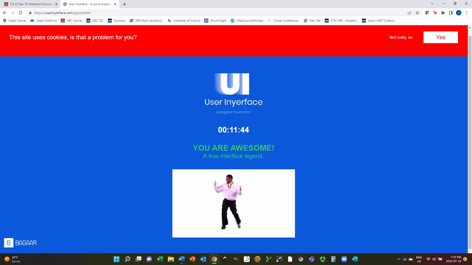
While reading through the instructions, my first impression of Task 10 was that it sounded fun! As I navigated to User Inyerface and began the activity, my attitude quickly changed. I became incredibly frustrated within the first couple of minutes. After trial, error, and nearly twelve long minutes, I completed the process of creating my “account”. A small gif of a dancing Carleton helped me celebrate my achievement of navigating a nearly unnavigable user interface, and after a few calming breaths I was able to reflect on the design choices that made my experience so aggravating.
In Brignull’s 2011 article about dark patterns on the web, he discusses some ways that companies apply psychological insights deceptively (e.g. our tendency to scan a page for the important information). User Inyerface used this insight on the first page – I wanted so badly to click on the big green “no” button! I realized that no matter what the big green button said on it, I would probably want to click on it, which makes it a powerful design choice that could be used to manipulate responses. But of course, I went into the activity expecting to be fooled so I thought twice about clicking it. The link to the next page was hidden in an oddly-formatted sentence near the bottom of the page. It was unclear which of the words contained the link, so I ended up navigating to the next page by clicking indiscriminately on all of the words until something happened.
On the next page, I became irritated by the “hurry up” message that kept popping up. It took some time to figure out that the small copyright symbol at the bottom was intended to be the “c” at the beginning of the word “close”. There was no indication that the word was something I could interact with. There was also a certain amount of stress I felt while seeing the numbers ticking away and keeping track of how long I had been struggling with the interface. The stress of trying to do it quickly undoubtedly made me less effective at navigating the site. I can see how this would be useful for companies who will make more money if their customers are worried about navigating the site quickly as opposed to looking for small details that could save them money.
The inconsistent wording regarding the password requirements and suggestions made it difficult to figure out what kind of password was acceptable, which only increased my frustration. The requirement to include a letter in common with the email address would have been very suspicious if this were a real account registration. If someone wanted to hack an account, they would be one letter closer to guessing the password.
There were several other designs to the UI that bothered me, but I think the very worst was the last page where I had to click on images to prove I was not a robot. The first set of images asked me to click on all pictures with a bow. However, the images consisted of bows and arrows, ribbon tied in bows, and people bowing to one another. I arbitrarily picked one of the three types of bows and selected them all. When I submitted my answer, there was no feedback at all about whether I had chosen correctly and I was immediately asked to do the same exercise with a new set of equally ambiguous directions. After several iterations of this, I selected all the images and finally made it through. I feel that there are many ways that designers could use the ambiguity of the English language in a malicious way to confuse customers.
Overall, the designers of User Inyerface did an excellent job of keeping me on the site for much longer than it would normally take me to create an account. Just by trying to navigate an aggravating interface, I became aware of many subtle design choices that can help or hinder a user. It seems much easier to influence responses and capture the attention of a website user than I had previous realized.

Brignull, H. (2011). Dark Patterns: Deception vs. Honesty in UI Design. Interaction Design, Usability, 338.