Category Archives: Linking Assignment

Link to Task 8: Golden Record Curation with Selene

After reading Selene’s Golden Record Curation assignment, I decided that I had to link to it because it was so outside of the box. Like myself, Selene felt it was important to include representation of cultures from all parts of the globe. To do this, she “broke the rules” and selected more than 10 tracks. After all, if the reason we need to pare down 27 tracks to 10 is due to space constraints, why not just edit the tracks for time? I admit, I had not read Selene’s rationale before looking at the class data. When I saw that she had selected all 27 tracks, I thought that it must have been an error and disregarded that data.

Selene’s post prompted me to do some more thinking about what I would actually recommend if I were involved in the curation of a new Golden Record. I really appreciate the idea of trying to remove any cultural bias. Perhaps we could make a future Golden Record that is less anthropocentric. What if we included sounds of different animals all over the world? Or maybe recordings of different weather (e.g. rain, wind, thunder). If a future record is still in audio format, there are so many interesting sounds on Earth other than carefully composed human-made sounds. Why not give intelligent life information about the planet as a whole? After all, if natural history has taught us anything, it is that the dominant life forms on the planet tend to change over time.

Selene’s Golden Record Curation

Thanks for giving me so much to think about, Selene! Keep thinking outside of the box.
Link to Task 9: Golden Record Curations with Al

I was drawn to Al’s analysis of the Golden Record Curation data because in reading his reflection, I realized I had found a fellow scientist. As a laboratory coordinator in higher education, I spend a lot of time talking with students about data analysis and topics such as correlation vs. causation. Al explained our inability to know why anyone chose the tracks they did in terms of untestable hypotheses. The clear and concise explanation of his methods of data manipulation were easy to read, and I was fascinated by the way he used the filters in the Palladio app to explore potential cultural biases by looking at the number of times western songs were chosen. The idea of cultural bias had crossed my mind, but I wasn’t sure how to go about looking into it. In the end, I believe that we both came to the same conclusion: that the data can only show us what was chosen and how often, but cannot give us an answer as to the motivation of the humans who chose the tracks.

Al’s Viz of the Golden Record Curations

Great post, Al! If you ever do design a T-shirt with the slogan, “5 out of 4 people don’t trust statistics,” I will order one of them 🙂

Link to Task 4: Potato Printing with Elvio

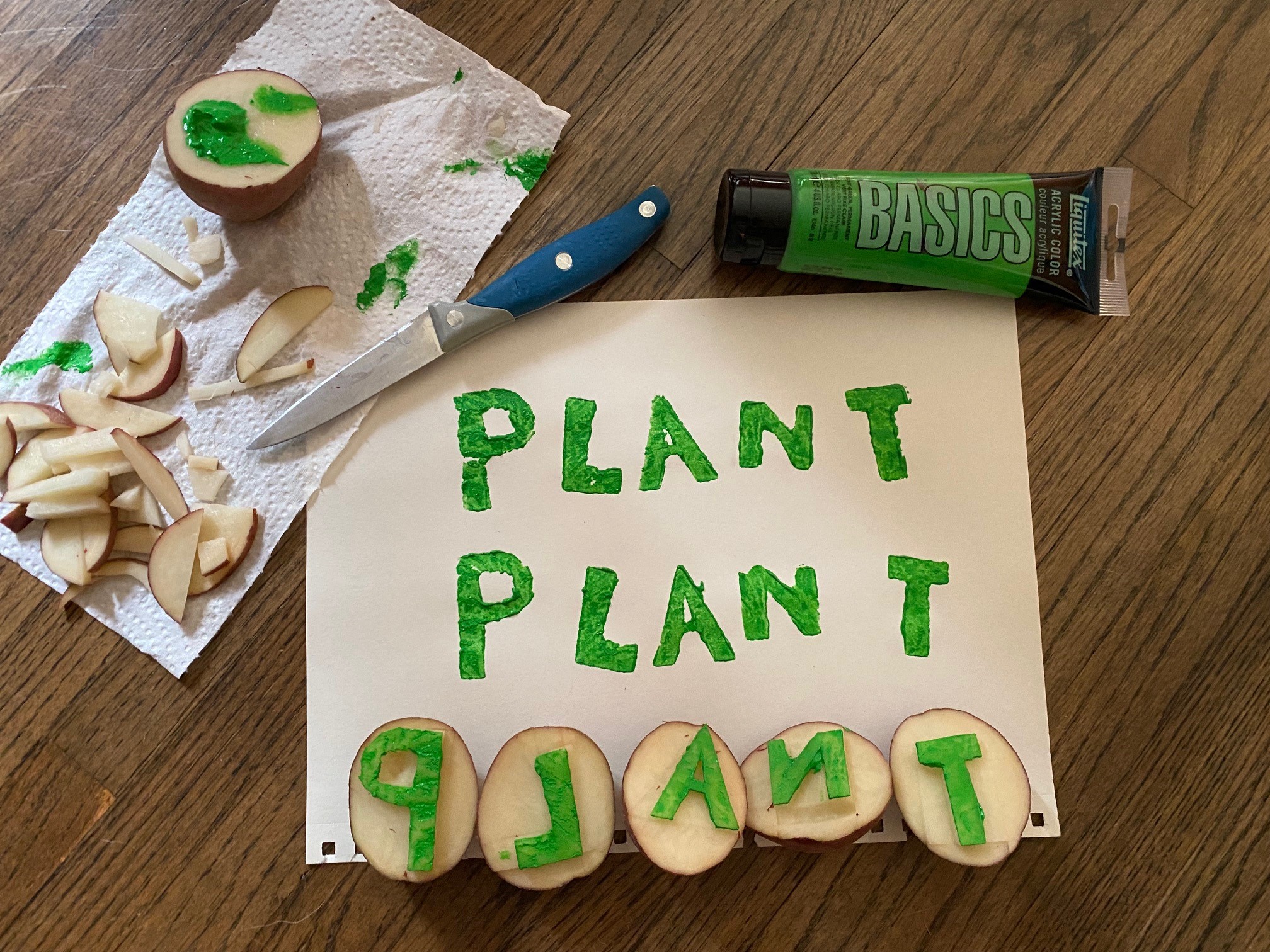
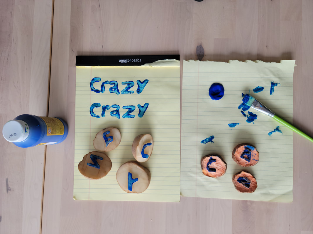
I chose to link to Elvio’s potato printing because we seemed to take a very different approach to the task, but still ended up with a similar product. I was also interested to see that we both took photographs of our supplies and stamps along with the finished prints! Elvio chose to write the word ‘Crazy’ in mostly lowercase letters with nice curves, like a typewriter, whereas I took the easier route and wrote ‘PLANT’ in all caps to maximize the number of straight lines I could cut. I did all my planning in my head ahead of time over the course of a couple days (sometimes I do my best thinking while I am trying to fall asleep), and then in about 20 minutes one day while I was waiting for supper to cook,  I spontaneously started carving the potatoes. It seems that Elvio was much more careful and tried to draw out the pattern on his potatoes before beginning to carve them.

A comparison of the two prints:


In the end, I think that Elvio came up with a more uniform set of prints and his lettering looks more like a hand-written sign. He wrote, “I agree with the argument that Gutenberg’s invention was successful because he replaced and mimicked the look of existing text.” I think that Elvio has done the same. If I were creating letters for print that were in less ephemeral medium, I think I would have taken into account the aesthetics and readability of the lettering.

Elvio’s Crazy Print

Thank you Elvio for the idea of using this task in a classroom setting. In my plant physiology lab, I have an entire activity that centres around osmosis in potato tissues… perhaps I can work on integrating printing into the lab so we can use the remaining potato tissue for something!

Link to Task 6: Emoji Story with Kayli

Warning: spoiler alert for both mine and Kayli’s emoji stories!

I chose Kayli’s emoji story because I immediately knew what movie she had chosen based on the title, even though I have never seen the film myself. An ant emoji and a male face emoji… it had to be Ant Man! I wondered for a while if I had an advantage in guessing it since I’ve been chatting with Kayli for the past year or so and know that she likes superhero films. But when I read the comments made by a couple of our colleagues who had seen the movie, I realized it was just a very straightforward depiction of the story.

We both took a similar approach in that we tried to choose recognizable stories and ended up using multiple emojis to represent a single character. In order to introduce Russel, the nature scout in the movie Up!, I used a tent and a boy emoji. Both of our stories had short titles that were easy to convey. One major difference between our emoji stories was that Kayli seemed to do more of a summary to give an overall impression of the important plot points, while I attempted to include the whereabouts of each character throughout the whole story. In retrospect, I think this made my story a bit harder to follow! Luckily, the iconic house with balloons managed to get my point across.

Kayli’s Emoji Story

Thanks for the fun story, Kayli! Nice work.

Link to Task 7: Mode Bending with Sage

When I first looked at Sage’s redesign of the What’s in my Bag? task, I wondered how she would use ASMR to get the point of the assignment across. Once I watched the video, I realized how effective it was! The combination of the whispering and the sounds such as the pop of the cap on the lipstick tube took an assignment that began simply as a photograph and text and made it all about the audio. The soft sounds and quiet speech had me leaning into my laptop so I could hear what was coming next.

In her post, Sage wrote, “Personally, the most challenging element of this redesign process was overcoming the absolute silliness I felt while recording myself whispering about my various items.” I could relate to this as I had never before made a TikTok, but really leaned into the silliness of adding animated stickers to the still parts of the video. In a way, however, it was actually kind of freeing to just play a little bit when we design tasks. Perhaps Sage cracking a smile while whispering or me giving a photo of myself silly animated glasses will make us seem more human and approachable to our students. Who knows?

A couple of things that differed between our redesigns was that Sage’s leaned very heavily into the audio part of the audio-visual medium, whereas mine had a bit more emphasis on the visual. Additionally, using TikTok meant that my video had to be short, so I tried to cram a lot of content into 2 minutes. Sage’s video was posted on YouTube, so she was able to take her time, which I think was an excellent choice as it added to the calm, relaxing nature of the video.

Sage’s ASMR Redesign of Task 7

Thanks for sharing your creativity, Sage. I loved it!

Link to Task 3: Voice to Text with Agnes

I was immediately drawn to Agnes’ voice to text story because it is all about moving from Ontario to Saskatchewan. I have lived in Saskatchewan my whole life and was excited to read about the perspective of someone who hasn’t always been here. I was so happy to hear about her experiences with the sunrises, sunsets, and distant horizon in the Land of Living Skies. I really think the skies are one of the highlights of the province, and sometimes I take it for granted. A few years ago, I participated in a science outreach program in a small town southeast of Saskatoon. One of the other volunteers was a new international M.Sc. candidate at our university and had just come to Saskatchewan the week before. Despite the minus 30 C weather, he asked more than once to pull over on the highway during our long drive to photograph the sky. It was then that I remembered just how lucky I am to see it all the time!

Agnes used the voice to text tool embedded in Google Docs, whereas I chose to use Speechnotes. It seems that we had similar experiences with the output generated by the technology as we both noted a lack of punctuation and inappropriate capitalization of words. In my story, the word “Garden” was capitalized multiple times and in Agnes’ story the words “Farmland” and “Community” were capitalized as well. I wonder if the technologies picked up on a certain cadence in our voices or some other subtle nuance in our speech patterns to decide that those words sounded like proper nouns. I got the impression that we both spoke a bit unnaturally while dictating to the laptop, which might have had an effect.

Link to Agnes’ Voice to Text Story

Thanks for sharing your story, Agnes! I enjoyed reading it.