Geob 270 – Lab 4
Lab 4: In this lab, I was given another scenario. This time, I took on the role of an employee of the Globe and Mail, Canada’s national newspaper, as a data journalist. I had been commissioned to author an article on cost of housing and housing affordability. I focused on two major cities in Canada: Vancouver and Ottawa. This lab focused on the ethics behind the representation of data and how it can be manipulated to support one’s purposes. These maps and analyses required familiarity with census data, tables, joins, classification, normalization, and visualization.
- The following image demonstrates how the same data can be represented in various ways, eliciting certain reactions.
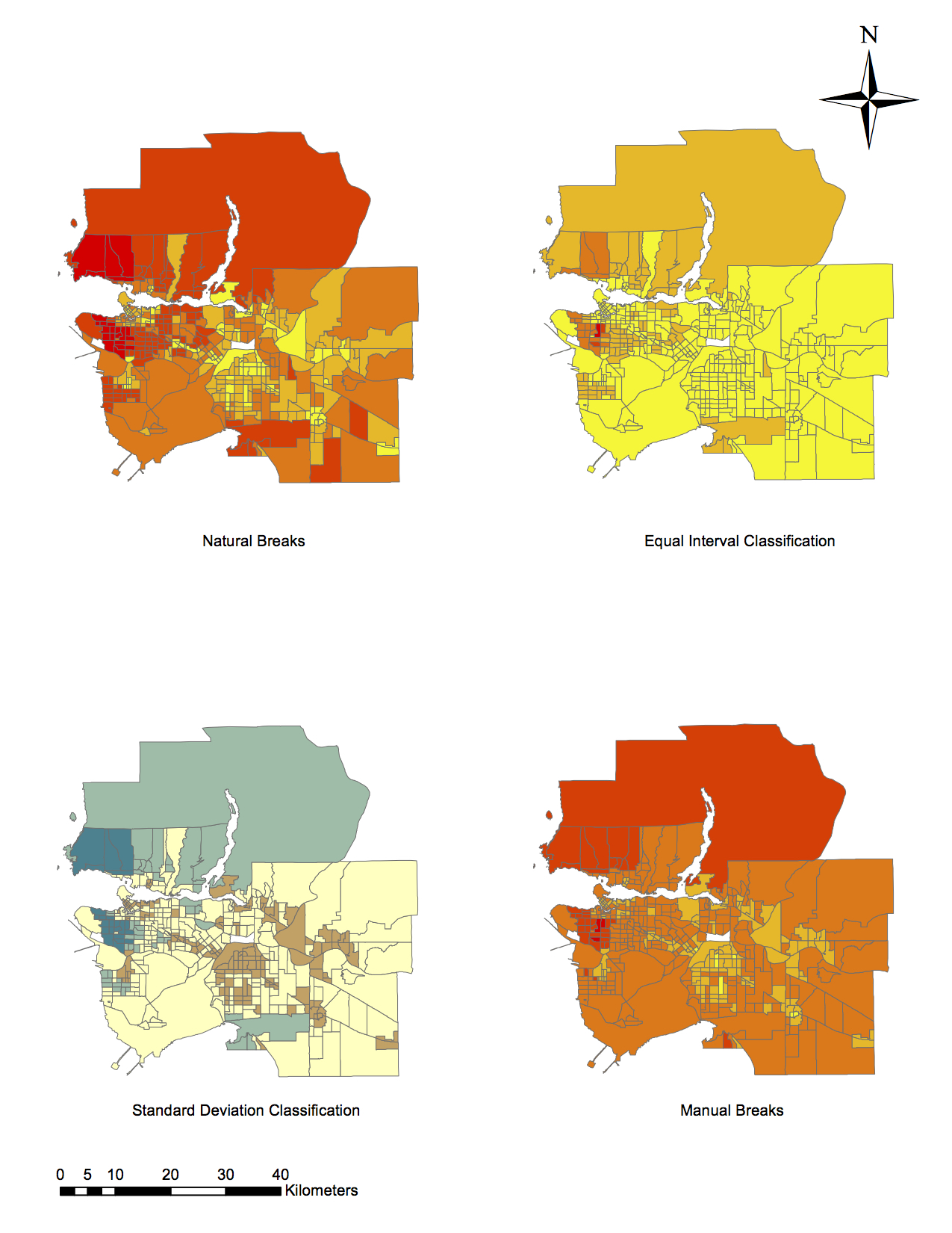
As a journalist, I would most likely use the Manual Breaks classification method for my audience because it portrays very high housing costs throughout the Vancouver area. Most tracts are orange or red, with only a couple being yellow. This conveys to the audience that the housing market is bad for buyers. I would choose this representation because this extreme is likely to stir a reaction among the audience, which is ideal for a journalist. As a real estate agent, I would choose the Equal Interval Classification method to present data because it portrays the area near UBC to be of moderate cost, whereas other methods say that the UBC area has high housing costs. The Equal Interval method also shows that the Greater Vancouver area has relatively low housing costs, which would persuade potential buyers into buying property.
There are strong ethical implications for these choices in representation. The data is being represented in such a way that it suits my interests in both scenarios. This shields an audience or potential buyer from the actual trend in the housing market. If the methods were swapped between scenarios, the data would still be represented, but it would not encourage the desired reaction.
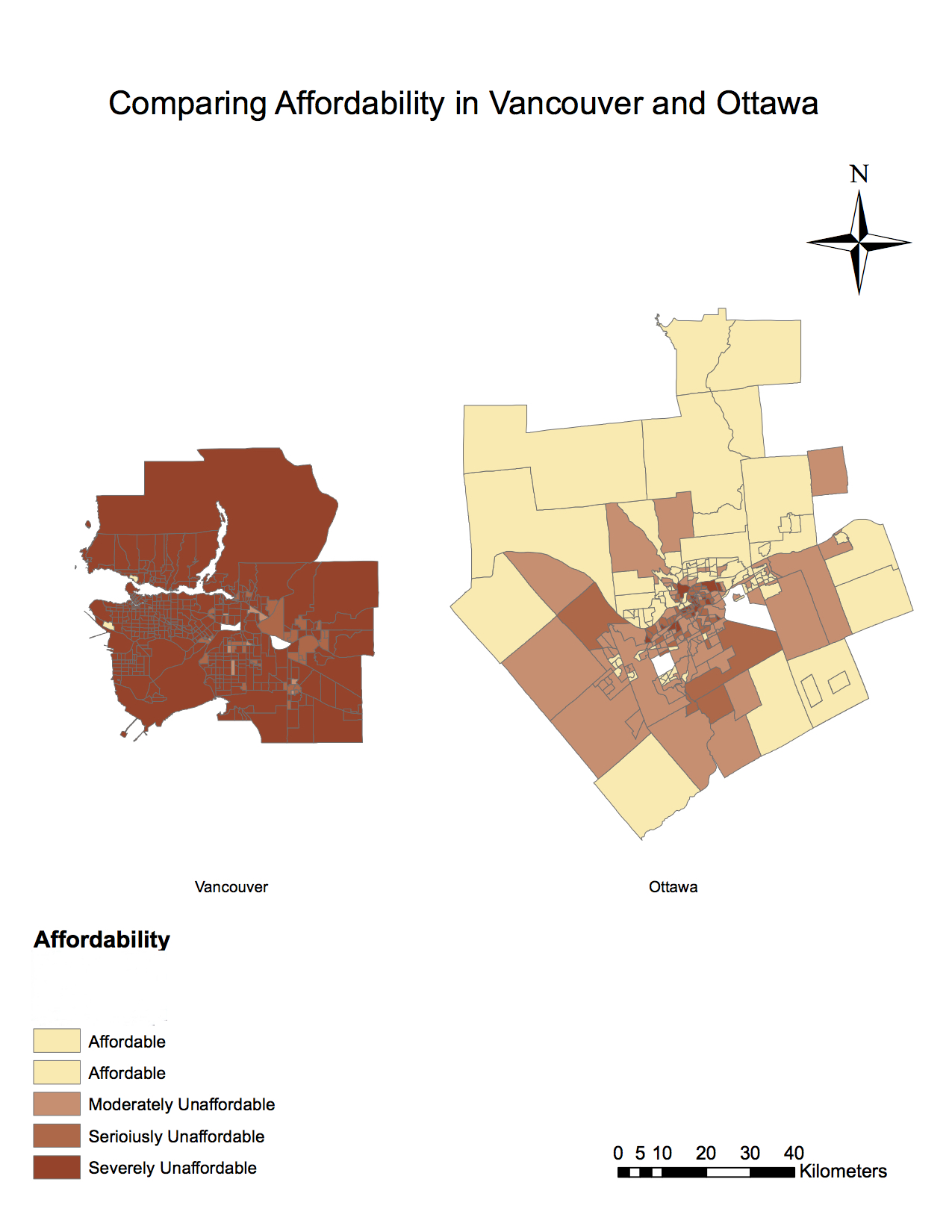
- Affordability is measuring the ratio of household income to the cost of owner dwelling. This is a better indication of housing affordability rather than housing cost alone because it takes into account a prospective owner’s financial mobility. An expensive house is less daunting to someone making above-average income than it is to someone making an average income.
The housing affordability categories in the above map were created by the 12th Annual Demographia International Housing Affordability Survey (2016 Edition: Data from 3rd Quarter 2015), and presented by Wendell Cox. This Survey was conducted to analyze housing affordability using data from Australia, Canada, China (Hong Kong), Ireland, Japan, New Zealand, Singapore, United Kingdom, and the United States. Though the names of the categories (Affordable, Moderately Unaffordable, etc.) are somewhat subjective and should be approached with wariness, the data is useful, as it was collected and presented with the housing market and homeowners in mind.
Affordability is a major key in establishing an area’s livability, because it is the first step that a potential homeowner should take. Other factors, such as crime rate, education trends, and weather may be important aspects to research as well. There are also the intangibles that differentiate a house from a home. A city’s culture and readiness to embrace a family atmosphere may be almost impossible to quantify, but should not be overlooked.