“As I see it, technology has built the house in which we all live. The house is continually being extended and remodelled. More and more of human life takes place within its walls, so that today there is hardly any human activity that does not occur within this house. All are affected by the design of the house, by the division of its space, by the location of its doors and walls. Compared to people in earlier times, we rarely have a chance to live outside this house. And the house is still changing; it is still being built as well as being demolished. […] I would like to take you through the house, starting with the foundation and then examining with you the walls that have been put up or taken down, the storeys and turrets that have been added, the flow of people through the house — who can come in, who can go into particular spaces” (Franklin, 1989).
This was an interesting task, especially after going through some of people’s posts in the last week and reading through their motivations and justifications for selections. Instead of looking at how we can go find information not initially presented to us, we were asked to look at a set of data and try infer what can’t be known by consulting it alone. Looking for the invisible by analysing the visible is an interesting process and one that has been important in areas of politics, economics, science, and activism. Once I got past the ‘anxiety’ of working with software I wasn’t familiar with and a system of visual data representation I had to decode, I really started enjoying it. As questions and insights started popping up whilst I played with software, I was able to return to the focus of this task and start noticing things I wanted to talk about.
Quantitative Overview
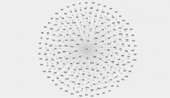
When importing the .json file provided on Palladio, the first visualisation we are presented with is a full scale overview of the data connections. All nodes are visible, curator names are highlighted, and the relationships between curators and tracks are linked.
We can instantly see that Men’s House Song is a strange outlier, but beyond that the data is very dense and difficult to read and isolate connections or nulls. Zooming into and dragging nodes to clearer space is possible, but tracking links and quantifying relationships or identifying nulls is nearly impossible unless you have a second list of data to cross-reference with.
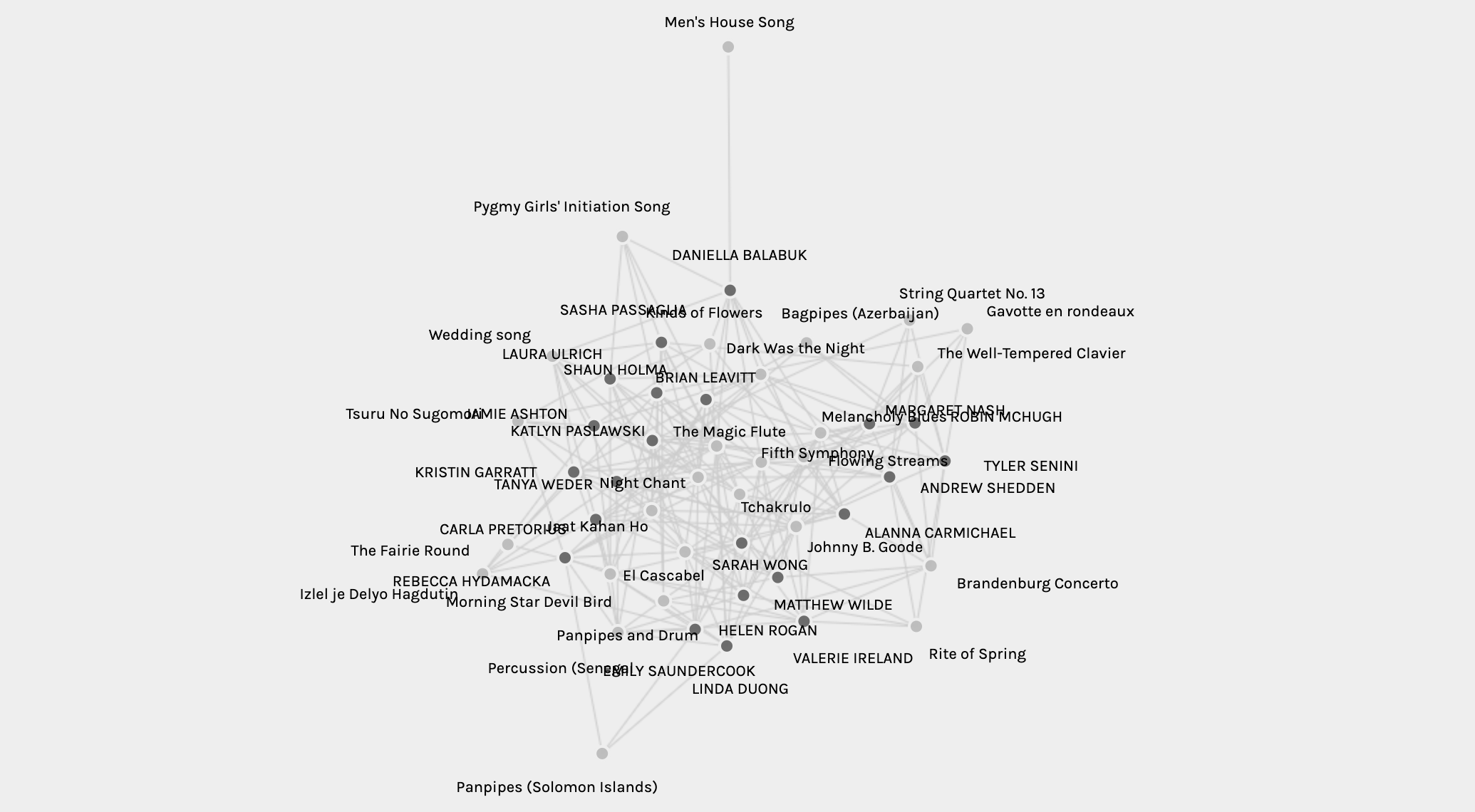
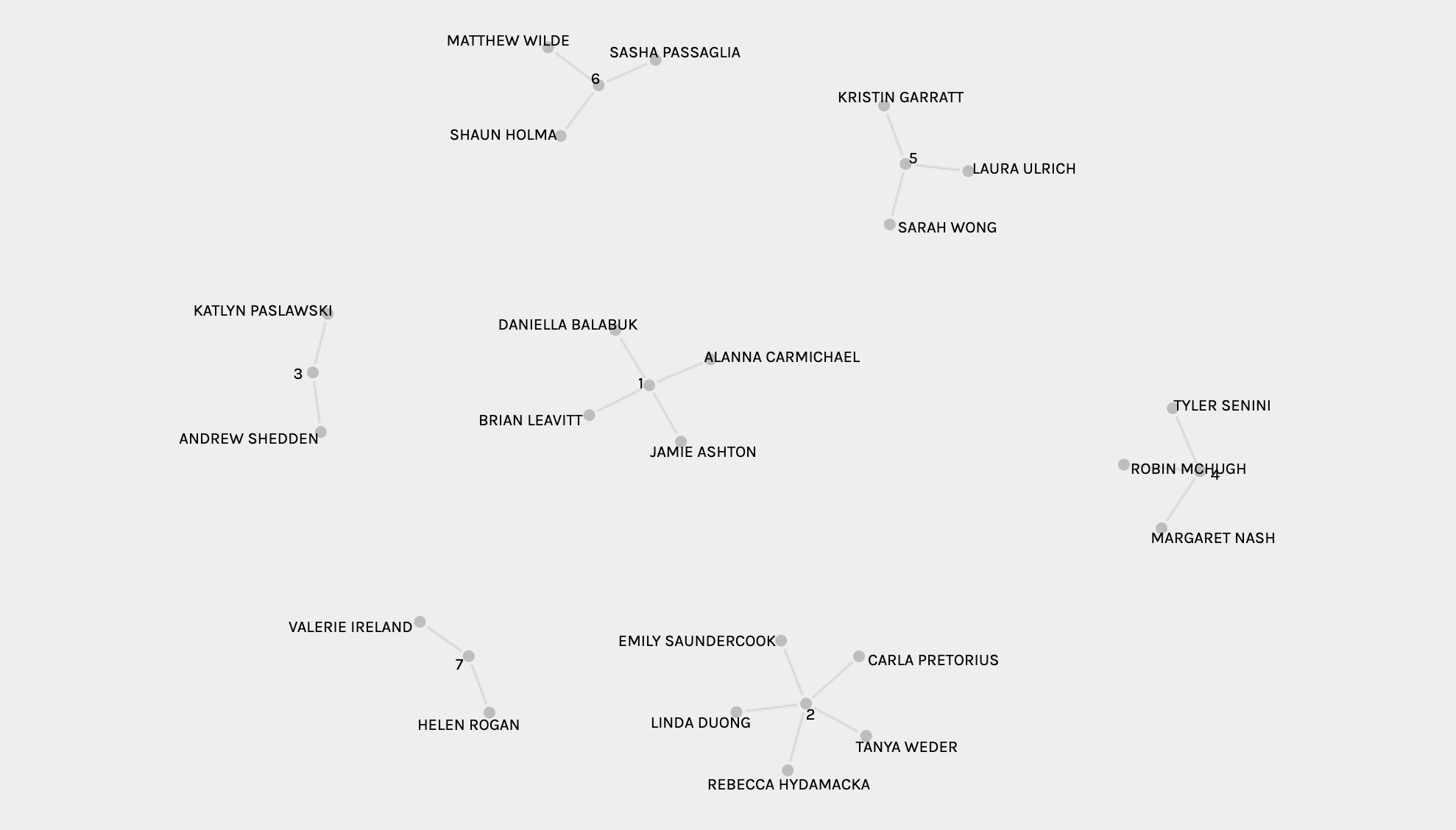
A second quantitative overview comes from looking at the two different sets of data: the tracks and the curators. You can reselect the parameters to show a firework visualisation that shows all the options for both of these groups.
You can ascertain who is in the 7 groups that the algorithm generated. However, in this overview mode you are unable to see which tracks are shared within each group.
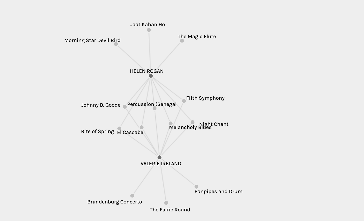
To gain greater insight into these individual groups and identify which songs they do/do not share, one can select the curator source and track target and then display them as isolated facets. For example, below you can see the songs shared by Helen and Valerie (group 7).
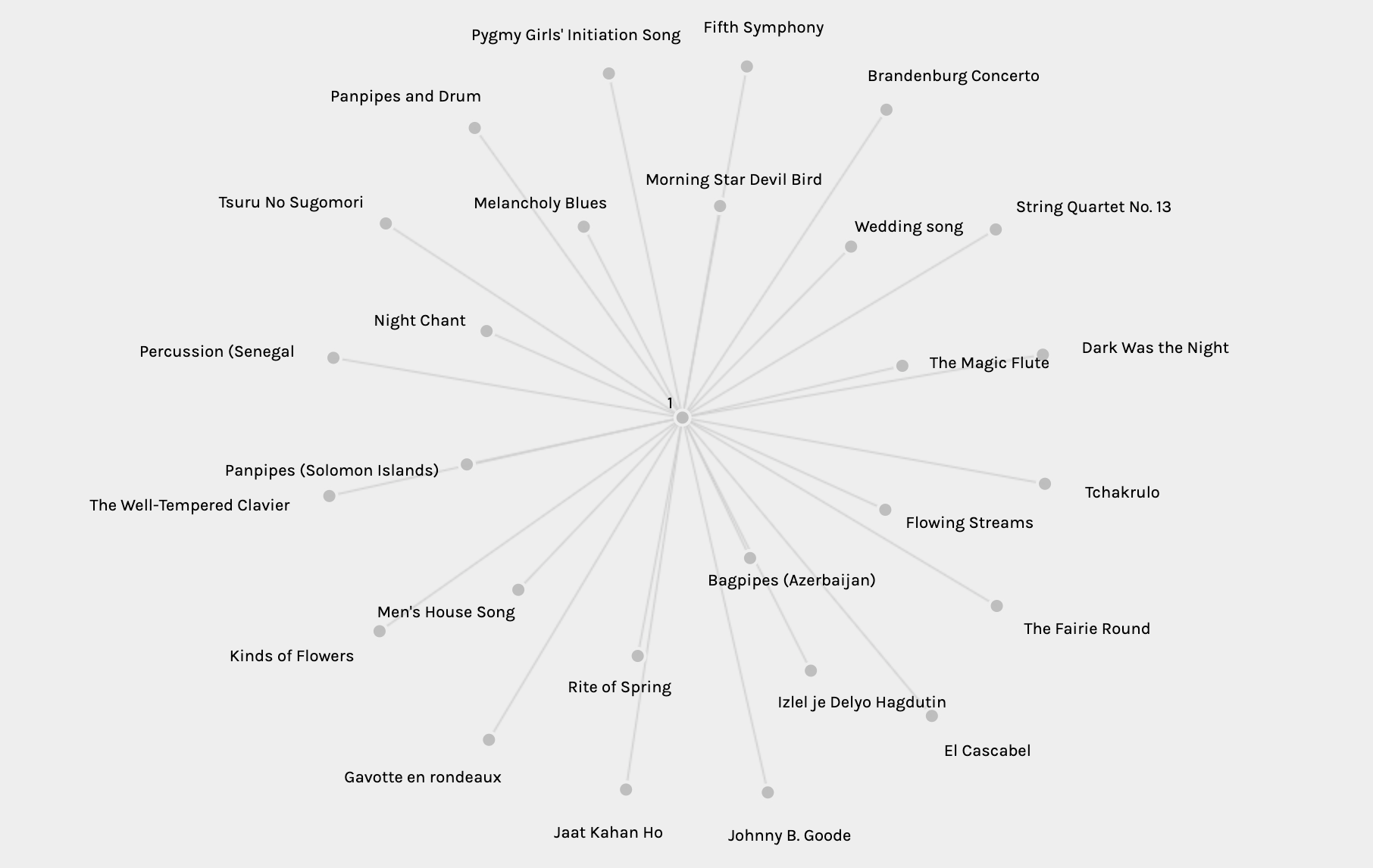
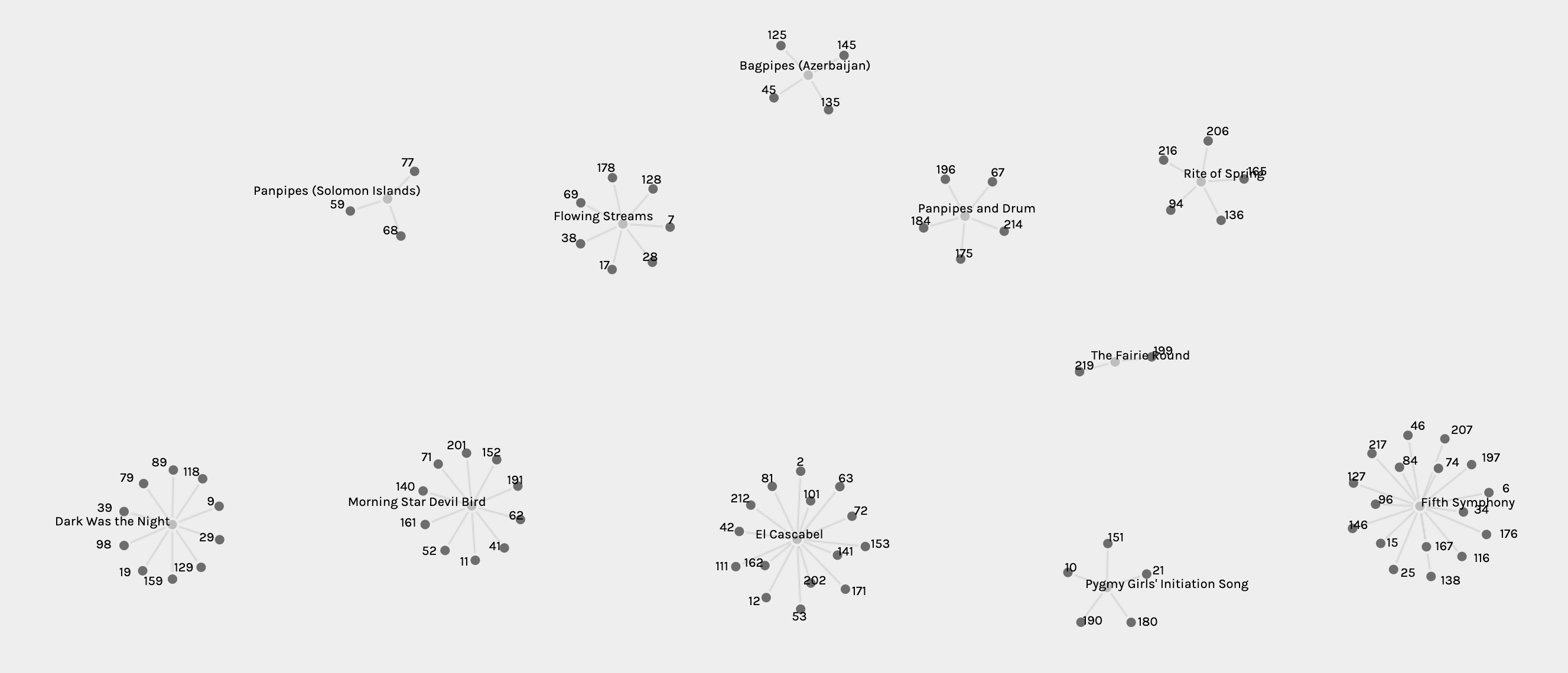
Similarly to the overview of groups, you can get an overview of the tracks and see how many people selected each one. However, you cannot determine which individuals selected them as they are listed via curator IDs rather than curator names.
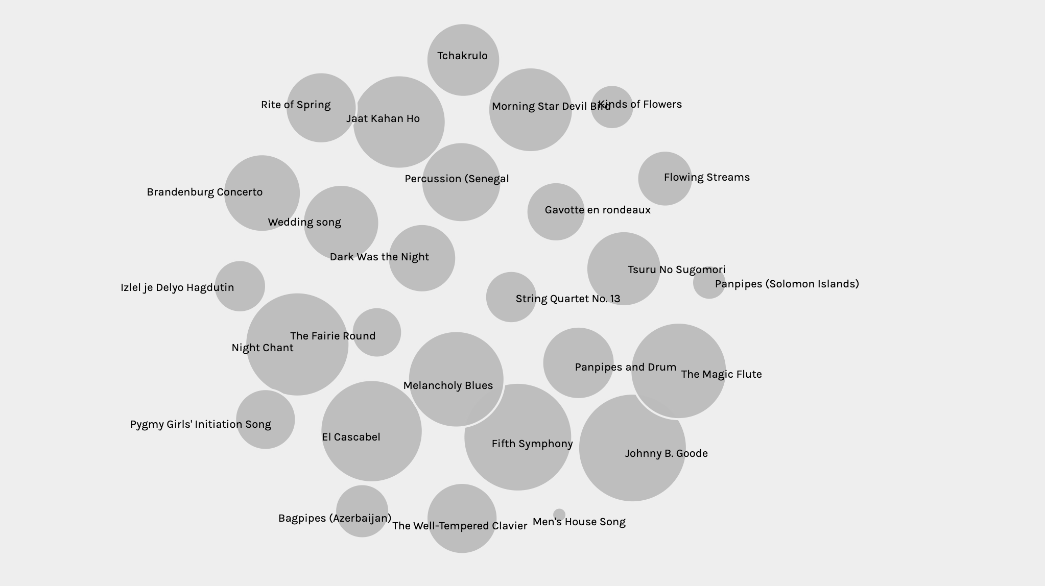
Finally, one of my favourite initial quantitative data overviews was gained by displaying nodes size based on weight. The screenshot below wonderfully shows which songs are the most and least popular.
From the data overview, we can see that quite a lot of data and information is visible. We can easily get insight into the tracks and curators, and their relationships in varying complexity. There are ranges of information density that we can select using the parameters for source, target, and facets of data and can move and highlight nodes to certain extents. However, even in the overview some of the null information (or invisible content that we couldn’t access/interpret) became apparent. This includes:
- relationships between songs outside of the pre-determined 7 groups
- the process/conditions for the creation of the groups by the algorithm
- a key for the relationship between track/curator names and ID numbers
Qualitative Analysis
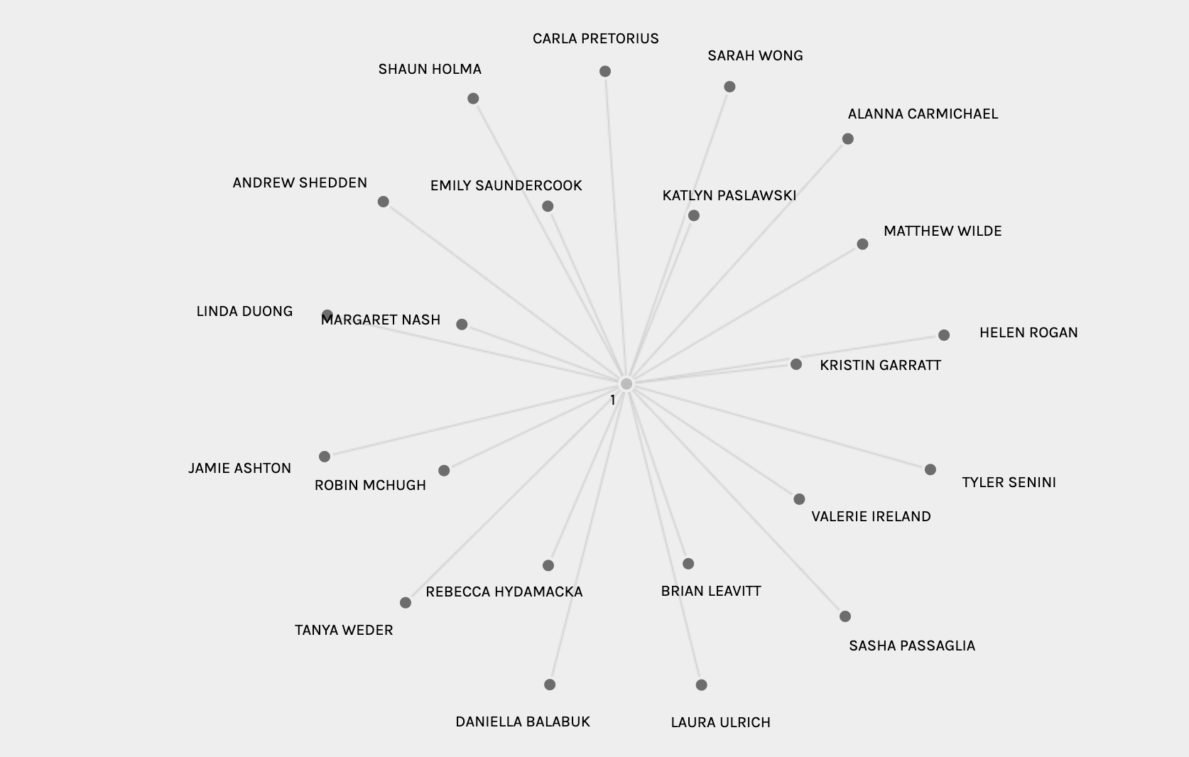
The grouping feature makes it easy enough to tell which groups of individuals share large commonalities between their selections, noting which songs individuals picked that was not shared with others in their group. Below, for example, we can see the group that I have been placed in along with Daniella, Alanna, and Brian. The node network shows which songs we selected alone, which songs we share with one other person, which songs we share with two other people, and which songs all 4 of us selected. Surprisingly, only 2 songs were selected by the 4 of us (Flowing Streams and Dark was the Night), but 4 songs were shared between three of us.
Whilst we can easily see the information about which songs we share and the weight of these overlapping son groups, there was no function to see which of our commonly selected songs (such as Dark was the Night) were also selected by others. I wish there was a feature where you could click on a node and it will isolate it to show relationships between all groups and data relating to that node. However, the focus of this section is to analyse what qualitative information we can infer from the visualisations alone.
When looking at these visualisations, we can see which songs are really popular in the overviews and we can see which songs are shared between individuals in groups. However, the motivations for choosing these songs (or not selecting others) are not possible to determine through these visualisations alone. We could go and look at people’s motivations for choosing songs and cross-reference their reasons from their blogs (and possibly even infer reasons for lack of selections), but the visualised data-set itself cannot show this. We could guess that people generally liked the songs that were selected, but we have no epistemological foundation for this assumption. People may have opted to randomly select songs out of a lottery, and prescribing preference to these links would be invalid. Overall, then, we can determine which songs are the most and least popular but there is no way to gain insight into why.
The following qualitative data can thus not be drawn from looking at the visualisations:
- Why people selected the songs they did, and why they didn’t select the others
- What the reasons are for the commonly selected songs in a group (e.g. preference vs cultural familiarity vs random selection etc.)
- Whether people would have selected these songs if there wasn’t a required number of songs to select
Reflection
Data representations of this kind are prevalent across economics, politics, academic research, and even activism. There is often a lot of valuable information inferred from the quantitative information drawn from data visualisations, but without explicit inclusion of qualitative data to offer context, there are various things that cannot be reflected/interpreted in the data. In a world where our lives are increasingly being steered by big data that is drawn from our movements and participation in online spaces, there are implications that are worth considering from these recognitions of data shortcomings.
Lets take our groupings, for example. We were placed in these groups without insight into what parameters the algorithm used to place us together. In this context there is not much of a political implication, but imagine groups were used to determine whether you were eligible to get insurance or a home loan. This is a huge problem with artificial neural networks in particular, which are increasingly being used to guide exposure to content and navigation of the internet as personalisation trends and surveillance capitalism grows. Transparency and understanding for the reasons behind these types of grouping are thus becoming increasingly important to ensure that individuals are not disadvantaged due to an algorithmic assumption that is an inaccurate reflection of their needs.
It seems strange to think of data visualisation and algorithmic processing as something that could be laced with bias. However, it is a reality that needs to be considered and questioned regularly particularly when it begins impacting people’s ability to access or interact with certain spaces online or in the real world. I always look at three different prompts when looking at data visualisations:
- what the creators focused on including and what they wanted to show
- what the creators did not deem it important enough to include, and why
- whether the creators intentionally decided to exclude or restrict access to certain functionalities or sets of information, and why
In the case of Pallandio, the data and functionalities I wanted but couldn’t access was probably due to the first reason. The purpose of the project was specific, and probably limited on time (or funding) due to it being part of a research project. However, when exploring the politics of the internet on the web these inclusions and exclusions can show bias, or intentional design for the sake of inclusion and exclusion.
Even if the data is seemingly neutral and the people/platform that is was developed is neutral, there could be cognitive bias in those who are analysing and interpreting it. For example, someone could look at this dataset and consider that 5th symphony is objectively one of the best, most enjoyable songs without being aware of the fact that it is so prevalent in this data visualisation due to having been selected by WEIRD individuals who curated the Golden Record and then reselected by another group of primarily white Western individuals who are culturally familiar with the piece. Similarly, the Men’s House Song is an outlier that may lead to the conclusion that people just don’t like it, or feel that it doesn’t represent human life and culture really well. The song may, however, just have been really hard to find (especially with such a vague name). Bias and assumptions in the reading and interpreting of data sets is therefore equally important to examine in ourselves or in sources that are offering us secondary insights into sets of data.
In closing, then, I guess my primary reflection from this task is to gently remind myself and others that data visualised cannot always be considered as objective or as a full representation of the reality it is trying to reflect. Often, therefore, we should be trying to look beyond the data itself and turning to ask where that data was drawn from and what the reasons are for data being selected from those areas. The internet is a big place with a lot of information, and it is easy to infer conclusions that suit our desired outcomes or pre-existing views by only recognising information that already supports our pre-existing conclusions. This draws me back to the Franklin quote I opened with. Data visualisation can give lots of information, but the pieces that are left out are equally important to consider as they may shed light on places where inclusion/exclusion is continuing either due to lack of recognition or due to the desire for the imbalance to be maintained. We need to look at the web and the internet that runs on it to see who is being allowed into and represented in what spaces before we assume that those spaces can act as a reflection of all.
Crash Course Statistics
Statistics can be scary, but they are SO fun as well. I know that this task was not traditional statistics, and was rather focused on data visualisation. However, the ability to look at represented information and interpret it becomes easier with some statistical know-how. Below is Crash Course’s Statistics Playlist Curriculum, in all it’s easy to understand wonderfulness. Enjoy if you want to!
References
Franklin, U.M. (1989). The Massy Lecture Series I. In Franklin, U.M. (Ed.), The Real World of Technology (pp. 20-45). Canada, Toronto: House of Anansi Press.


VALERIEIRELAND
July 14, 2020 — 2:12 pm
I enjoyed reading your, post Jamie! Although I’m still not sold on the idea that statistics is fun 🙂 Interesting points about data visualization in your reflection and I totally agree that a key takeaway could be that data can’t always been seen as objective or the representation of reality. Especially when conditions and reasoning can be so diverse. Side note, I really liked the organization of your post into qualitative and quantitative. The structured approach brought on a few more reflections of the task in my own thinking and the way data is viewed.
Valerie
Jamie Ashton
July 16, 2020 — 11:45 pm
Hi Valerie!
Thanks – Statistics and I have our moments together and moments apart 🙂 The post organisation only happened on my third edit. My writing was feeling all jumbled and then the categories clicked which made it all make sense in my head. Glad it helps make sense of things for others too.