GEOB270 have allowed me to gain hands on experiences on using ArcGIS where I otherwise would not be able to have access. What I liked about this course is that I was able to learn skills to make a presentable and meaningful maps digitally as opposed to drawing maps back in middle school for Social Studies classes. I feel like I have gained an employable skill as well because now I can tell people that I understand GIS jargon, its processes to produce a map, and the lengthy time, effort, and energy it consumes in order to produce a fair map.
Category Archives: Courses
Experience with Final Project
Our project aims to propose possible SkyTrain routes into UBC. We proposed 2 scenarios where one route is based on population density and the other route is based on creating a transit line for the area of Vancouver where there is still no direct access to UBC. Since we are in a group of four, we decided to split the work by having two people work on one scenario together. Some interesting things I learned from the project is that we discovered that TransLink is actually going to proceed with a SkyTrain line in the future that connects into UBC. Their current plan is to build along West Broadway, which is not where we have decided to place. However, with personal observations on our route (not from the maps we have produced and analyzed), we realized our route have very narrow roads where it may not be feasible or appropriate to build a SkyTrain in the area. We understand why TransLink has planned to build along West Broadway where the 99BLine Bus runs because it is a commercialized strip with wider roads. Hence, I have learned that in order to do an analysis on a feasible route, a lot of other factors have to be taken into place. During the process of brainstorming and analyzing the possibilities, we will always find that we could always miss a factor or two and have to redo a part of analysis. However, the GIS techniques came in handy, such as clipping and reclassifying data. We used that a lot in our project and it becomes satisfying when the result we want shows on the maps. Throughout the project, I also experienced the lengthy and tedious amount of time and work it takes to acquire the proper data needed for our analysis. The data are really scattered around on various websites and sometimes we would think a certain website database should have it, only to find that they do not.
Please feel free to take a look at our final proposal: final-project-proposed-skytrain-routes-to-ubc
Environmental Assessment
Accomplishment Statement
Developed the ability to parse and filter data. Effectively acquired and manipulate the visuals of a digitizing data by filtering and mining data in order to successfully represent an appealing and useful model for analysis.

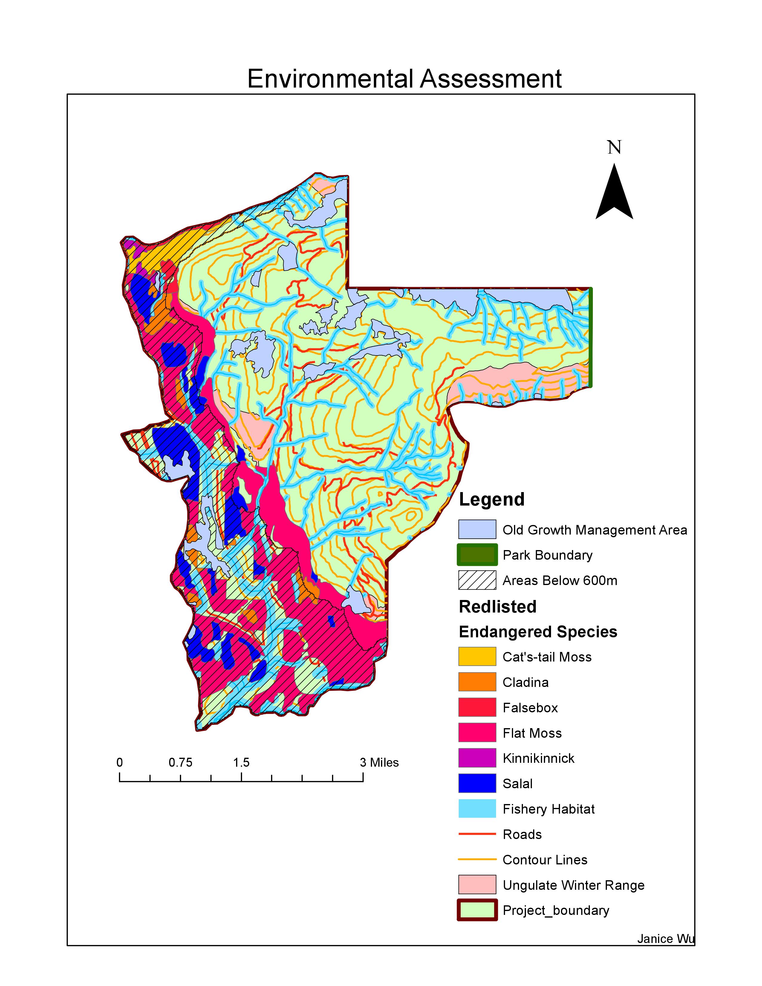
The project proposed was a year round destination resort on Brohm Ridge near Whistler. It will include 124 ski trails and 21 lifts and will take about 20 years to build the entire project. Because there has been concerns about the environmental impacts of this project, my job as a natural resource planner, is to investigate whether or not the concerns reflected by BC Environmental Assessment office and the Resort Municipality of Whistler are significant issue. I also need to evaluate whether there is sufficient evidence to either oppose or accept the project with the concerns being addressed if the project can be accepted.
First, I acquired data from the Canadian government’s database in order to investigate about the endangered species and the trees that are under protection in that area. Then I also gathered relevant data for the analysis, which includes information on roads, railways, rivers, lakes, topographic contours, etc. I made sure to name my files correctly, so that I, or the people looking at my map, won’t be confused about. After that I filtered the data so that only the information within the boundaries of the area where the project is held at are visible on the map. Finally, after putting all the information onto a single map, I am able to analyze the data and find out where are the areas in within the project boundary that are under the elevation of 600m, which is Whistler’s concern of safety for skiing. I also checked the percentage of areas that winter animals dwell in and the area of protected trees within the project boundary, which could potentially be significant numbers to reject the project. Fish habitat in the rivers are also of our concern for its part of the ecosystem that may be impacted by the project, so it is something I had to calculate the percentage of existence within the project area as well.
My general results for each potential factors that will be impacted by the project is as follows:
Old growth forest within the project boundary: 6.78%
Ungulated habitat within the project boundary: 7.89%
Endangered species within the project boundary: 24.8%
Fish habitat within the project boundary: 26.3%
Area below the 600m vertical within the project boundary: 31.78%
In my opinion, the two greatest environmental concern would be fish habitat and the endangered species that will be impacted in the ecosystem. The percentage of endangered species that will be effected is significant when they are contemplated as habitat that are on the edge of extinction. If people do not protect their existence, there will be a shift in the food chain, which will have an impact on humans. Fish habitat will especially cause a direct influence on humans as well because of the food chain and humans eat fish. Plus, it has the highest percentage of inclusion within the project boundary. Hence, it will be a major concern on human health and wildlife habitat. Although the area below the 600m vertical has the greatest percentage out of the five aspects that are considered, it is not a significant number because it means that about 68% of the area considered for the project will be safe and available for people to ski on, which is enough resource for the resort to function. They only need to make sure that the 31.78% of the area which are under the 600m vertical needs to be fenced off or put to use in other means than skiing.
So are the concerns addressed significant enough to reject the project? As an environmentalist, I would definitely oppose the project because I would be biased towards the involvement of endangered species in this project and that consideration would be weighted the most in my decision. As a city developer, I would definitely go forwards with the project because the potential factors are all under 50% of significance and there are over 50% of the land that can be used for the function of skiing, which is the main purpose of the resort. Hence, this place can be a major attraction and make profits for the city and for capitalists. As a natural resource planner though, I cannot be biased with any of the resources. I have to look at the numbers and the numbers do tell me that that all the resources that will be impacted are under 50%. In fact, protected trees and ungulated winter habitats are both under 10% each. Are these significant percentages considering the amount protected trees there should be and if less than 10% of the ungulated winter habitats were impacted, would there be significant changes on the environment? I would need more environmental knowledge/background in order to make this decision, but for the sake of make a final decision for this project, I will consider leaning towards agreeing with the environmentalist and putting a halt on this project.
Housing Affordability
Accomplishment Statement
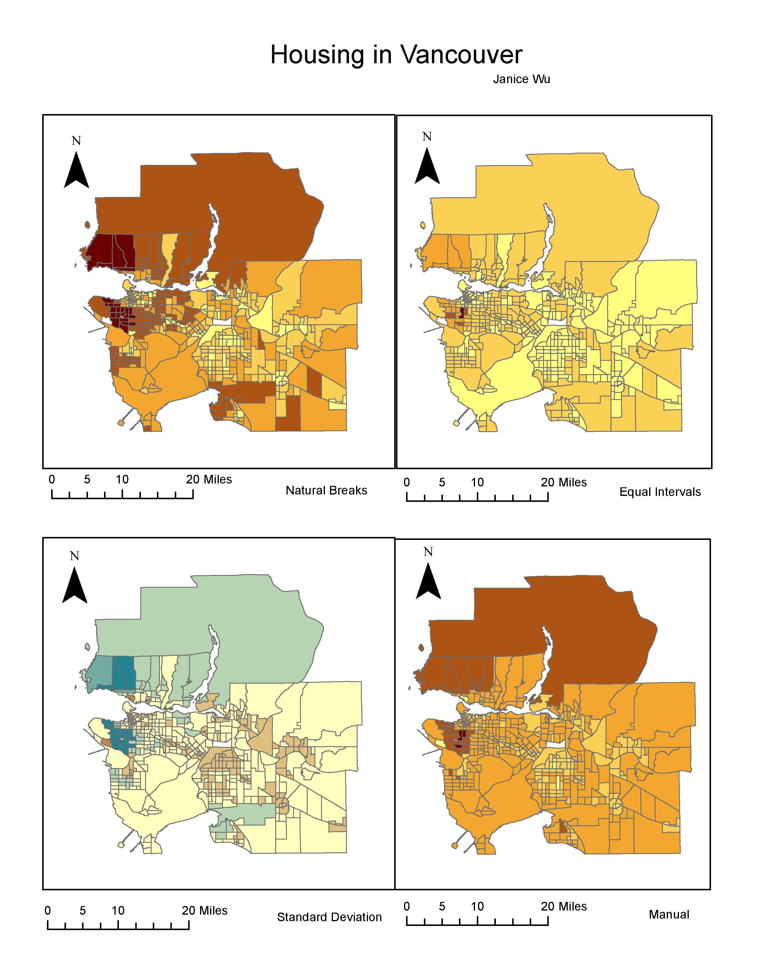
Deepened the knowledge of map classifications such as using equal interval, manual breaks, natural breaks, and standard deviation classification methods to show effective maps. Also, acquired data on reliable websites in order to perform the analysis.

The map above portrays the different data classifications that can influence the meanings given off by the maps. Natural breaks allows automatic groupings generated by the computer based on the data distribution and is also the default in ArcGIS. Equal interval has equal ranges between each class, but it does not look at the distribution in the data. Standard deviation looks at how far the values deviate from the mean, so it is excellent to use when data has a normal distribution. Manual breaks allows people to put in their own breaks, so that the map can be manipulated manually.
If I was a journalist, I would want to use natural breaks to present my data to the audience because it shows the greatest difference between classes, which is eye catching to the eyes and will appeal to the readers. Standard deviation is also good too because it can tell readers which parts of Vancouver deviates from the mean the most. If I was a real estate agent, I will be using manual classification because it does not show that the area right beside UBC is the most unaffordable. The area coverage of severely unaffordable housing are also a lot smaller. Also, I can modify the class ranges in manual classification in order to portray Vancouver catered to my client’s buying preferences. Ethically, I want to share the truths of unaffordability in Vancouver with my readers as a journalist. As a realty agent, however, depending on my practice, I would either show the maps that has or has not been modified.
Housing Affordability VS Housing Cost

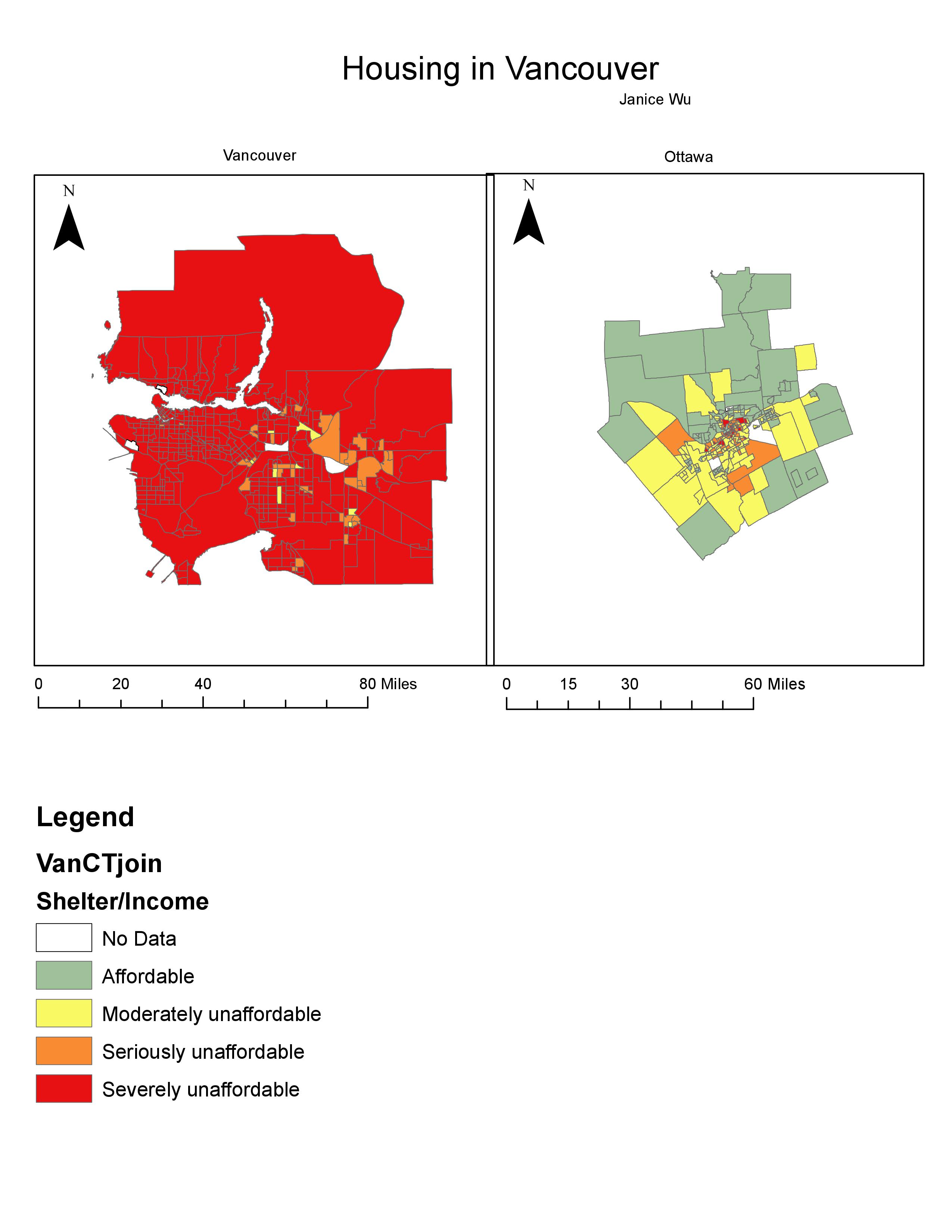
Measuring housing affordability means to measure the relative cost to how much the purchaser is able to pay. It relates the cost to the income of the purchaser, making it a better indicator than housing cost alone. Housing cost, on the other hand, will compare the cost of housings to other aspects that cannot accurately portray its affordability at the time of the housing market.
Housing affordability rating categories
There are four different affordability rating categories determined by the 12th Annual Demographia International Housing Affordability Survey of 2016, which are listed as follows:
Affordable (3.0 and under)
Moderately Unaffordable (3.1 – 4.0)
Seriously Unaffordable (4.1 – 5.0)
Severely Unaffordable (5.1 and over)
Affordability Means Livability?
No. Vancouver is a great example of how cities can be livable, but not affordable. Livability is assessed with the quality of its environment, social stability, economy, opportunities, etc. As a city, Vancouver has great accessibilities to parks and recreations, social services, health services, etc. It has even been ranked as one of the most livable cities in the world on various news articles online. Hence, a livable city does not mean it is an affordable one. They denote two different meanings.
Planning for a Tsunami
Accomplishment Statement
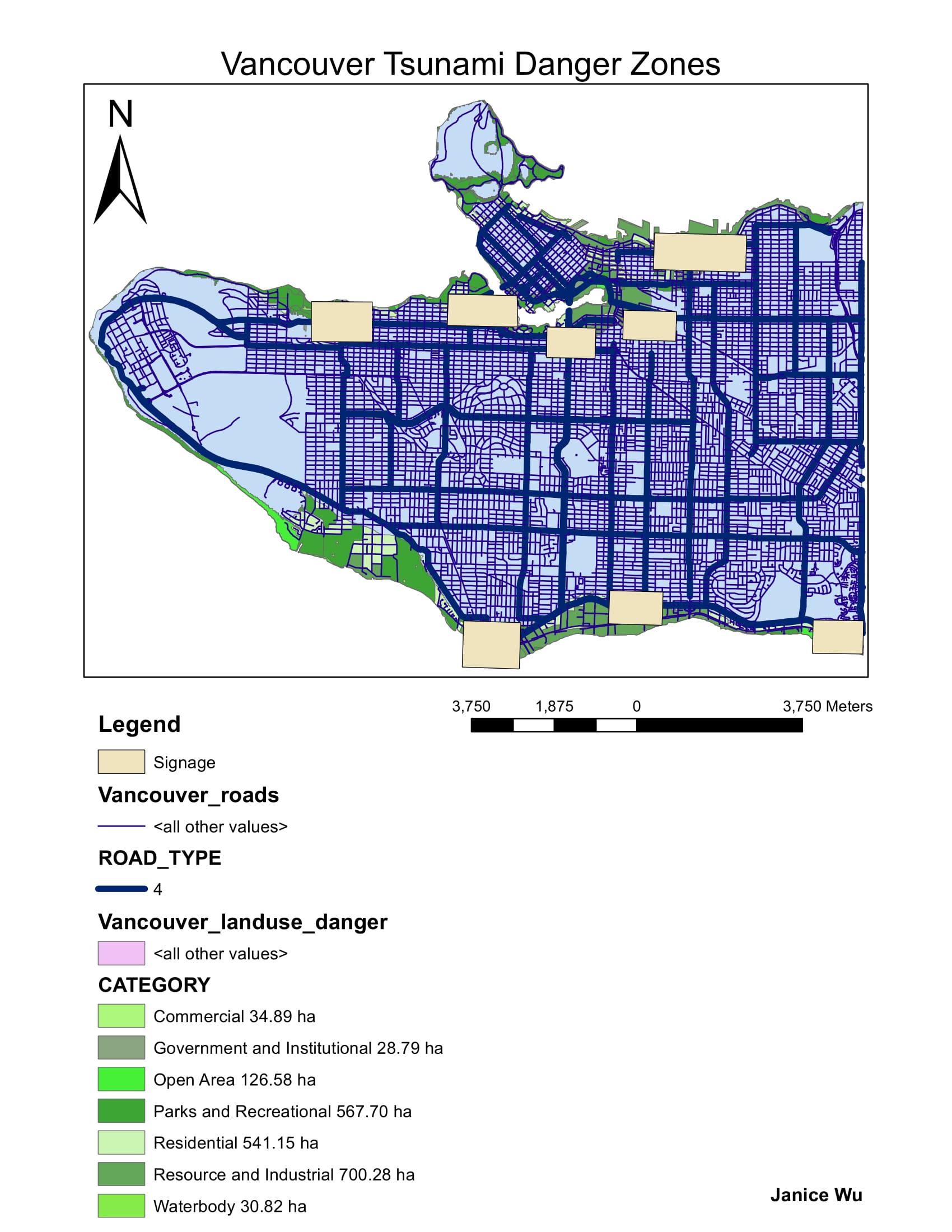
Implemented various spatial analyst tools in order to present a visually appealing map catered for specific purposes. In this lab, specifically, I performed buffering analysis in order to find out the range of within an area around the shoreline of Vancouver. I also used functions such as reclassifying raster layers to show different values on our map, intersecting tool to combine raster and vector layers, then clipping layers to extract information to tailor the needs of my map. Most importantly, I utilized skills to make a printable map.

Percentage of City of Vancouver that is in danger
In order to calculate the percentage of areas that are in danger in the City of Vancouver, the layers come in very handy. I discovered the total area of the City of Vancouver by looking at its attribute table where there is a column that calculates the shape area of the layer already. Similarly, with the layer in the danger zone of Vancouver, I looked at the attribute table and acquired the total area by looking at the sum under its statistics properties. Vancouver’s total area is 131033339.950334 meters squared and its total danger area is 20314805.867912 meter squared. Hence, the percentage calculated results to 15.5% of Vancouver is in the danger zone.
Then, I used the intersect tool to create new layers where it will put together the features of danger in Vancouver and health/education facilities into one layer. This list all the healthcare and education facilities within the danger zone in an attribute table when you look at the layer. The facilities in danger are listed as follows:
Education (10 institutions):
ST ANTHONY OF PADUA
ECOLE ROSE DES VENTS
HERITAGE 3R’S SCHOOL
VANCOUVER MONTESSORI SCHOOL
FALSE CREEK ELEMENTARY
EMILY CARR INSTITUTE OF ART & DESIGN (ECIAD)
HENRY HUDSON ELEMENTARY
ST JOHN’S INTERNATIONAL
ST FRANCIS XAVIER
INSTITUTE OF INDIGENOUS GOVERNMENT (IIG)
Health (5 facilities):
FALSE CREEK RESIDENCE
BROADWAY PENTECOSTAL LODGE
COAST WEST COMMUNITY HOME
YALETOWN HOUSE SOCIETY
VILLA CATHAY CARE HOME
Coordinate Systems and Spatial Data Models
Accomplishment Statement
Practised viewing vector and raster spatial data. At the same time, I understood the importance of having the right settings for a map in order to accurately view and portray the maps. Hence, I used knowledge I have learned in my introduction lab to verify the maps’ coordinate systems and projections. I also implemented knowledge for changing misaligned and improperly referenced data.
Fixing misaligned and improperly referenced spatial data
Misalignment happens when the maps being viewed are projected on a different system, causing inaccurate coordinates being shown in a single map. This can cause errors in human analysis because distance, area, angles, and directions can all be distorted. In order to fix this, ArcCatalog needs to be used to first verify each maps’ projections. Then, also in ArcCatalog, navigate to the layer which you would like to change its projection. Under the section ‘XY Coordinate System’, you can then select the Geographic Coordinate System that you would like. Once all the maps are in the same coordinate system, the layers can be added to ArcMap again for viewing.
The advantages to using remotely sense Landsat data for Geographic Analysis
Landsat operates to collect data of land use, which can record vegetation type, moisture, or heat levels over time. This can be good for viewing changes overtime. Moreover, Landsat can be used in remote areas where other operations may not be able to reach. The data collected also shows different colours to represent different wavebands of radiation, which allows analysts to analyse and observe data more easily.
Introduction to GIS – Beginning of My Journey
Accomplishment Statement
Learned basic functions and skills to perform ArcGIS. Explored around the application in order to know the software better, which will benefit and allow me to execute functions quickly for later projects.