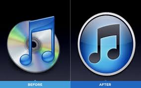
At the beginning of September I was confronted by a pop-up window on my desktop asking me to download the newest version of iTunes. As an avid iTunes user I just jumped through all the hoops without hesitation to get the latest version, not thinking that much would really change.
But by the time the whole process was over and I had restarted my computer I quickly noticed that my iTunes logo was no longer there. It had disappeared. It was then that I realized that my iTunes icon had not vanished from my desktop; rather it had morphed into some new Mickey Mouse cartoon logo. Despite the huge change in looks, I honestly didn’t think much about it at the time. Once I made the correlation of music note to iTunes, I just went on with my day.
Looking back on it now, this was a colossal and very bold move on iTunes part. The act of changing a globally know symbol is quite a risk to take. Looking into the redesign of the logo, I unearthed the reason behind the change. As the technological advances of society are quickly moving forward, Apple felt compelled to update their music stores image. The old iTunes image used a picture of a CD in the background. But as CDs slowly losing their relevance, it was time for a change.
