When I first examined the visualization of our song choices, I noticed how difficult it was to interpret and understand what I was looking at. In particular, the most challenging part of this task was trying to identify where the lines intersected, and what their meaning was. (And to be honest, I am not entirely sure that I elicited the true meaning all of the patterns that were shown)
After taking time to study the mess of lines and dots, I could see some parallels to the multi-graphs that were referred to in the videos from this week. For example, the graphs mapped out our musical selections as “nodes,” where the connected points revealed the shared choices that we made (Systems Innovation, 2015). I found that inferences could also potentially be made about how someone’s song criteria influenced their choices, as the visualizations grouped together those with similar responses. This can be seen in the image below, where those who chose to preserve Johnny B Goode were also likely to preserve the Fifth Symphony or Brandenburg Concerto.
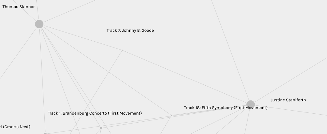
In addition, based on the size of the nodes and frequency of edges, it appeared that among the most common song choices were:
- Brandenburg Concerto
- Johnny B Goode
- Fifth Symphony
- Crane’s Nest

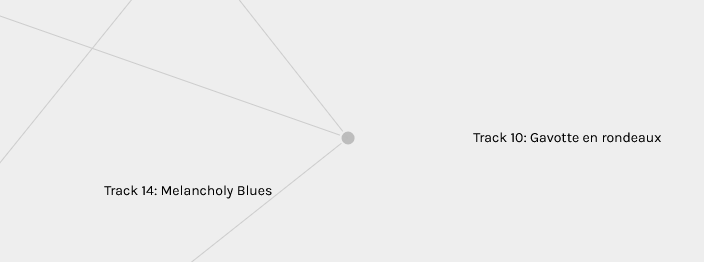
On the other hand, some of the least common song choices were:
- String Quartet No. 13
- Gavotte en rondeaux
- Pygmy Girl Initiation Song
Interestingly, several songs were unrepresented* in the visualization, such as:
- Bach’s Glenn Gould
- Georgia
- Malanesian Panpipes
- Iziel je Delyo Hagdutin
- Beethoven’s 5th, part 1, Otto Klemperer
*To find which ones were not included I actually had to go into the notepad version of the .json file, as I found trying to sift through the visualization to be too difficult (although there is probably an easier way that I didn’t know about).

However, while these images visually represented the frequency and pattern of selections that were made, it made me wonder about what was left out. That is, what about the reasons behind the songs I didn’t choose, as well as the ones that my classmates did not select? And how might the weighted connections used in the graphs oversimplify our preferences? For example, the data being shown does not reveal my own rationale for choosing Cranes in Their Nest, which centered on the emotions that it evoked and its cultural connections. It only reveals that by choosing it, I was more likely to also select Flowing Streams.
To further examine what information was left out, I went to visit the blog posts from others in the course, in an attempt to discover the reasons they gave for their song selections. Three examples of reasoning that are left out of the visualization can be seen in the quotations below:
- “I curated the list of musical content down to these ten picks in order to create a narrative for both the record and our human society. I tried to mix as many different cultures while keeping the narrative, but I worry that my own inclination with western media may have come through with the majority of selections being from the northern hemisphere.” (Navid Panah)
- “I wanted to choose a variety of songs to preserve the original intent of the golden record. Some major considerations I had when determining my opinion of “variety” were: country of origin, length, genre, and if the song was instrumental or vocal. This list contains both short and long songs (in fact, it keeps both the shortest and longest track on the record!), represents each continent of the world, and has a mix of vocal and instrumental tracks. Overall, I also tried to include songs that differed from each other tonally, as I felt that would have the strongest impact.” (Tristan Wong)
- “For instance, I chose Johnny B. Goode because it’s meant purely for listening and entertainment while Azerbaijan bagpipes seems more ritualistic and cultural (though it’s not a guarantee aliens would interpret that way). I also ignored lyrics, except to include tracks with vocals, because aliens would be unlikely to be able to interpret spoken words.” (Evan Daigle)
After reading through these blog posts, I could see that it’s important to understand what these data networks represent: not just what’s visible, but also what’s missing. The gaps in data can shape narratives just as much as the information that is included. While I could find information from the visualizations about frequency and patterns of selections, I could not fully discern the meaning behind the choices (and thus the data) itself. Consequently, data visualizations can only tell part of the story; if we want to understand their real meanings we have to dig deeper and look beyond just the graphs and numbers.
References
Systems Innovation. (2015, April 19). Network connections.[Video]. YouTube.
I appreciate your honesty, Jon! I wish to share my own; I was able to open the visualization with Palladio, but struggled with the filtering options. I was limited to the initial visualization and did not look into how to use the filtering functions. Therefore, I appreciate your methodic and technical breakdown of the information from the visualization created through our song selections.
I appreciate that you explored some of our classmates’ sites — taking time to read their reflections and rationales for their song selections — to help yourself consider what might be missing in the data, shared through the visualization. While I arrived at the same conclusion as you had, I did not take this step to verify my thinking.
Thank you for your work, Jon 🙂
Hi Patrick, thanks for your feedback! One of the things that I find interesting about this course is how each of us might approach the same task in different ways 🙂