Click here for Radio Garden.
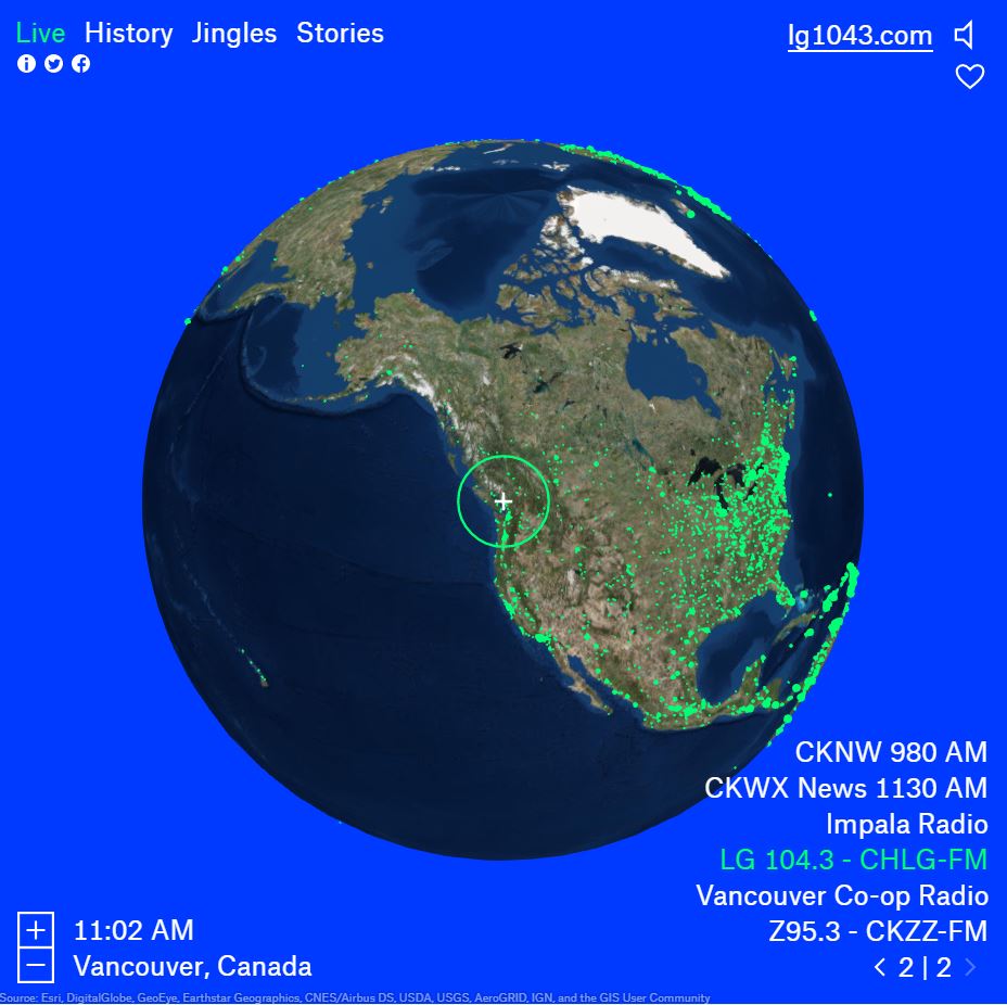
This interactive map titled Radio Garden uses a 3D globe to not only visualize data, but it also allows a user to hear it. There are four layers to choose from; live, history, jingles and stories. For the history, jingles and stories layers, each illuminated point corresponds to a sound-byte for that given area. For the live layer, each point links to a live radio broadcast feed.
I believe for the live layer, this map links geo-coded points to live internet radio broadcast feeds. This map also attempts to acquire more data by allowing radio stations to submit their live feed. The other layers are pre-recorded sound-bytes from a research project sourced in the information section, Transnational Radio Encounters, funded by the Humanities in the European Research Area. It is not clear whether all sound-bytes are from this project.
This interactive map is ‘visualizing’ sound, so it simply represents the data using points on the globe which a user can click to hear the audio. The creator of the map accomplished this by programming multiple free technologies together. One function that is interesting is its use of geolocation of IP addresses. This means the map uses an IP address to zoom in on the location a computer is viewing the map from. For example, my IP address is in Vancouver, so it automatically zooms into the Vancouver area. Depending on the layer visualized, it zooms to whichever point is closest to Vancouver.
What I find most interesting about this map is its lack of administrative boundaries. Clicking on a point will tell you the city and country, but labels are not immediately visualized. It forces a user to see the earth as one planet not divided by borders. This is an intentional bias of this map and it is clearly stated in the information section; “from its very beginning, radio signals have crossed borders. Radio makers and listeners have imagined both connecting with distant cultures, as well as re-connecting with people from ‘home’ from thousands of miles away”. Their intent is to erase borders and connect users to audio that is familiar to them, or for users to explore new audio.
Some other not as noticeable biases revolve around which data is ‘displayed’. The majority of live radio stations fall in North and South America and Europe. Radio stations are much sparser in the Asian countries. A quick google search states China has 3,000 stations yet only about 4 are visualized on this map. The other layers for history, jingles and stories show even more bias towards Europe with the majority of points falling in this area. This is a little troublesome because the stated purpose of the map is to enlighten users of different radio cultures across the globe. Yet this task is hindered if only certain areas of the globe are properly represented. On a more local note, points on large cities represent more than one live radio station. I’m curious to know the logistics behind which radio station is presented upon first click.
While these biases are important to take note, I believe the intentions behind the map are well-meaning. The fact that the map allows for users to send in their radio station tells me that this map is, ideally, continually collecting data. Areas that are under-represented are most likely out of the scope of the research project thus logistically difficult to collect.
All in all, I believe this is an excellent interactive map. It triggers a sense not prone to cartography, sound. Interactive maps offer the capability to use this feature. While the inner workings of this map are most likely complex, it is displayed in a simple to use click and scroll context. Despite its simplicity, it is powerful.