
This type of assignment is not my cup of tea. It put me way out of my comfort zone! In one of my other courses, there was an app called Threadz that analyzed the MET students’ contributions to discussion posts. It has the same visualization effects with the bubbles and the connecting lines. However, I found it much easier to work with because you could also view with tables. Analyzing the visualizations and reflecting on the implications and outcomes provided by the Palladio app was a challenge for me. I do not think in bubbles and connecting lines. I think, visualize, and organize my thoughts in tables and boxes.
Thankfully, I managed to click around enough on the Palladio App to find data that showed a list of all the songs and the number of people who had picked that song. I copied the information and created my own table and ordered it from the most popular tracks to least popular tracks. I was surprised to find that ALL 27 tracks were picked by at least 3 of the 23 MET students in our class (presuming everyone enrolled participated). Interestingly there were 219 votes cast, which likely means that 22 people voted and someone only picked 9 instead of 10 songs by mistake.
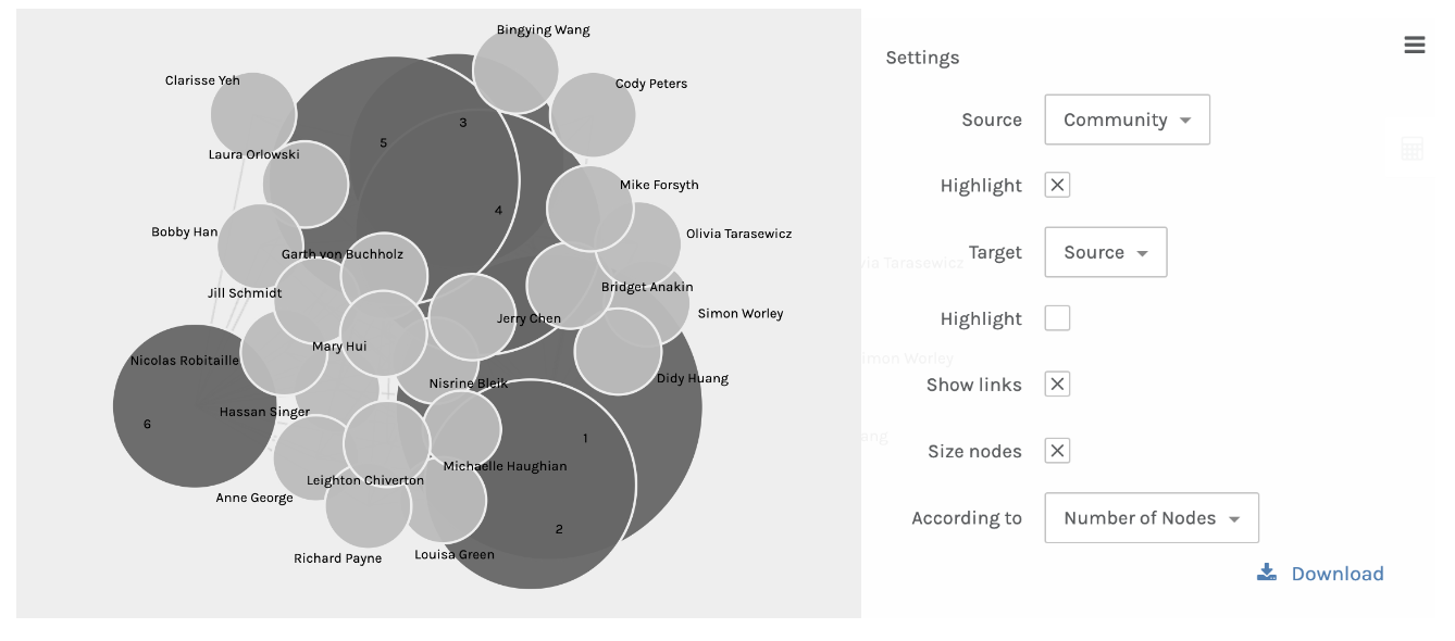
I noticed that on the default Bubble Graph view the dark grey bubbles were people and the light grey bubbles were the songs. When comparing my own table above to the bubble graph, I was surprised to see my name on the outskirts of the bubble graph. I’m not on the absolute edge, but only one layer into the web of most common connections. I am surprised by this because of my ten choices, half were in the popular majority, as is evidenced by the table above that shows a thick line indicating that the songs above that line have votes from at least half of the participants.
I understand that a major flaw in my table (in comparison to the bubble graph view) is that I cannot see the connections between the people who voted for the same songs as me. I can only see the popularity of the songs picked. Truthfully though, I don’t see the connections between people anyway! The lines from my bubble go to the songs I chose. I don’t see any lines from person to person. I would assume that the placement of my bubble must determine how many connections to other people’s song choices there were, and that the closer to the middle of the web your bubble is, the more overlapping choices you had with people, thereby creating communities of individuals with similar responses. I did play around with the settings, and ended up finding the images below as the most helpful in determining my “community” of similar song choices.
We are asked to reflect on why these responses are similar and is the app able to capture the reasons behind the choices. I struggle with this reflection because I don’t know anyone in this class, and without examining each person’s individual criteria for picking the songs they picked, I don’t know how I would be able to understand the similarities. I think it would be safe to assume, based on the nature of the Golden Record’s purpose, that diversity would be one common thread between each student’s choices, but how they came to their choices is still a bit arbitrary. I can’t make any conclusions based on race, culture or gender because I don’t know the race, culture, and gender of each of my classmates. There could be unending factors that contributed to why someone picked or didn’t pick a song. This reasoning also applies to the fact that no, the visualization is not able to capture the reasons behind the choices.

Hi Jill!
Thank you for your honest feelings about this assignment! I also found myself way out of my comfort zone particularly using Pallado. I haven’t been as nervous about analysing something quantitative in nature such as this since I first started my MET journey back with ETEC 500.
I really like the way you have laid out this task. It is easy to follow your visual prompts and I applaud you for finding a similar but easier to follow app for the data analysis. I have to admit that I am terrified of numbers and anything data related and wish that I had thought of finding something else like you did instead of Pallado. I admire your out of the box thinking!!
I was also surprised to find that all of the 27 tracks were picked by at least 3 of the 23 students in our class and am intrigued to know why. I was even more surprised that the top pick was Jaat Kahan Ho when I had really been expecting it to be Beethoven’s 5th (which admittedly did come in second). I have to wonder if the results were compared with other 540 classes, if there would be a similar outcome of if it’s just a fluke in our particular class. This song as the number one outcome got me thinking about India’s contributions to the world (which are numerous!), and probably due to the fact that I am reading the third novel in a series of books set in Jaipur, India and the theme of the book has to do with the oils and scents that India produces and uses for fragrances being some of the oldest and most beautiful in the world. I might be a little biased because I adore India and my husband’s family originally came from India, but it always amazes me the richness and depth of culture/food/art/music/the list goes on.. that has been produced from India.
It was also interesting that at least one of each of the 27 songs was chosen by at least one student and there were none left out. It would seem that the songs were well chosen and represent something to at least three members of the class at a minimum. While we were doing the first Golden Record task, I not only had a difficult time choosing which songs to expel but even more so, I was constantly thinking about all the songs that I would have included if the task had fallen to me all those years ago. Music like great art work, literature, food, and so many other beautiful parts of the human collection, are just too difficult to edit down!