Links: My post for Task 1 · Erin’s post for Task 1
I chose to link to Erin’s post because our items and themes are similar, but Erin also reflected on how “[her] tendency to travel light is very much the same when it comes to other aspects of [her] life” (Duchesne, 2022), which really resonated with me. I found this point fascinating and wanted to dive deeper into Erin’s post.
Themes we both explored:
-
- Essentials only
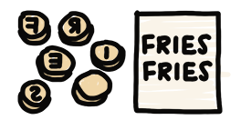
- Item: Keys
- Digital, paper-free
- Item: Extra mask
- Social connection
- Items are representative of own image
- Technological literacy
- Similar to items from 10-15 years ago
- Reference to location

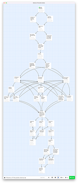
Click here to view image in full size · The approach to this image was inspired by Xanadu (Nelson, 1999)
How has your colleague’s experience differed from yours? And how do you know?
Through her post I learned that Erin and I have many similarities, as highlighted in the image above. As for differences:
-
- Location: She’s in Edmonton; I’m in Vancouver
- Undergrad: She went to University of Alberta; I went to UBC
- Work environment: She works in-person (I gathered this from her references to her lunch bag and school keys); I work remotely
- Job: She’s a grade 1 teacher; I work in organizational learning
From these, I imagine Erin has more experience than I do with cold weather, meal prep, and interacting with children. On the other hand, I may have more experience with rain, making instant noodles (probably! haha), and interacting with experienced professionals.
What web authoring tool have they chosen to manifest their work?
-
- For our blogs: We’re both using WordPress on UBC Blogs.
- For our posts for Task 1: Erin primarily used text and a photo, whereas I used text and an interactive image. I find Erin’s post very clear, and I’m now thinking that text and a photo would’ve been sufficient for my post as well. I think my decision to create an interactive image may have been influenced by my background in visual art and design.
How does their tool differ from yours in the ways in which it allows content-authoring and end-user interface?
I imagine the content-authoring capabilities for our sites are similar since we’re both using WordPress on UBC Blogs. However, we’re using different themes, which results in differences in interface:
-
- Displaying number of comments: The theme that Erin chose displays the number of comments for each post under its title, which makes it easy to see the level of engagement with the post. This is not displayed in the theme I chose.
- Nested comments: The nested comments in Erin’s theme makes it easy to see responses to comments. My theme has nested comments as well, but with significantly less indentation, which makes it more difficult to see how the comments relate to one another.
- Text size: The text size for my theme is larger than Erin’s. On desktop, this results in an average of 11 words per line in my posts, and 17 words per line in Erin’s. This means it would take longer to read one line on Erin’s site, but my posts would appear to be longer.
I also appreciate that Erin has set up links to her assignments in the top navigation of her site. This makes it easy to locate her posts.
What literacies does their site privilege or deny in comparison and contrast to yours?
I will leverage two key themes of The New London Group’s (1996) article A pedagogy of multiliteracies: Designing social future — cultural & linguistic diversity and modes — in exploring the literacies of our sites and posts.
Cultural & linguistic diversity
-
- Language (similarity): Erin and I both use the English language for our posts.
- Being environmentally conscious (privilege in Erin’s site): In her post Erin mentioned she “cares about sustainability” (Duchesne, 2022), which is reflected through some of her reusable items, as well as her mention of not having paper in her classroom. I absolutely do care about the environment, but admittedly there’s always more that I can do, and it sounds like Erin is more literate than I am in this regard. I wonder if her literacy on sustainability would be reflected in her upcoming posts, and from a quick look I see that the word she chose for her potato print was ‘world’!
Modes
-
- Visual design (similarity): For my site, I try to use headings, dividers, and images to help increase the clarity and readability of my posts. I see that Erin makes good use of headings as well.
- Gestural design (privilege in my site): For my post I created an interactive image to describe my items, which unintentionally speaks to my passion for interactive multimedia. This is also reflected in my post for Task 5. In realizing this now, I will identify more opportunities to create interactive multimedia for my upcoming tasks.
What theoretical underpinnings are evident in your/your colleague’s textual architecture and how does this affect one’s experience of the work?
Site
I think someone experiencing my work would find it clear what points I am making, whereas someone experiencing Erin’s work would find it easy to understand the connections across her points.
-
- Me: Further to my reflection earlier on the people Erin and I interact with respectively, I’m thinking my work environment may have influenced the way I communicate. I work in the business sector, where most people I interact with are constantly multitasking, so I have to ensure my points are crystal clear. In both verbal (on-the-spot or otherwise) and written communication, I typically start by stating the point I would like to make, following with an overview of the supporting arguments, and then expanding on the arguments. In written communication, I also leverage headings and bolding to help make my text scannable so people can easily focus in on what matters to them. I’m seeing now that this may have carried over to the way I write these posts!
- Erin: I find Erin’s writing to flow very nicely — it feels to me like I am following a cohesive train of thought. Her transitions across points are thoughtful, and her writing flows very smoothly as a result.
Post – Task 1
-
- Me: One of the themes I explored in my post was the idea of ‘backups’, made possible with technology. With work, I’m also a huge believer of having multiple points of entry and flexibility in learning and development, made possible with intentional use of technology, in order to help make the learning as valuable and effective to the individual as possible. I’m realizing now that there is a parallel here!
- Erin: It seems to me that Erin’s post takes a more guided approach and uses storytelling, which I imagine would be very effective considering the age of her learners.
How do the constraints of the course design manifest in your architectural choices? How have you responded to the pedagogical underpinnings of this course design in your own web space?
The one constraint I can think of is the inability to easily see all the links created through all linking assignments, although that is a limitation of the World Wide Web now, as Nelson warned in 1999 (Nelson, 1999).
To help take a step towards closing this gap, I identified all the posts created for the linking assignment so far and visually connected them through this mind map. However, please note that this approach is closer to the Memex (see Bolter, 2010, p. 35; Trevor Flowers, 2016) and not Xanadu (see Nelson, 1999):
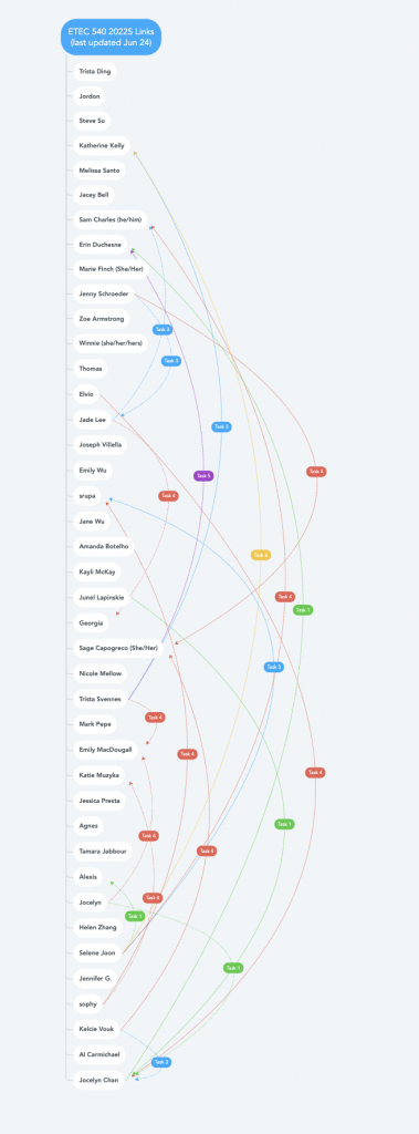
Click here to view mind map in full size
References
Bolter, J. D. (2010). Writing space: Computers, hypertext, and the remediation of print. Routledge. https://doi.org/10.4324/9781410600110
Duchesne, E. (2022, May 16). Task 1: What’s in your bag? Erin Duchesne ETEC 540. https://blogs.ubc.ca/erinduchesneetec540/2022/05/16/task-1-whats-in-your-bag/
Trevor Flowers. (2016, June 19). Memex #001 demo [Video]. YouTube. https://www.youtube.com/watch?v=pW4SS_9nXyo
Nelson, T. H. (1999). Xanalogical structure, needed now more than ever: Parallel documents, deep link to content, deep versioning, and deep re-use. ACM Computing Survey, 31(4). https://doi.org/10.1145/345966.346033
The New London Group. (1996). A pedagogy of multiliteracies: Designing social futures. Harvard Educational Review, 66(1), 60-92. http://newarcproject.pbworks.com/f/Pedagogy%2Bof%2BMultiliteracies_New%2BLondon%2BGroup.pdf