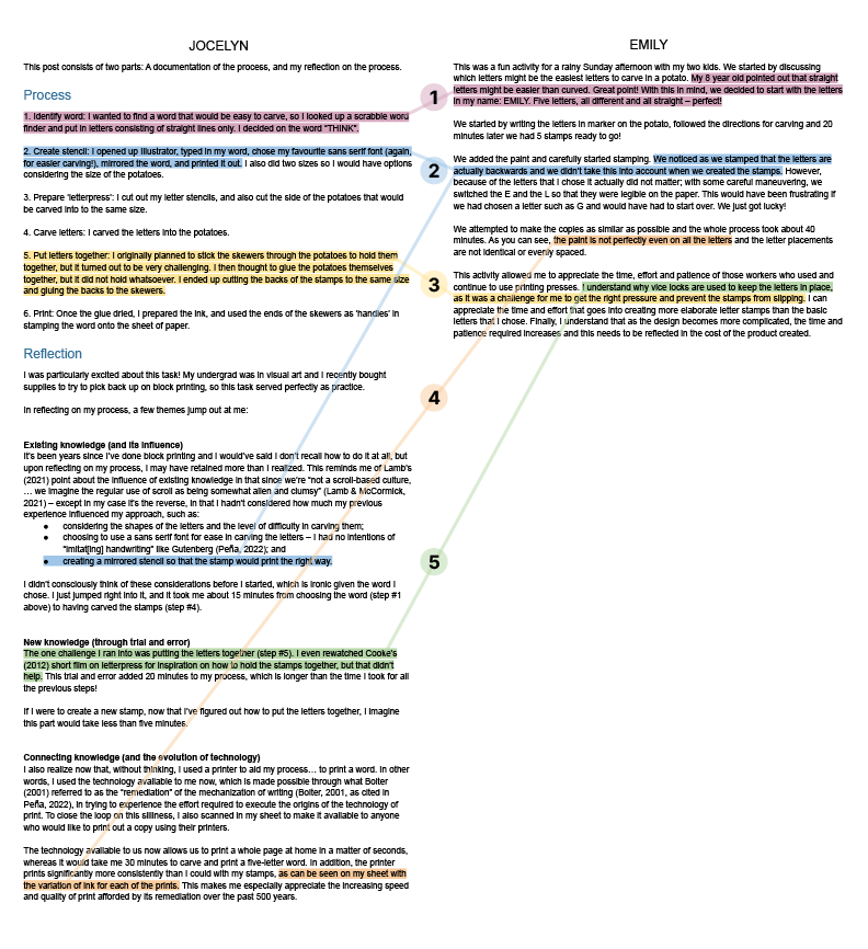
Task 7: Mode-bending


Approach

My approach to this task is influenced by two resources in particular — an episode of the Stuff to blow your mind podcast from earlier in this course, and a chapter from the Jenkins et al. (2009) book from ETEC 510:

    • In the Stuff to blow your mind episode, Lamb’s (2021) point that since we’re “not a scroll-based culture, … we imagine the regular use of scroll as being somewhat alien and clumsy” really stuck with me (Lamb & McCormick, 2021). It made me think about the influence of the capabilities of the average human being — such as the abilities to see, speak, and hear — and how they must’ve influenced how our society is structured.
    • In Confronting the challenges of participatory culture: Media education for the 21st century, Jenkins et al. (2009) highlighted that “[e]ach medium has its own affordances, its own systems of representation, its own strategies for producing and organizing knowledge. Participants in the new media landscape learn to navigate these different and sometimes conflicting modes of representation and to make meaningful choices about the best ways to express their ideas in each context” (pp. 87-88).

Together with the concepts of the designs of meaning and the four factors in the The New London Group (1996) article, it got me thinking:

    1. What did I miss sharing in Task 1 by (unintentionally!) using the visual form only?
    2. How can I leverage the affordances of audio to redesign my first task?
    3. What might I learn about my own preferences and tendencies of communication through this reconsideration of the audio form?

With these in mind, I set out to — to use language from The New London Group (1996) — use my Available Design from my first task and transform it into “a new meaning-making” (p. 76), Redesigned resource.


Process

My first thought was to create a Twine game with short video clips and images, where the audience watches short videos (visual and audio design) about the items, and then are presented with a few scenarios where they choose the item(s) to use if they were me. I figured this would cover The London Group’s ideas of “all meaning-making [being] multimodal” (p. 81), “Situated Practice” (p. 85), and “Critical Framing” (p. 86). I quickly decided against this because I feel like I would still be leaning into a primarily visual form, even if it would be one that is supported by audio. I wanted to use this opportunity to explore how to flip this around — I want to create something that is primarily audio, and supported with visuals only if the visuals supplement the audio form itself. (I still think the Twine game could be interesting and would like to build that sometime!)

Thinking further about the audio form, I realized I could leverage its affordance of sound over time to redesign my first task. I recorded audio clips of the sounds that my items make, and then recorded myself describing the same themes from Task 1 but considering the audio components of the items. From there, I simply put the audio clips together.

And here’s where I thought it got interesting! After putting the clips together, I thought about how I could add visuals — but going back to my three questions from earlier, my challenge for myself was to use visuals that only supplement the audio. I decided to add captions, as well as sound waves of the sounds made by the items. The result is what you see in the video above.


Reflection

I will expand on my thoughts by answering my own questions from earlier.

What did I miss sharing in Task 1 by (unintentionally!) using the visual form only?

In my original post, I made no reference to the sounds made by my items, specifically, how they don’t make sounds when stationary, and then sound different when moved on their own compared to when they’re in use. I guess I knew this, but hadn’t given it any thought before. I thought this was particularly interesting because my items don’t change much visually — with the exception of my phone screen, but still only to a certain extent.

How can I leverage the affordances of audio to redesign my first task?

As mentioned in Process, I attempted to leverage audio’s affordance of sound over time. This is my first time exploring audio design on its own, and I imagine there is much more for me to learn about this through other resources and more exploration. It is also not lost on me that I relied on the visuals of audio editors (I used Audacity) to edit the audio, even though I set out to rely on the audio form itself for this task.

What might I learn about my own preferences and tendencies of communication through this reconsideration of the audio form?

Through this task, I realized I tend to default to visuals, and even when I leverage other modes, it is usually to supplement the visual design. I have now gained more appreciation for audio and realize there is much more for me to learn.

I also think it would be interesting for me to repeat this activity for each of the other modes. For the most part, I subconsciously compared my experience with this activity to visual design, even in this post, likely because that is what I’m most familiar with. I would like to explore each of the modes further so I can build my understanding of the ‘languages’ of the modes, be able to identify the connections across them, and make even more “meaningful choices about the best ways to express … ideas in each context” (Jenkins et al., 2009, p. 88).


References

Jenkins, H., Purushotma, R., Weigel, M., Clinton, K., & Robison, A. J. (2009). Confronting the challenges of participatory culture: Media education for the 21st century. The MIT Press. https://doi.org/10.7551/mitpress/8435.001.0001

Lamb, R., & McCormick, J. (2021, May 14). From the vault: Invention of the book, part 2 [Audio podcast episode]. In Stuff to blow your mind. https://www.iheart.com/podcast/stuff-to-blow-your-mind-21123915/episode/from-the-vault-invention-of-the-82564254/

The New London Group. (1996). A pedagogy of multiliteracies: Designing social futures. Harvard Educational Review, 66(1), 60-92. http://newarcproject.pbworks.com/f/Pedagogy%2Bof%2BMultiliteracies_New%2BLondon%2BGroup.pdf

Linking task 4: Potato printing — Emily

Links: My post for Task 4  ·  Emily’s post for Task 4

I chose to link to Emily’s post because we took similar approaches, but I had prior knowledge whereas Emily figured it out along the way. I had reflected on existing vs. new knowledge in my post, so I thought it would be interesting to dive deeper into this through Emily’s post!

Themes we both explored:

    1. Choosing letters consisting of straight lines only
    2. Mirroring the letters
    3. Alignment of stamps
    4. Evenness of ink
    5. Putting letters together

Click here to view image in full size · The approach to this image was inspired by Xanadu (Nelson, 1999)


How has your colleague’s experience differed from yours? And how do you know?

I think Emily’s experience differed from mine specifically around mirroring the letters (theme #2 above).

I also noticed that many of the other students in ETEC 540 did not mirror their stamps initially.

The need to mirror the stamp was almost implicit in me. As I’m reflecting again now on where I acquired this knowledge, in addition to my previous experience with block printing, I’m remembering that I also have a stamp with my Chinese name on it from when I went to Pre-K in Hong Kong. I believe the school had them made for all the students, and they were used to stamp our names onto our work. I’m thinking this may have to do with the fact that there are often many strokes in Chinese letters, so stamps would make it easier for the teachers to label our work. I’ve always seen that my name on the stamp itself is mirrored, and it stamps the right way.

If I were to assume that most Chinese people have stamps of their names from when they were kids, I wonder how this may influence the results if this task were done by students in a Chinese university.


What web authoring tool have they chosen to manifest their work?

    • For our blogs: We’re both using WordPress on UBC Blogs.
    • For our posts for Task 4: Emily and I both used text and images for our posts. We also both documented our processes even though that was not part of the expectations of the task. I enjoy learning how things are made and really appreciated Emily sharing her thought process and photos in her post.

How does their tool differ from yours in the ways in which it allows content-authoring and end-user interface?

I imagine the content-authoring capabilities for our sites are similar since we’re both using WordPress on UBC Blogs. However, we’re using different themes, which results in differences in interface:

    • Navigation panel: Emily chose a theme with a left navigation panel, whereas mine is on the right. This got me wondering whether a left, right, top, or bottom navigation is best considering user experience, and from a quick search it looks like a left navigation is generally more user-friendly (Bailey, 2006), but it also “depend[s] on [the] context” (Bakusevych, 2021).
    • Display of comments: Emily’s theme does not have nested comments (like in Erin’s theme), but it does state what the comment is in response to, i.e., ‘posted [date] at [time] by [name] in reply to [name of original commenter]’, which I think helps make it easy to follow.

What literacies does their site privilege or deny in comparison and contrast to yours?

I will leverage two key themes of The New London Group’s (1996) article A pedagogy of multiliteracies: Designing social future — cultural & linguistic diversity and modes — in exploring the literacies of our sites and posts.

Cultural & linguistic diversity

    • Language (similarity): Emily and I both use the English language for our posts.
    • Being a parent (privilege in Emily’s site): Emily mentioned that she created the potato stamps with her two kids. I do not have children, so I imagine Emily has much more knowledge and experience raising children than I do. I especially appreciate that it was Emily’s eight-year-old who pointed out that straight letters would be easier to work with, to which Emily responded positively in an encouraging and supportive manner. This makes me think of a leadership trait that I learned from a leadership course at Stanford Continuing Studies, on ‘mom-ness’ (Ireland, 2020). Here are some of my notes from the course on the mom-ness leadership trait:
        • Dichotomy of traits, love and devotion, and development of teams, paired with ruthless protection of turf
        • Example: Good, experienced parents who instinctively know how to…
          • Teach and develop talent over time
          • Reprimand without completely deflating egos
          • Model and convey values
    • Background in visual art (privilege in my site): I explored this both in my original post and in my reflections above so I won’t expand on this here, but I can see how my background in visual art influenced my post and site.

Modes

    • Visual design (similarity): As mentioned above, Emily and I both documented our processes and included the images in our posts. One slight difference is that I included timelapse GIFs to show more of the process, but I think Emily’s static images were also very clear.

What theoretical underpinnings are evident in your/your colleague’s textual architecture and how does this affect one’s experience of the work?

    • Me: I enjoy making connections across my knowledge (I also explored this in my linking post for Task 3), and especially appreciated The New London Group’s (1996) factor of “Transformed Practice in which students transfer and re-create Design of meaning from one context to another” (The New London Group, 1996, p. 83). I think this shows up in the way I structured my reflection for Task 3, with the headings ‘Existing knowledge (and its influence)’, ‘New knowledge (through trial and error)’, and ‘Connecting knowledge (and the evolution of technology)’.
    • Emily: Emily created the stamps with her kids and used the word “we” throughout her post, which makes me think she is great at taking a collaborative and supportive approach to learning.

How do the constraints of the course design manifest in your architectural choices? How have you responded to the pedagogical underpinnings of this course design in your own web space?

I would like to take this opportunity to iterate the mind map I created for my other linking posts (linking post #1 – Task 2; linking post #2 – Task 3) in response to this same question.

Updates:

    • I lined up all posts related to the same task vertically. In other words, all posts related to Task 1 are in the same ‘column’, all posts related to Task 3 are in another ‘column’, etc. I’m hoping this makes it easier to see the number of connections made across each task.
    • I moved the connections for Task 4 from the right to the left, to leave more space on the right for posts related to the upcoming tasks.

Click here to view mind map in full size


References

Bailey, B. (2006, April 1). Navigation: Left is best. Usability.gov. https://www.usability.gov/get-involved/blog/2006/04/left-navigation-is-best.html

Bakusevych, T. (2021, March 2). Top vs side navigation: Which one is better for your product? UX Collective. https://uxdesign.cc/top-navigation-vs-side-navigation-wich-one-is-better-24aa5d835643

Ireland, C. (2020). Leadership by design: Using design thinking to transform companies and careers. Stanford Continuing Studies.

Nelson, T. H. (1999). Xanalogical structure, needed now more than ever: Parallel documents, deep link to content, deep versioning, and deep re-use. ACM Computing Survey, 31(4). https://doi.org/10.1145/345966.346033

The New London Group. (1996). A pedagogy of multiliteracies: Designing social futures. Harvard Educational Review, 66(1), 60-92. http://newarcproject.pbworks.com/f/Pedagogy%2Bof%2BMultiliteracies_New%2BLondon%2BGroup.pdf

Linking task 3: Voice to text task — Agnes

Links: My post for Task 3  ·  Agnes’ post for Task 3

I chose to link to Agnes’ post because I found her sharing on “feeling that [she] had to make [her] stories short” in her childhood to be fascinating (Agnes, 2022), since I might say I felt the opposite of that in my childhood. It makes me wonder how our different feelings on this may be reflected in our styles of communication now, including our experiences with this task. I will reflect on this further below.

Themes we both explored:

    1. Tool used
    2. One-way storytelling
    3. Content of verbal vs. written communication
    4. Expectations of communication skills
    5. Punctuation
    6. Incorrect words captured
    7. Speed of speech
    8. Lack of tone in text

Click here to view image in full size · The approach to this image was inspired by Xanadu (Nelson, 1999)


How has your colleague’s experience differed from yours? And how do you know?

Agnes shared that as a child, she felt like she had to “make [her] stories short and to the point … to keep the attention of [her] family members” (Agnes, 2022). This stood out to me because when I was a child, I enjoyed spending time on my own — usually to make ‘art’ with traditional and digital media, learn to create websites, or play video games — and appreciated having less attention.

I wonder how this may have influenced our styles of communication, including our experiences with this task. Looking at our posts for Task 3, I’m seeing that Agnes considered when the technology may not be appropriate, whereas I leaned into the technology almost as an extension of my own abilities. I wonder if this may have be sparked by our feelings from childhood, where Agnes appreciated connecting with people, and I appreciated exploring technology independently.


What web authoring tool have they chosen to manifest their work?

    • For our blogs: We’re both using WordPress on UBC Blogs.
    • For our posts for Task 3:
      • Agnes included an image of a person (of herself?) using a recording app, which I think adds a human element to her post and reiterates that it is a person leveraging technology. I wonder if this extends on my hypothesis above of Agnes being more people-focused than I am.
      • I included relevant icons in my post to help make it easier to understand the text, which, upon reflection, seems to allude to my appreciation for web design.

How does their tool differ from yours in the ways in which it allows content-authoring and end-user interface?

I imagine the content-authoring capabilities for our sites are similar since we’re both using WordPress on UBC Blogs. However, we’re using different themes, which results in differences in interface:

    • Profile picture: Agnes chose a theme that has a space in the top left corner for a profile picture. My theme does not have this.
    • Left vs. top navigation bar: The theme Agnes chose uses a left navigation bar, which contains the menu, search bar, recent posts, recent comments, archives, and categories. On mine, the menu is fixed at the top, and the rest are scattered across a second column and the footer. I find the left navigation to be cleaner. *Update: After this post, I looked into customizing my widgets and moved the navigation to the right.

What literacies does their site privilege or deny in comparison and contrast to yours?

I will leverage two key themes of The New London Group’s (1996) article A pedagogy of multiliteracies: Designing social future — cultural & linguistic diversity and modes — in exploring the literacies of our sites and posts.

Cultural & linguistic diversity

    • Language (similarity): Agnes and I both use the English language for our posts.
    • Regional knowledge and vocabulary (potential difference): Agnes mentioned she moved from Ontario to Saskatchewan. I’ve never been to either of those provinces (aside from a layover at the Toronto Pearson Airport), so I imagine Agnes is much more familiar with Ontario and Saskatchewan than I am. On the flip side, if Agnes is not familiar with BC, then she may not have had Nanaimo bars or know how to pronounce ‘Coquitlam’. I’m not familiar with some of the places Agnes referenced in her post (e.g., Nipissing University, Bradford, St. Mary’s School, Estevan), and I’m not sure if or how that might be affecting my understanding of her post. Similarly, in my post I referenced several major streets in Vancouver, and I wonder how those might affect her understanding of my post if she’s not familiar with Vancouver.

Modes

    • Visual design (difference): As mentioned above, Agnes uses photos with people on her site, whereas I have been using graphics. I think the use of photos with people evokes more of a human element in Agnes’ site.

What theoretical underpinnings are evident in your/your colleague’s textual architecture and how does this affect one’s experience of the work?

    • Me: In my post I mentioned my thoughts on the parallel I see between unscripted/scripted stories and painting/photography. I value “systems thinking” (The New London Group, 1999, p. 67), “utilization of available discourses” (The New London Group, 1999, p. 88), and “pattern recognition … to act flexibly and adaptably in context” (The New London Group, 1999, p. 84), and I think the last paragraph in my post lightly hints at that.
    • Agnes: In her post Agnes mentioned that “[i]n oral storytelling, the information communicated is often collaborative” (Agnes, 2022). Her reference to collaboration suggests to me that she values collaborative learning, which is incredibly important in today’s world.

How do the constraints of the course design manifest in your architectural choices? How have you responded to the pedagogical underpinnings of this course design in your own web space?

I would like to take this opportunity to iterate the mind map I created for my first linking post in response to this same question.

Updates:

    • For easier viewing, I moved the connections related to Tasks 1-3 to the left, and Tasks 4-6 remain on the right.
    • I also added hyperlinks to each of the connections, so viewers would be able to jump directly to the posts, if they wish.

Click here to view mind map in full size


References

Agnes. (2022, June 12). Task 3: Voice to text. Agnes’s webspace ETEC 540. https://blogs.ubc.ca/etec540ag/2022/06/12/task-3-voice-to-text/

Miami Dolphins [@MiamiDolphins]. (2022, June 10). #MiniMic x @HollywoodVon [Video attached] [Tweet]. Twitter. https://twitter.com/MiamiDolphins/status/1538937472985489409

Nanaimo bar. (2022, March 23). In Wikipedia. https://en.wikipedia.org/w/index.php?title=Nanaimo_bar&oldid=1078748111

Nelson, T. H. (1999). Xanalogical structure, needed now more than ever: Parallel documents, deep link to content, deep versioning, and deep re-use. ACM Computing Survey, 31(4). https://doi.org/10.1145/345966.346033

The New London Group. (1996). A pedagogy of multiliteracies: Designing social futures. Harvard Educational Review, 66(1), 60-92. http://newarcproject.pbworks.com/f/Pedagogy%2Bof%2BMultiliteracies_New%2BLondon%2BGroup.pdf

Spam prevention powered by Akismet