

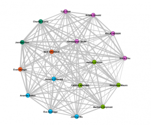
Analyzing the data from the curation quiz was quite interesting. I happened to match up with Jessica, Ana and Eva according to the colour grouping. However, upon viewing the sites, I recognized that my choices also matched up with Tanya, Barbara and Stephanie as well since my proximity to them in the data was about the same. I came to realize two things in reviewing the data while qualifying the relevant websites. First, we were grouped based on strictly quantifiable parameters of matching music selection and the data did not explicitly state how closely our choices matched. After doing my own
examination, I could only notice an average of 60-70 percent commonality of music selection with the other members of the blue group. The second thing I noticed is that each of us had different qualifiers for how we selected music. The criteria ranged from seeking diversity in cultural soundscapes, instruments, emotions, time period, and power structures. I was a complete outlier in my criteria for music selection as I sought to establish Earth as a non-invadable planet through showing strength in our music. With this, I realized that data can easily be misinterpreted as in this example, I was clustered into a group with completely different views based on non-exact matches. Furthermore, the data doesn’t represent the reasons for our null choices. This exercise definitely shows that interpreting data needs to be done without assumptions and a critical lens.