
Understanding the inner workings of the web, how content within it is connected, and how search engines (ie algorithms) operate is increasingly important as our lives become enmeshed with and reliant on technology. This entanglement between algorithms and humans is at times, undetectable. Within this post, I will discuss how online behavior generates data which algorithms then organize, add value to, and make inferences from along with its limitations. Understanding this allows the end user, such as you and I, to interpret information being presented to us when we use search engines such as Google. To do this, I will use a networked graph that was generated using datasets from my course.
For our last activity, each classmate had to narrow down a list of 27 songs from the interstellar Golden Record to just 10 songs. Our professor took this dataset and entered it into a program called Palladio. This program takes datasets and creates a networked graph out of it for the purposes of interpreting relationships among the data. I found analyzing this graph initially challenging as interpreting data presented in this format was new for me.
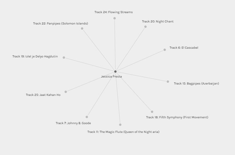
Here is a representation of the songs I chose, in isolation from the rest of the class. In this graph, my person and the songs are considered the entity, also known as the nodes which are then linked by edges (Systems Innovation, 2015). In this graph, these edges represent the relationship between the source node (myself) and the targeted nodes (my song choices). One could argue that this is a directed graph due to the orientation and relationship of the source and targeted nodes. The source node is reflected by the darker shading while the target node is reflected by the lighter shading. I chose the songs, the songs did not choose me, therefore the direction in this graph only goes one way.
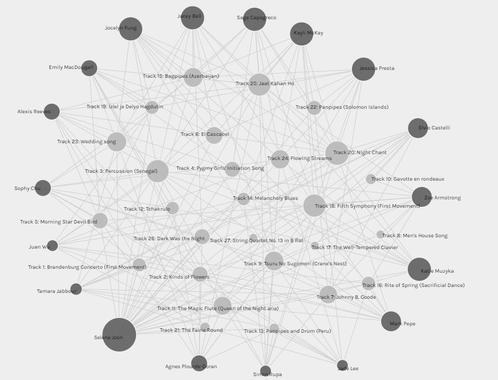
When we add more nodes (all of the other classmates and their song choices) and represent the various relationships (edges) between them, we end up with a multi-graph like the one below (Systems Innovation, 2015). In order to better understand and derive more meaning from this graph, I chose to organize the nodes and adjusted the settings to show the weight of relationships by size. This in turn, created a weighted graft where the size of the node represents the weight of its relationships. Classmates who chose less than ten songs from the list have a smaller sized node, and those who chose more than ten songs have a much larger node. One classmate chose all 27 songs and are represented by the largest node in the multi-graph. When it comes to the connectivity of the target nodes to the source nodes, the more often a song was chosen, the larger the node is. For example, track 3, 18, 20, and 25 were the top selected songs from the class.
Thinking about my role in health care and how the Health Authority’s across the province are transitioning to a digitized system, I cannot help but wonder how health data/informatics would be represented by these multi-graphs. I would imagine it would create layers upon layers of these webs of health data.
But what is the significance of this data? What does it represent? How would we interpret this without any context? From just looking at this graph, I am unable to decipher why someone may have chosen these songs. Personally, I just chose what I thought sounded the nicest to listen to. I somewhat kept the idea of extraterrestrial life potentially listening to them in the back of my mind, therefore diversified the list slightly, however it did not play a big role in my decision making.
If we were to take this one step further, and think about the complexity of online behavior and the relationships we generate through online activity, we can begin to see how this behavior can be monitored to produce data points like the above. A person, represented by a source node, can have their online activity generate target nodes, which can then become connected to other target nodes creating edges. The more online activity, the more data produced and relationships identified. This online behavior when tracked, likely results in multiplex networks, allowing algorithms to make inferences and conclusions about us and what we like in order to deliver targeted ads (among other things). This has me reflecting on the problem of algorithms generating what Rodney (2020) calls our data doubles. I am going to leave you with this concluding thought, which is an an entire excerpt from Rodney, J.’s (2020) article which can be found on page 32, because it was very impactful for me and is something I have not forgotten over a year later:
As we can see, raw data lacks context, and when algorithms attempt to make meaning out of data that is not contextualized, misinterpretations are bound to happen. These errors in algorithmic judgement can have lasting, negative impacts on those exposed to them. Sadly, there are more and more examples coming to light of the bias inherent to AI. What would these errors in judgement and machine learning look like in the context of health care? Would you be comfortable having AI make health care decisions on your behalf? What is an acceptable margin for error in something like this? As we move to digitizing the health care system… it is only a matter of time before algorithms start creeping into this sector.
References
Jones, Rodney H.. “1 The rise of the Pragmatic Web: Implications for rethinking meaning and interaction”. Message and Medium: English Language Practices Across Old and New Media, edited by Caroline Tagg and Mel Evans, Berlin, Boston: De Gruyter Mouton, 2020, pp. 17-37. https://doi.org/10.1515/9783110670837-003
Systems Innovation. (2015, April 18). Graph Theory Overview [Video]. YouTube. https://youtu.be/82zlRaRUsaY
Systems Innovation. (2015, April 19). Network connections [Video]. YouTube. https://www.youtube.com/watch?v=2iViaEAytxw