Looking into the Context and the Problem
Shortly after I joined one of the curriculum committees at the Justice Institute of British Columbia, I learned that the paramedicine program has a 100-page practical simulation book, detailing how instructors should describe each scenario for simulation practice. The students, wearing their uniforms, carrying emergency cases, often stand in the middle of the classroom and try to imagine the physical environments where they are supposed to save lives.
In school, students rely on verbal explanations from the instructors to assess hazards and determine their next steps, whereas they are expected to observe the environment, identify risks, and save lives independently in the field. It is clear that there is a gap between what is learned in the classroom and what is required in the field.
As an instructional designer, I hope to fill the gap by designing and developing user-centred immersive experiences that could potentially shift the way we learn and teach in formal and informal environments.
Setting up Achievable Goals
Working with a team from the Centre for Digital Media, our goal is to develop a working VR prototype that simulates immersive learning environments for paramedics. The prototype will provide both experiential and reflective learning opportunities for trainees to apply critical assessment and decision-making skills, leading to better response when real events occur.
In addition to the realism of the learning environment, our design includes: 1) functionalities to track, analyze, and review how trainees made their decisions during the simulation; 2) non-intrusive user interface and exemplary user experience for reflective learning; 3) and a final package that can be easily installed and used in different physical settings.
Building, Testing, and Iterating the Prototype
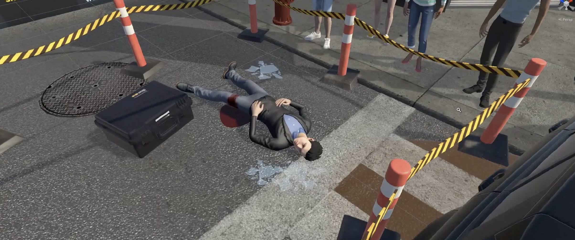
Through iterative design, rapid prototyping, and user testing, we created a simulation in which a young adult is struck by a vehicle and becomes unresponsive. In the simulation, the patient is found lying supine on the pavement, with obvious bleeding; there are broken glasses on the ground near the patient, and the gas is leaking; police have stopped the traffic and firefighters are at the scene to assist.
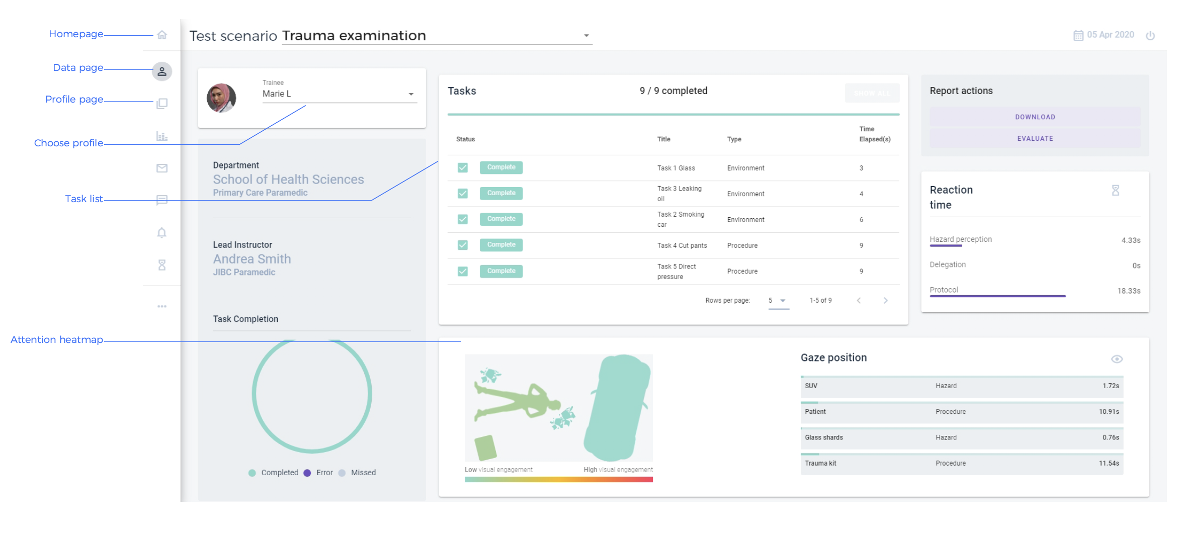
Students are required to identify all the hazards, and then use three dressings, in the correct order, from the emergency case to stop the bleeding. In order to analyze students’ decision-making processes, we also designed a dashboard that collects two sets of data: attention and reaction time. Attention, tracked through head movement, measures how long students look at an object, while reaction time measures how long it takes a student to complete a task. The dashboard is cloud-based so instructors can read the analysis and provide feedback from anywhere.
Presenting a Mid-Project Video Demonstration
Halfway through the project, we were asked to present this project to JIBC donors, faculty, and staff. Although the final prototype has evolved from this iteration, this video provides a succinct introduction to our design. I personally adore this video for its energy and simplicity.
Designing and Redesigning the Dashboard
The team conceptualized, prototyped, and iterated the dashboard in two or three weeks. Click the image to view the final interface of the dashboard.
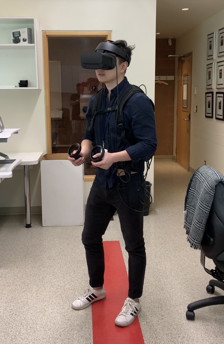
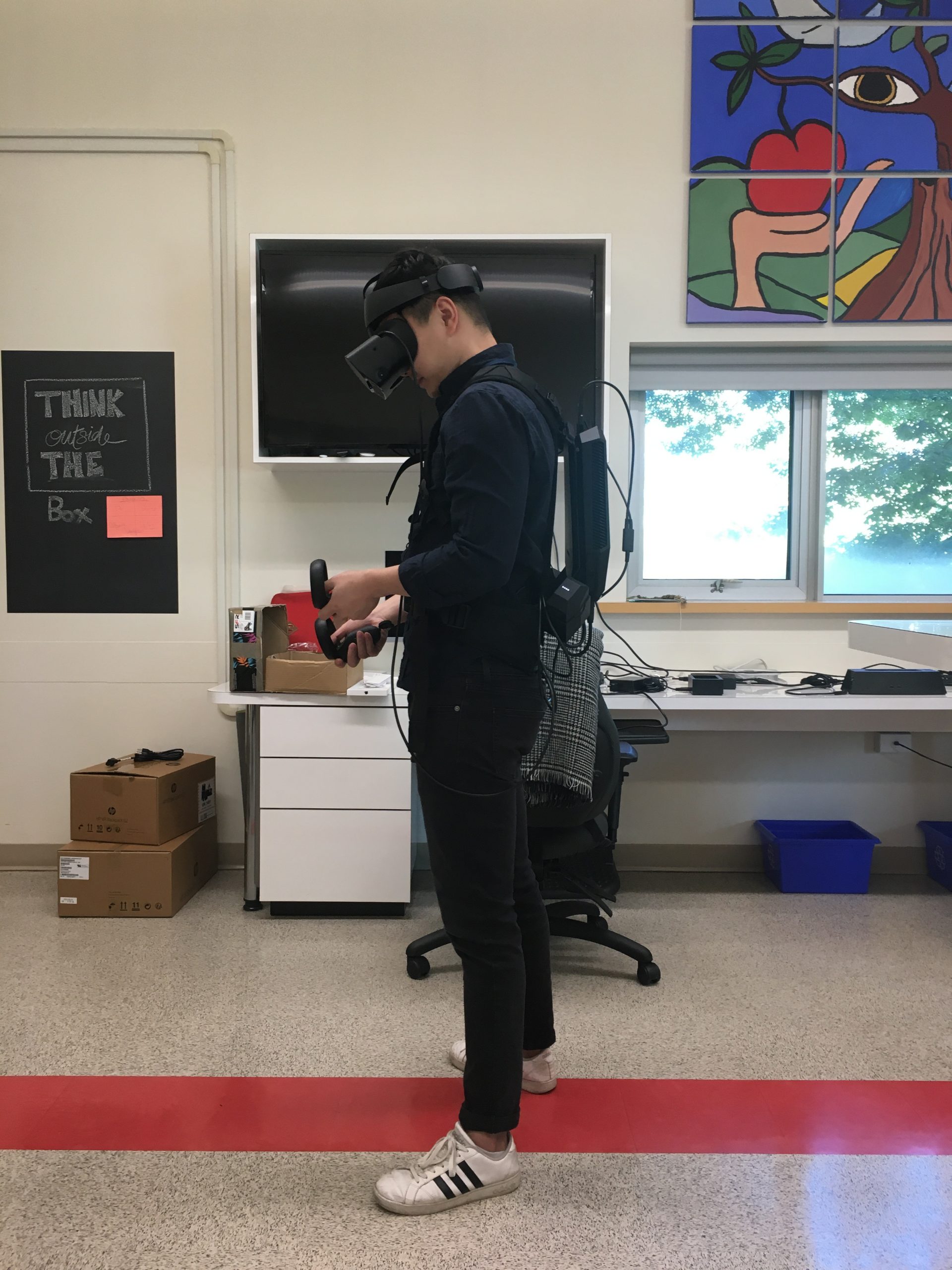
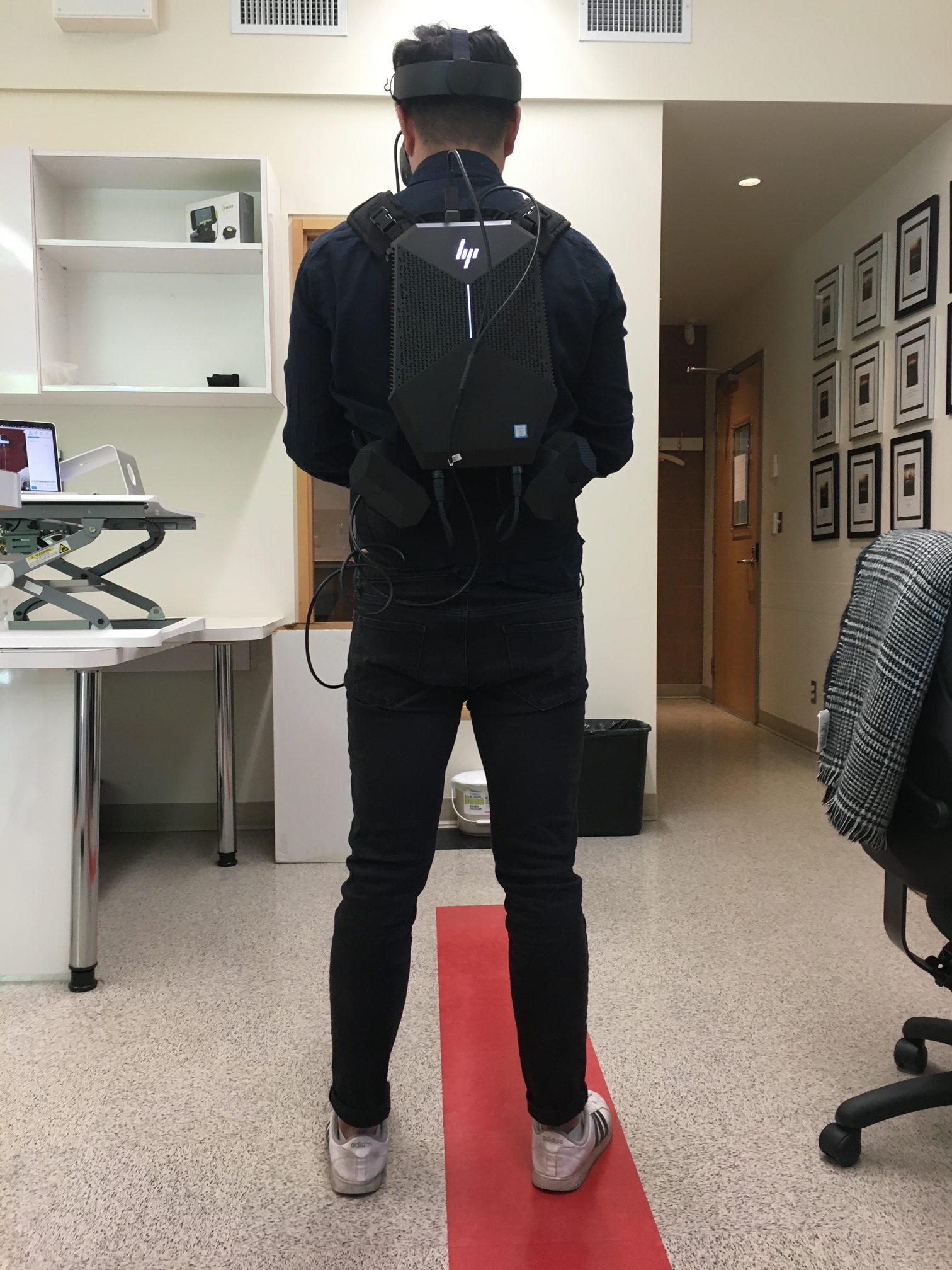
Installing the Final Prototype and Putting on the Backpack Devices
Walking Through the Final Prototype
And Finally Meeting the Team
Centre for Digital Media
- Eris Lam, Developer
- Kyle Liu, 3D Artist | Unity programmer
- Julia Read, Product Manager | UI Lead
- Farbod Tabaei, Concept Artist | Game Designer
- Sooq Won, UX Researcher | Graphic Designer
- Yuan Zhang, 3D Artist | Game Designer
- Robyn Sussel, Faculty Advisor
Justice Institute of British Columbia
- Junsong Zhang, Instructional Designer, CTLI
- Robert Walker, Director, CTLI
- Svetlana Larson, Regional Training Coordinator, PCP
- Eric McConaghy, Regional Training Coordinator, PCP
And a big thank you to people who participated in the user testings and provided valuable feedback.
