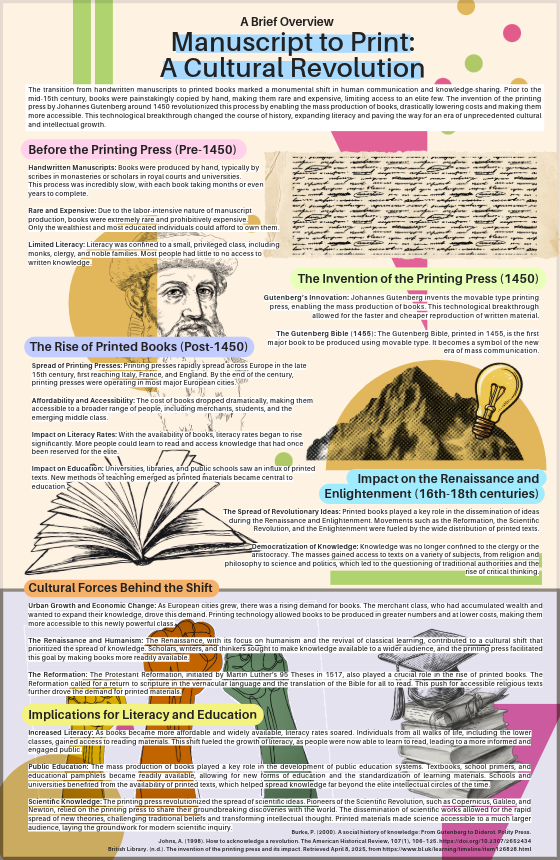
This infographic is aesthetically pleasing due to its clean layout, cohesive color scheme, and balanced use of white space, which all contribute to an easy-to-follow and visually engaging presentation. The typography is clear and well-organized, helping guide the viewer’s attention through the content.
However, there’s room for improvement in terms of visual storytelling — incorporating more icons, illustrations, or data visualizations could make the information more dynamic and easier to grasp at a glance. Enhancing contrast between sections or using more intuitive visual metaphors could also boost clarity and engagement.


