

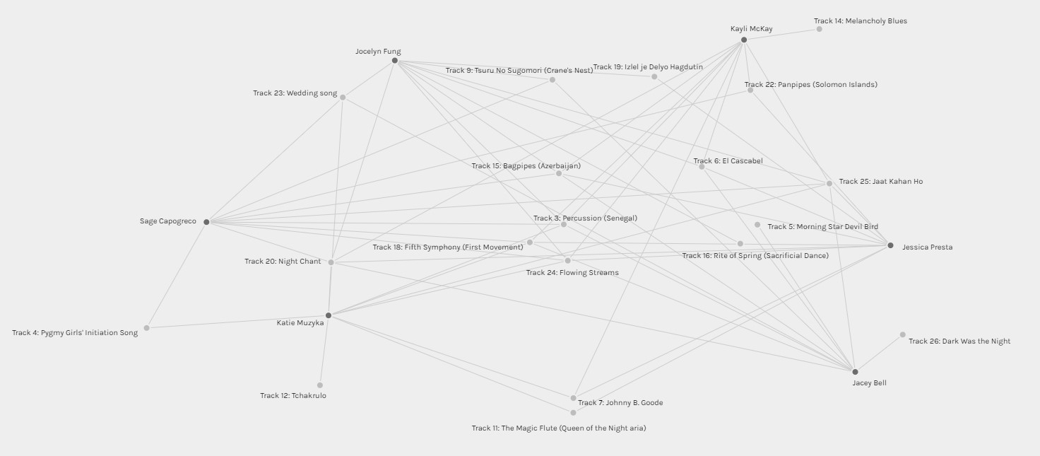
After completing the Golden Record Curation assignment, we were asked to complete a quiz to collect data for this assignment (I completed the quiz but must have forgotten to actually click submit – my bad!). Using the Palladio app, we were to interpret the data collected through the visual output that Palladio gave us as seen below.
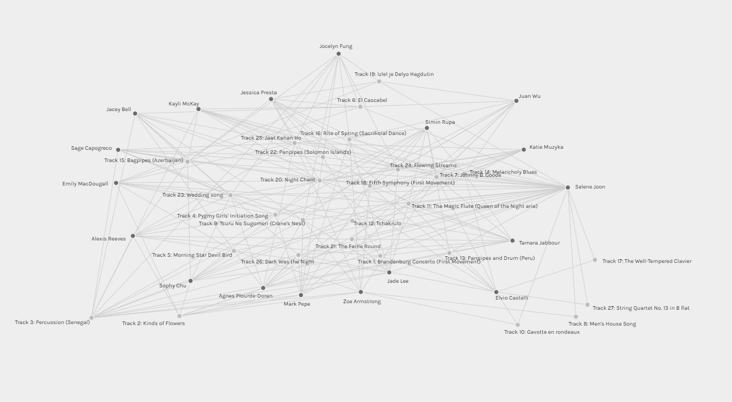
Using Palladio was a lot simpler than I had originally believed it would be. The app made it very easy to manipulate the data and visually see the connections between the songs picked and those who selected them. I began my interpretation of the data by “untangling” the data in each of the four given communities as it was a lot easier to manipulate in smaller chunks.
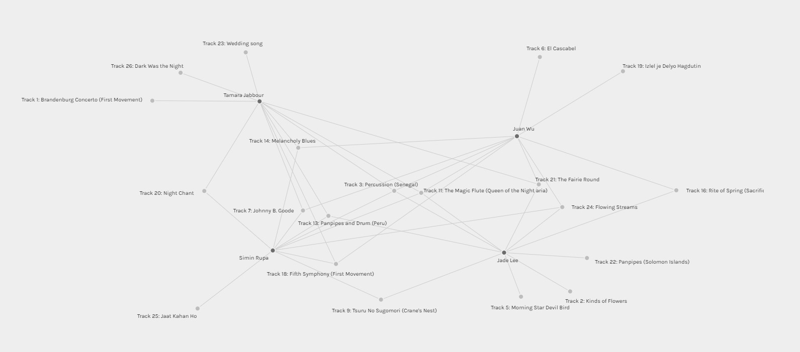
Community 1
I began with Community 1 and I moved each member into a separate section of the generated “map”. I then untangled the data in a way to try to see the connections as clear as possible. I moved the selections that were only picked by one user to the outside of the map, the selections that were picked by two were moved to go in-between the two users along the outside, and the selections that three or more users picked were left in the middle. The image above and the other images below were all “untangled” using this method.
To interpret the data for Community 1, I immediately looked for the tracks in which they most had in common. The only two tracks in which they all selected were “Track 3 – Percussion” and “Track 11 – The Magic Flute”. Further interpreting this data, it seems like Tamara, Simin, and Juan had more selections in common with each other than with Jade. Although it is only a slight difference, it was a bit more noticeable once I untangled the data. Tamara and Jade also had the most selections in their group which were not shared with their other members with three each. Looking at the tracks that are common amongst these members, it looks like they appreciated tracks which were significant due to their impressive sounds. Tracks such as Queen of the Night and Percussion are very pleasing to listen to.
Community 2
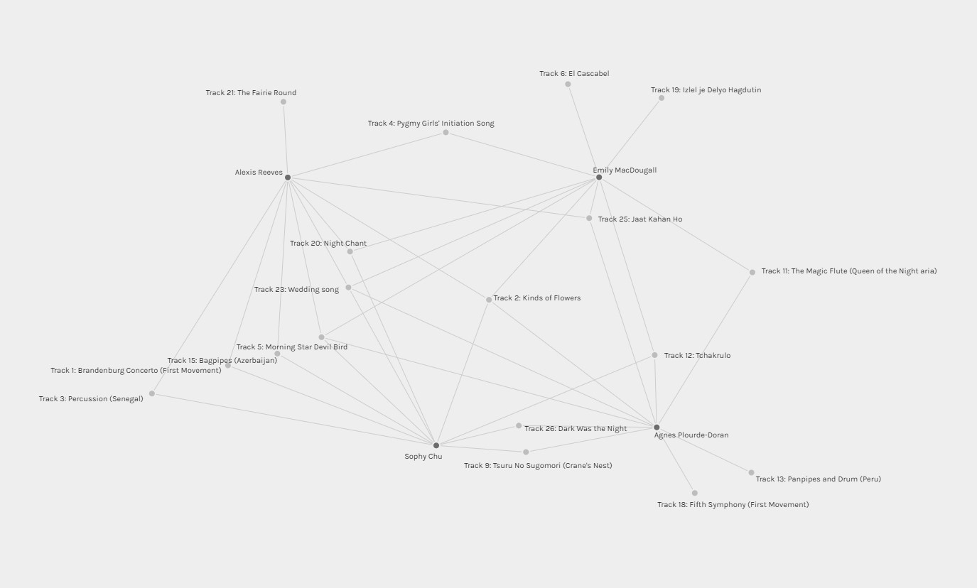
Community 2 members shared the tracks “Kinds of Flowers”, “Wedding Song”, and “Morning Star Devil Bird” amongst the four of them. This group also had a lot less tracks that were only selected by one group member. Through that interpretation, I would be inclined to say that these group members’ reasoning for their choices would mesh well. Based on their selected tracks that are in common, I would assume that their reasoning for their choices was based on cultural significance of the tracks.
Community 3
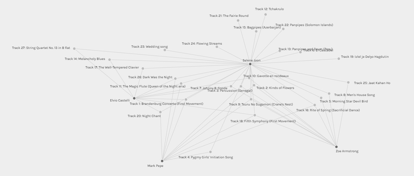
Community 3 was a bit difficult for me to interpret as Selene had many tracks selected compared to the other members. If I were to exclude Selene’s choices, I would assume that the reasoning for the choices in this group were to further narrow down their selections while still maintaining a variety of the styles of music.
Community 4
 Looking at Community 4, their common selections reflected the same reasoning as those in Community 1 (impressive musically). However, it seems like their sense of “community” was stronger than that of in Community 1 based on having more in common with each other.
Overall Reflection
In reflection of my short interpretation above, it is impossible for myself to know the exact reasoning of the choices of my peers. Palladio did an excellent job of presenting the data in a way which could be interpretable – but only to a certain extent. With no data relating to the reasoning of their choices (or non-choices) makes it impossible to be sure and to properly analyze the data. In order to properly interpret the data, I would need to give each track a data tag that signified its style, instruments used, genre, country, vocals, etc. If I were to use these tags and then run the data in another program, I would be able to further break down the data to see the patterns of each users’ selections. These connections then would have a deeper meaning instead of the sole reason of being in common. With these connections, I would be able to assume why users selected their tracks but still would not be able to say for certain why they omitted other tracks.
This task was interesting for me as I imagine this is the basis for targeted ads that we see while using the internet. Website keep track of us just like the little dots on the Palladio app and they try to find commonalities amongst our search history, links we click, and even the time that we spend on a certain section of a page. These sites do not have the reason for why we either do or do not click an ad, but as soon as we make a selection we are then swarmed with that topic. These complex algorithms can only assume why we click an ad, and can make educated guesses on what type of style of ad to present to a user. When it comes down to why a user did not click an ad, the algorithm assumes simply that it was because we were not interested in it (which is the only assumption we can make for our task as well). Technology is now smart enough to make these complex decisions of data interpretation for us, which is both an amazing and frightening thought.


alexis reeves
July 18, 2022 — 3:02 pm
Hey Joseph, I enjoyed reading your reflection on this week’s task. I like that you brought up the idea of using tags to further interpret the data in the future and think it would be helpful to further pick apart the connections made and therefore bring more meaning to why they were connected in the first place.