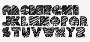
Great article linked in here about font conversion optimization. This article compares the in and outs of different fonts to play with word psychology. Research from Google and IBM concluded that “Serif” font is the best to improve comprehension for readers. Have an amazingly hard to understand article? Switch your font to “Serif” now to increase user understanding. This article has it all, from line spacing analysis to different font size usage for impact. It even talks about a New York Times opinion writer’s thought on the confidence level of certain fonts.
To relate this article back into our class discussions, this article is highly usable for the creation of websites and blogs. Certain fonts can set the tone of the website. For example “Arial” font on a size 12 for a paragraph will seem to give it a bit more life without losing too much professionalism. “Comic Sans” for example is too comical and should only be used for writing for children. This article is a sure read for anyone trying to get their message across using fonts, sizes, and spacing to their advantage.
Source: Marketing Land
Hey! I really found such type of article for a long time. Your article is very classic and contains very valid points. Different fonts for many purposes are very necessary for all designers.
Thanks a lot.