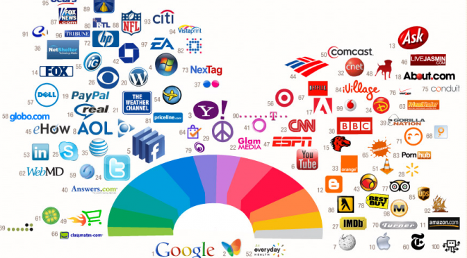
Look around yourself for a minute. Do you see cars passing by? Or, maybe, you have a cup of Starbucks coffee in your hands? There are so many different things around you and each of them refers to particular brand.
Try to think about Starbucks. What image appears in your head? I see their green logo – this is the strongest association I have with this company. What do I think about green colour? It is connected to something organic and healthy.
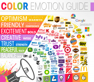
So, costumers would more likely buy product with appropriate colour-style, because it causes diverse emotional reaction in our brain.This is why usabilitypost.com paid special attention to this topic.
Thus, you do not want your technologies company logo to be designed in yellow colour. It is too cheerful and funny for a serious and reliable brand. You would prefer something more calming and inspiring confidence. For example, grey, white or blue.
In addition, it is very risky to include more than 3 colours into your logo design. Psychologists proved that our brain can remember 1-3 colours a lot faster and better than 5 or even 4.
Why do people have to remember your brand’s logo quickly and with no effort? Because your brand will become recognizable faster and buyers’ number will increase significantly.


