Sitcom of Commercials

by Katie Fang ~ January 24th, 2011

Building customer loyalty has been one of the biggest challenge to marketers. How to make consumers be ‘addicted’ to your brand so that they won’t even stand up for a washroom break when watching your commercials? Lately, I started to reflect on those commercials that are filmed in series.

So here is an example that I love the most – Corona.

YouTube Preview Image YouTube Preview Image

The commercials featured lots of stereotypical beer drinking situation – beach, ocean, and girls. But the most important part that was integrated is its humour. I mean who doesn’t like those funny ads that makes you laugh, since generally sitting through ads is the most painful thing when you are watching your favourite show.

So here comes the end for wordy boring commercials, and cool ads with humour are taking over the market. I mean less wordy doesn’t mean NOT informative right? For instance, the ads above conveys perfect message and image of its product.

It tells you

– You should drink Corona on the beach

– You should drink Corona, because you can see beautiful girls

– You will have a nice life if you drink Corona (enjoy life on the beach)

– It is for both female and male

So what can you get out of these two commercials? Leave a comment below.
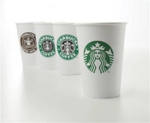
Starbucks goes TITLE less.

by Katie Fang ~ January 17th, 2011

Nowadays, probably coffee and Starbucks are synonyms.Going to Starbucks for a coffee is a daily activity for coffee lovers. And now the question is – why Starbucks is playing with its well-established logo?

Lots of companies are going with the market trend, which is somehow playing its role in the betterment of the environment, whether it’s a marketing strategy to increase its revenue or simply doing “good deeds”. However, Starbucks is heading towards another era – brand transformation.

The original Starbucks logo is consisted of a siren and its name in a circle, and now its dropping Starbucks Coffee and the circle in its logo, leaving a simple image of the siren.

Some think that Starbucks is playing with fire- messing around with its well known logo is a death sentence; others say that Starbucks is so big that they don’t need to have their name on the logo to promote itself anymore.

Well, I have to admit that it’s a bold move. In the beverage industry, lots of companies are emerging, maybe they are not as big as Starbucks, but certainly their cheap prices and convenient locations have lots of local loyal customers. So what makes Starbucks think that changing its logo will possibly assist in winning its battle?  First, because Starbucks is unique. It is not selling you a cup of coffee, but selling you the STARBUCKS EXPERIENCE. Therefore, by removing the text provokes the concept of ‘Starbucks’ rather than a cup of ‘Starbucks Coffee’. Second, the fact that Starbucks chose to omit its title on its logo suggests some future possible marketing strategy, such as establishing new product lines (something other than coffee).

What do you think about it? Is it a good thing or a bad thing for Starbucks to drop the name from its logo?

Spam prevention powered by Akismet