Task 9: Network Assignment Using Golden Record Curation Quiz Data
Palladio is an interesting tool to help make data more visual in graphical form and to analyze relationships.
Using Palladio as a way to collect data from our song selection and see through a visualization of data was very interestingly displayed. I found it a bit challenging to interpret, as I had to interpret what the organized clusters of names and numbers meant. We had to choose 10 pieces of music but in the graphical visualizations, I only saw 7(#0-#6) clusters in total, so it didn’t seem correct that that graph was grouped by song choice. These networks that were created with our songs choices helped to show the relationship of our song selections. I found that I had to assume a lot of things with the data given as there was no clear explanation of how to interpret it.
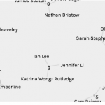
It was neat to see my name as a node which connects to all the tracks that I chose as well as all the tracks that other students chose. Here as represented in this web visual below:
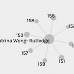
Here the title of the track is displayed along with the lines that connect each person to that track. This could indicate the relationship between the song that was chosen the most among the people in the class. It appears that the connections are based on similar tracks as a total of most highest ranked.
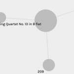 The graph on the left shows all the tracks with their numbered connections clustered around it. While the graph on the right shows a close up of an individual Track with their data connections.
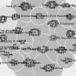
As for when it’s viewed as Untitled, it appears that our nodes (names) are connected by track choice.
You can visualize the relationships between the dimensions of data as the nodes are connected by the lines. The amount of lines indicate the many connections that we (as a class) all have with the choices of pieces in music, which reflect the magnitude within the data.
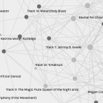
In the visualization below, the 7 clusters grouped by numbers ranging from 1-230. The cluster are organized in some way to represent a total of certain choices. Sum of modularity:
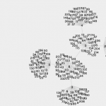
In this visualization graph (below), it shows clusters of certain peoples connections organized into 7 groups (from 0-6). It could mean groupings of certain song selections or most common songs chosen by the same people. This particular view seems a bit more specific to each person’s grouping.
Having only chosen 10 songs out of the 27 that were given, I am not sure if this type of data can represent the songs that were “null” or not chosen. It would seem that songs that were not chosen would still need to be accounted for, as data but not be directed connected in the web. It didn’t appear that these songs were clearly shown or accounted for in the visualization. I would assume that it would be a web on it’s own without a line of connection. It seems that the reasons for my song choices are not obviously shown in the visualization. Some of the reasons in my song choice were because of meaningful I thought the tracks to communication to extraterrestrials might be. How could this be displayed or shown on the Palladio visualization?
I don’t think that the visualization is able to capture the reasons behind our choices in songs. The data that would be missing for that might be a ranking of the songs, so that all songs are included in the data or show where the songs that are not chosen are in the web. The visualization seems very similar to how the Internet is viewed. The infrastructure that contains the web, and the web is the songs and curators, but is missing the visuals for hyperlinks and metadata to properly show our reasons behind the song selections (why the songs chosen are displayed).