 My experience in building the Moodle LMS course site has been enlightening. While I have used Moodle for close to ten years, I wanted to push the software to see if I could create a completely new style of online course based on the idea of building an interface similar to a website, complete with icons and introductory paragraphs leading to read more buttons.
The overall theme for the course was using Social Media for Business and Personal Branding. This was completely new topic for me, even though I had taught small components of the idea in my Digital Media Arts 11&12 classes, I wanted to produce something completely unique. The course is suited to the needs of business people and online entrepreneurs and those who want to learn more about how to use Social media to promote themselves, their products and/or their services. I worked far harder and longer than I anticipated to build this site, creating a great deal of original artwork, content and researching topics deeply to gain a better understanding of the most important concepts around business and social media.
I divided up the content into 6 units. Originally I had laid out 9 units, but later combined them together into six powerful thematic bodies of knowledge. The course includes these units:
- Introduction to Social Media
- Social Media for Business
- Digital Identity
- Social Media Tools
- Social Media and the Blogosphere
- Future Potential of Social Media
And the final section is a listing of resources I consulted, directly or indirectly to learn more about the topic. Each unit comprises of various notes, videos, discussions, surveys, a quiz and online assignments such as writing a blog article and setting up a LinkedIn account.
The course can be broken down into several elements, and all intertwine to produce a product that I am thrilled to have produced.
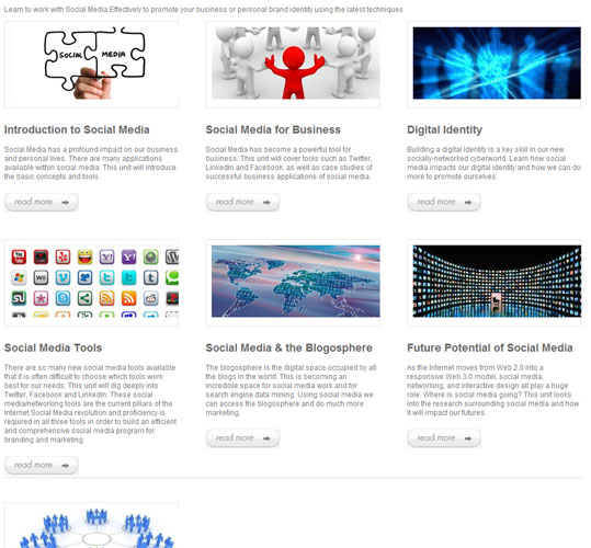
1. I created a Learning Management System (LMS) online course site in Moodle that contains the following components:A splash page with an easy to use, graphically powerful GUI (graphic user interface). My splash page is visually appealing, utilizing sophisticated HTML and CSS3 techniques to make a professional, and inviting space. Each unit has a brief description, a thematic graphic that links to the unit, as well as a read more button that links to the unit.
To remove distraction, I used a soft white and grey colour scheme in the splash page and the buttons highlight in soft blue when the mouse hovers. This page is carefully coded and can be a base upon which I can build in the future. One element I would like to add in the future would be jQuery to provide more fluidity, animation and interactivity. However, when I tested it inside this version of Moodle, the results were not what I wanted, so I will try it inside Moodle 2.0. I am happy with the final result and am glad my CSS worked well to layout the elements, produce the frame around each unit’s photos and produce beautiful buttons. Here is a screenshot of the splash page:
2. Six complete learning modules are also included within the course. Each module is varied in its content to create an interesting learning experience, and each allows for modular progression through each element, building the scaffolding required for a constructionist learning experience.
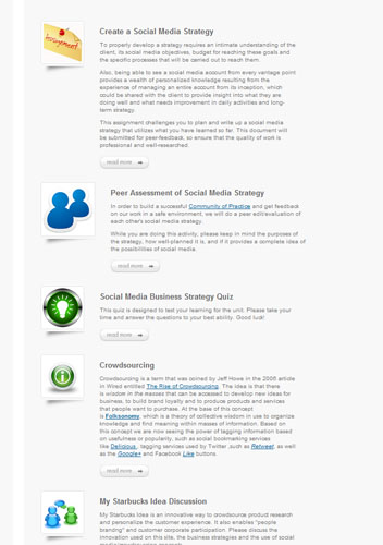
These units are designed for visual learner and for someone used to working on the web. Icons are used throughout the course units as visual cues to the type of content contained therein. A wide variety of activities are present within each section to account for different learning styles, different learning experiences and for different methods of information retention. I created all of the written content based on my professional web marketing and design experience, research both from academic, technical resources, as well as from personal experimentation. I also designed the course to fit in the academic placement of “continuing studies”, to remove the pure academic stream of thought and integrate it with practical experiential learning. Hence, I have tried to write the content to be as user-friendly as possible, keeping the message clear and utilizing visual cues to assist the learner.
This course is meant to be taken over about 6 weeks, and assignments are set up to promote learning at various levels along with the production of tangible elements at its conclusion. What is most unique about this set of units is that I carried the idea of the splash page further by making the entire course based on HTML pages, including the lessons within. Some element, such as assignments were more difficult, since the Moodle theme was limited and I could not access its styles, but overall I am well pleased with the results. Below is a sampling of part of a unit:
3. Five modules are programmed for selective release. I researched Moodle.org, forums, universities, guidebooks, and more and found this element to be a challenging application to the course, because I had to make an instance of selective release that made sense to the course. Rather than doing a manual release, a timed release of a programmed release based on completion of a unit, I chose to use group membership as the basis for selective release.
For purposes of viewing by my colleagues in this MET course, I made everyone a member of one of the groups under the grouping “Social Media for Business and personal branding”. I created two groups, one for business branding and one for personal branding. To make this work in cyberspace, I would initiate group membership in the signup process. This course could then be expanded to focus on personal OR business branding and each group could have their own set of assignments and notes, culminating in a group project at the end that would utilize both sets of skills. I wanted to have the entire course visible to the learner, once a member of a group, so they could see what elements they would be learning in a more detailed manner than a course syllabus.
The first module, Introduction to Social Media, is not programmed for selective release, so as to demonstrate the difference. Moodle 2.0 is much more sophisticated in its methods of selective release, so I had to improvise for our older version of Moodle, based on inspiration from this link: http://tstcedtech.weebly.com/22/post/2010/05/selective-release-sort-of.html
4. Discussion is built into the course across the units, both in the form of forums and chats, as well as a peer assessment. Each chat deals specifically with questions related to Social Media and its importance for business. In one of the chats, both groups have the ability to talk to one another to gain greater perspective. I used the companies Dell, and Starbucks as case studies and prompts for discussion within the course. Informal discussion also takes place through Twitter and Blog replies to articles created in the assignments in the course.
5. Assessment is build in throughout the course and marks are based on assignments, discussions, peer assessments, and overall participation. I debated about creating a course syllabus, and decided to incorporate a short one in the splash page. The original idea was to create a constructionist web-quest type of experience where discovery learning was built in via moving through the topics item by item, but also being able to scroll ahead to see what content is coming next. By integrating a short syllabus into the splash page, this constructivist principal has been safeguarded.
6. Fail-safe procedures are built into the course as well. For example, if the Youtube videos are not visible, a message states that it is necessary to refresh the screen or click on a link to watch the selected work on Youtube.com. Another fail-safe procedure built in is the fact that I left the original links to the course work visible below the GUI unit interfaces, in case the learner was not able to view the content on an old browser or limited bandwidth.
7. Cross-platform and browser capability was also built in. As I was working through the course, I was reminded of Bates and Poole (2003) and the SECTIONS model, so I worked in coding throughout that was compatible across the browsers Chrome, Firefox, Safari, and Internet Explorer. I also tested the course pages on my iPhone and a friend’s iPad to ensure cross platform compatibility. The course worked extremely well on all browsers and devices and looked the same across all platforms as well.
8. Extended elements are built in throughout the course. For example, terms are linked out to more information, a complete list of resources I used to build the course is present and I have also built in a list of extended reading. Building in extension exercises has been a key element to courses I have built in the past and I use them extensively in my teaching practice, so I wanted to build in that element as well.

Producing this course has been an incredible learning journey, promoting growth through challenge, long hours of work and contemplation, design and interface theory, as well as considerations in building an online course. Moodle is a flexible system that I am used to working with, and that enabled me to push the program to learn new elements and to experiment with my own design techniques. I have learned more through this course and this project in particular than I have over the years of using Moodle, due to the directed guidance, community of inquiry and practice, and the overall example of Dr. Egan who effectively modeled how to teach an online course. This provided the inspiration and the motivation to develop a course beyond my comfort zone and outside of my regular teaching context. I now have the skill set to develop more sophisticated courses for my own students and to test my course design work in the global marketplace. Overall, an uplifting experience, but one that required a lot of effort, incredible number of hours and a great deal of inspiration to complete.
Kenneth Buis
August 2, 2011
References:
Bates, A.W. & Poole, G. (2003). Chapter 4: a Framework for Selecting and Using Technology. In Effective Teaching with Technology in Higher Education: Foundations for Success. (pp. 77-105). San Francisco: Jossey Bass Publishers.


