Earnings Growth
by kevinmil
Stephen Gordon has posted a provocative analysis of wage growth here, on WCI. Stephen uses the Labour Force Survey to construct percentiles of ‘earnings’ by year and sex. I put ‘earnings’ in quotes, because earnings can be constructed in different ways. In the LFS, weekly earnings is constructed by multiplying ‘usual’ weekly hours by ‘usual’ hourly wage. Most analysis of income inequality has focused on administrative data, and so has used annual measures of earnings or income rather than constructed weekly earnings. My own taste is to focus on annual earnings rather than ‘usual’ hours or wages–especially since these would be harder to understand for salaried employees who aren’t paid an hourly wage.
In his blog post, Stephen does compare his results to this paper by David Green and Ben Sand. Green and Sand do the following things:
- Use the long-form census 1971-2006
- select on total income positive
- select full time workers
- select people with >0 weeks of work
- construct ‘weekly earnings’ as total annual earnings divided by weeks
- take log.
Green and Sand then graph the growth of percentiles of the earnings distribution, separately by males and females.
Here are their results for males
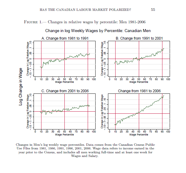
Green and Sand (2011), Figure 1
…and for females
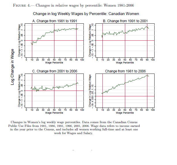
Green and Sand (2011), figure 4
Re-analysis with the SLID
I have replicated as close as possible what Green and Sand did, using the public-use version of the Survey of Labour and Income Dynamics. The SLID is an annual survey of incomes, which draws the income data from tax records. It is the best source of annual income data in Canada. The long-form census, which Green and Sand used, is better because it has huge samples. However, we don’t have the long-form census after 2006.
Because the sample size is fairly small in the SLID (about 50K people per year), graphing annual data was a bit noisy owing to sampling variation, so I did the analysis in three sets of years: 1996-2000, 2001-2005, 2006-2010.
Before showing the graphs, I will emphasize this can be tricky analysis and my work here has not been peer-reviewed. For transparency, I have posted my code here.
Males 1996-2000 to 2006-10. Over this 10-year period, there has been earnings growth. Much higher above the 80th percentile than below.
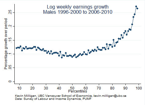
Earnings Growth of Males by Percentile, 1996-00 to 2006-10
Here is females, 1996-00 to 06-10.

Earnings Growth of Females by Percentile, 1996-00 to 2006-10
I can further break this down into the two subperiods, 96-00 to 01-05 and 01-05 to 06-10.
Males:
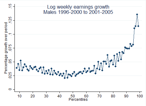
Earnings Growth of Males by Percentile, 1996-00 to 2001-06
Females:
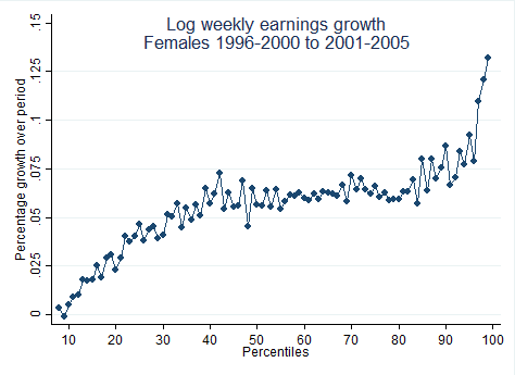
Earnings Growth of Females by Percentile, 1996-00 to 2001-06
And here is Males 2001-06 to 2006-10:
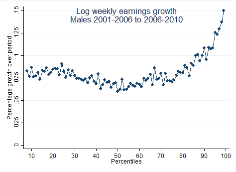
Earnings Growth of Males by Percentile, 2001-06 to 2006-10
And finally females, 2001-06 to 2006-10
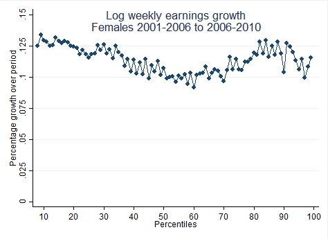
Earnings Growth of Females by Percentile, 2001-06 to 2006-10
Let me draw three conclusions from this analysis
- Median earnings growth is greater than zero for males since 1996. This is good news.
- Earnings growth continues to be skewed, in particular in the top 10 percent. Male earnings polarization appears to be continuing up to 2010.
- It is important to use similar data and methodology when comparing results to those in the literature.
Addendum:
Using 5-year periods is inconsequential to my conclusions about concentration of growth at the top. I did it to soften the sampling variation. Here is 2010 vs 1996, straight up with no averaging over years:
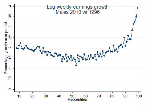
Males earnings growth, 2010 vs 1996.