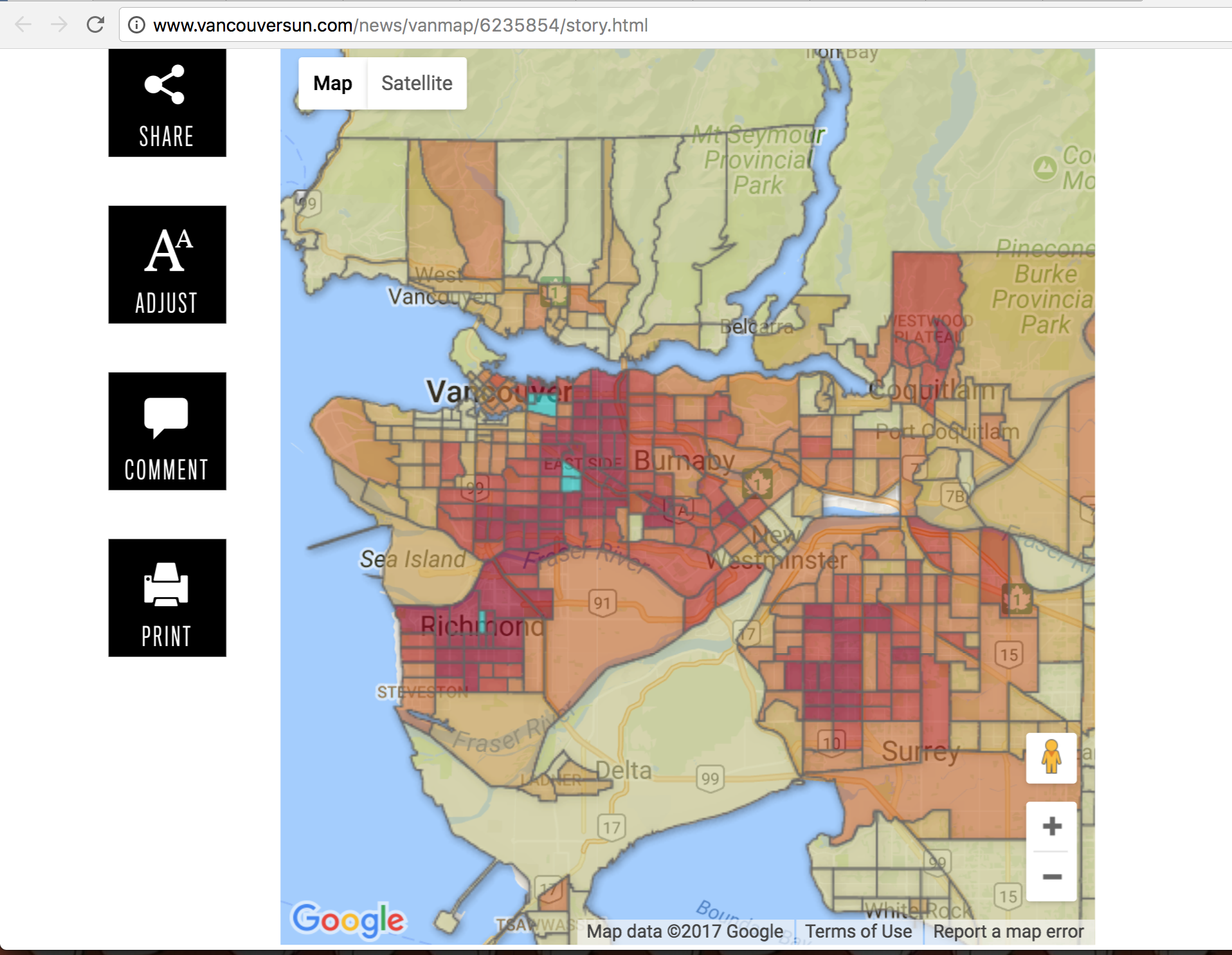
The above map is a visualization of non-English speakers in Metro Vancouver, but the title that accompanies it says that “more than a third of Chinatown residents can’t speak English”. This focus on a specific area of Vancouver directly conflicts with the representation of that data, wherein East Vancouver, Richmond, and north Surrey are seen as neighbourhoods with a high percentage of non-English speakers. The data sourced is only said to be from Statistics Canada, but no other mentions of parsing, filtering, mining, or classifying are given. This map is likely done on Google My Maps, but it is seemingly impossible to find alone if not attached to the Vancouver Sun article itself.
The display of the data shows a particularly strong clustering of non-English speakers throughout low income areas of Metro Vancouver, but in general gives the impression that most of the Vancouver population has a high percentage of Non-English speakers. This visualization is questionable, given that there is no legend for this map. The most that one can decipher from looking at this map from a first glance is the darkness of the colour, in which a somewhat single hue/colour family is used, from pale yellow to dark red, with turquoise-blue being used to highlight the top 5 neighbourhoods with the highest percentages of Non-English speakers. The data journalist states that “the darker the colour the more people who can’t speak English there are in that place.” The darkest red, from what I can observe, spans anywhere from around 9% to 25%, with the following dark orange, light orange, golden yellow, and pale yellow to account for the remaining 0% to 8.9% Non-English speakers. I only understood this skew when I clicked on each census tract, to read the pop ups that determined the percentage of Non-English speakers in the polygon, contrasted with the Metro Vancouver average. I am also critical of how this “Metro Avg” of 5.2% Non-English speakers was determined, as it is not indicative of what the predominantly dark red coloured map shows.
All of these ostensibly minute data visualization details indicate a bias towards wanting to show how many Non-English speakers live in Vancouver. Upon more investigation, I read that many of this data journalist’s current news articles also showed a similar bias, in their other articles about the number of immigrants in particular areas of Metro Vancouver, pointedly related to ethnically Chinese dense areas. This bias is not inherently negative, but has the ability to become xenophobic or even racist if it is not stated by the journalist to be otherwise. For example, this information could be used by some to construct a narrative about the “invasion” of Chinese individuals to strike fear and resentment in those who live in neighbourhoods where there are particularly large designations of Non-English speakers, especially given the overarching narrative of the Vancouver housing crisis. Instead, I suggest changing the classification method of this data to break up the red and dark red colour category percentages more, to provide a more balanced view of Non-English speakers in Metro Vancouver. I also suggest that a different level of generalization may serve as useful, as the census tract with the largest percentage of Non-English speakers (34.6%) is directly next to a census tract with 6.7% Non-English speakers. I attribute this to something alike atomistic fallacy, or attributing an individual value to a generalized area.