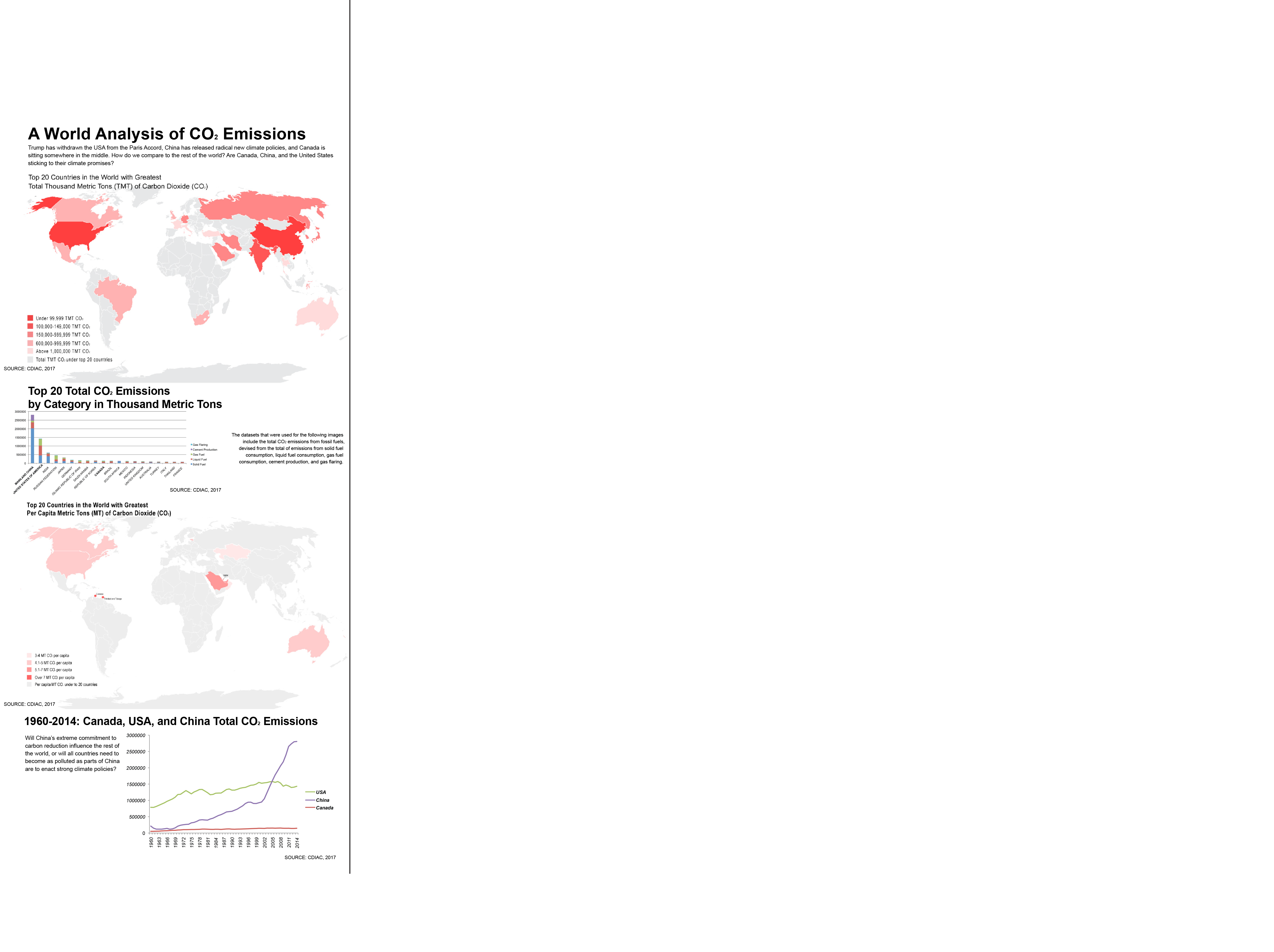
Within the last couple of months, President Trump has withdrawn the United States from the Paris Accord, China has released radical new climate policies, and Canada is sitting somewhere in the middle, with the proposals of major fossil fuel energy projects up for debate by activist groups and the NEB alike. Are Canada, China, and the United States sticking to their climate promises?
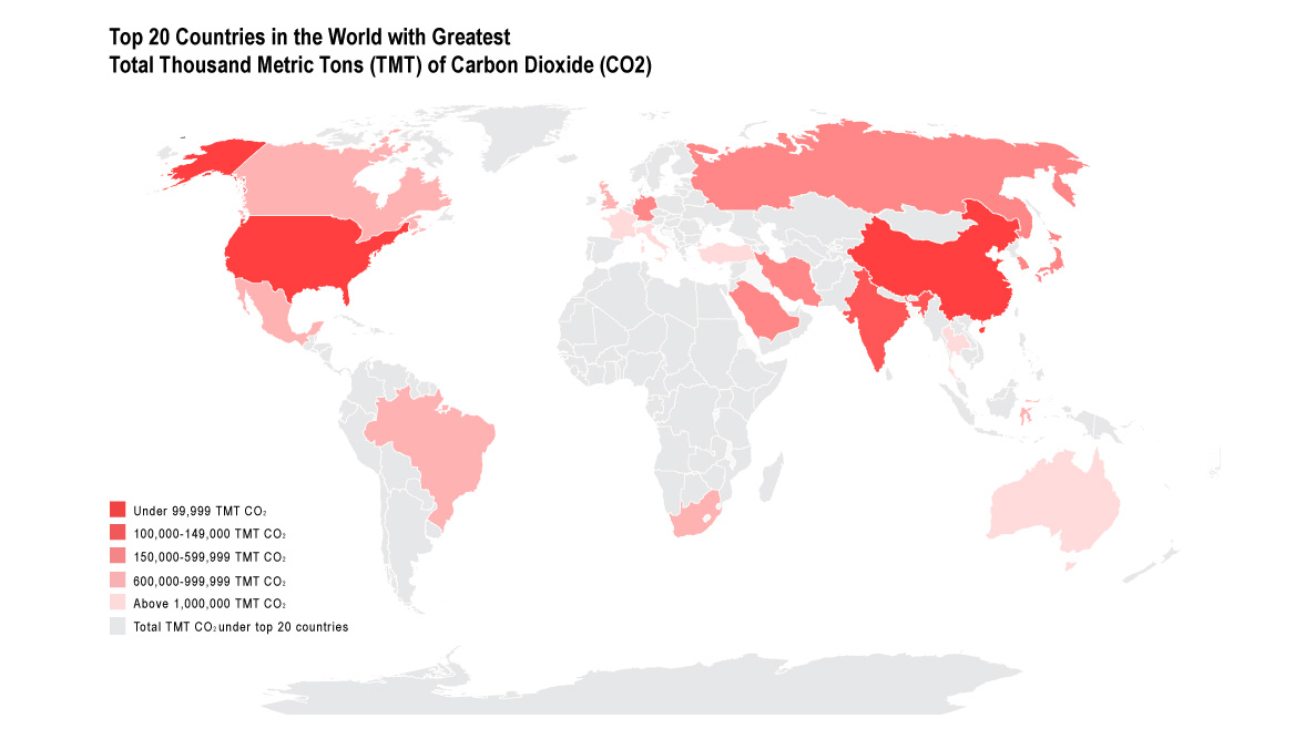
In order to truly understand the magnitude of these visuals, one must dive deep into the data used to create them. The datasets that were used for the following maps include the total CO2 emissions from fossil fuels, devised from the total of emissions from solid fuel consumption, liquid fuel consumption, gas fuel consumption, cement production, and gas flaring.
Top 20 Countries in the World with Greatest Total Thousand Metric Tons of Carbon Dioxide
Full sized image here.
The original dataset can be found here. The modified datasets can be found here (per capita CO2) and here (total CO2). The above modified data sets were sorted by value in Microsoft Excel, and then chosen as the top 20 countries with the greatest emissions per category.
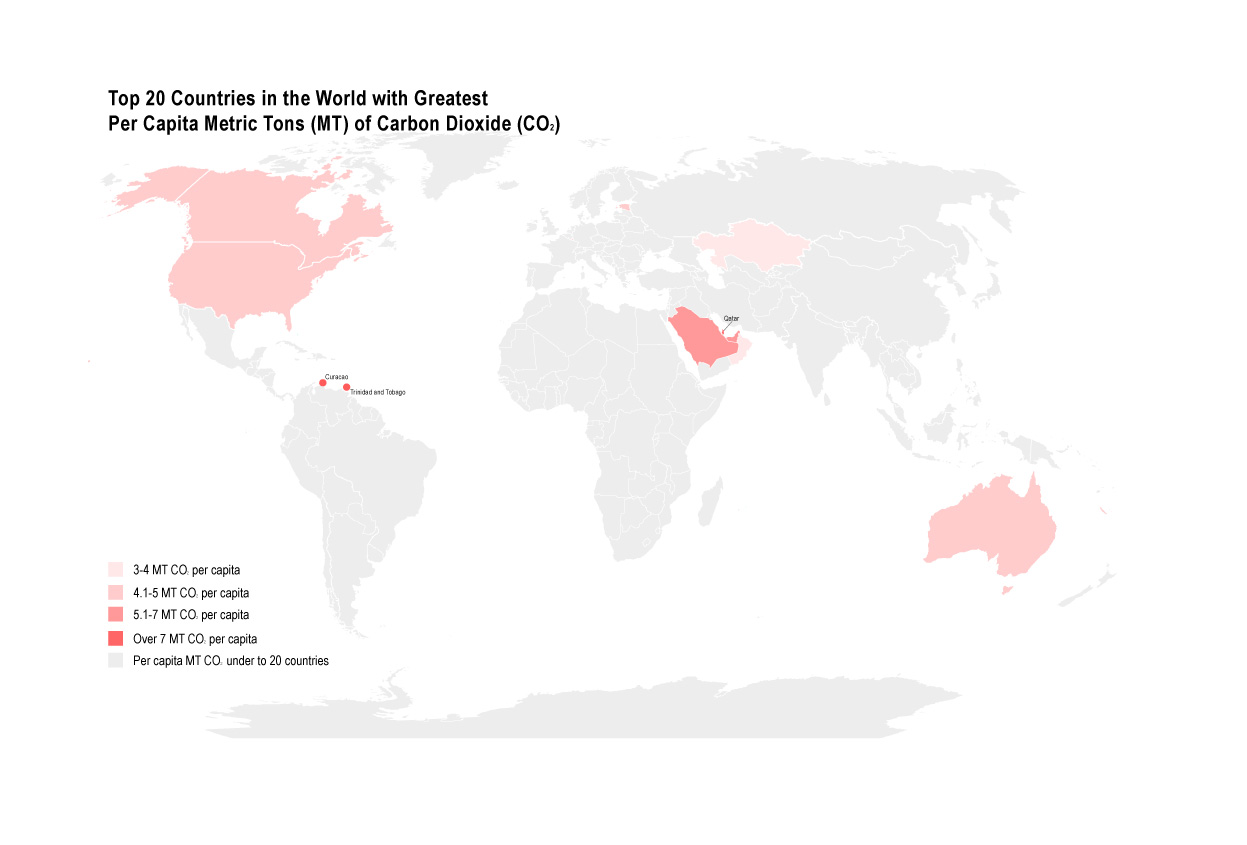
This data also breaks down each country’s per capita emissions of CO2, and the top 20 largest emitters are highlighted below.
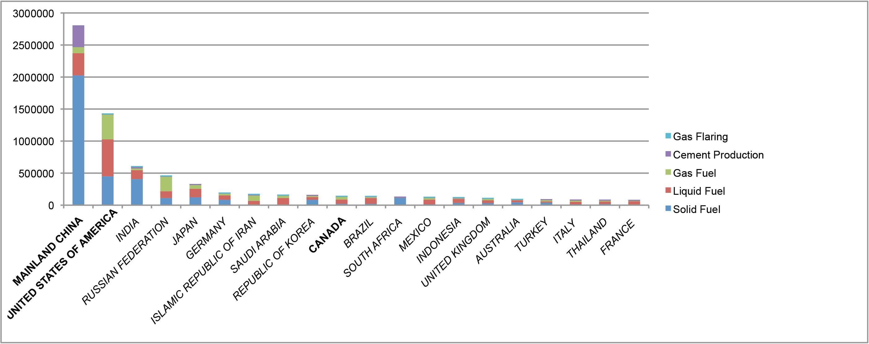
Top 20 Total CO2 Emissions
by Category in Thousand Metric Tons
 Full sized image here.
Top 20 Countries in the World with Greatest Per Capita Metric Tons of Carbon Dioxide
 Full sized image here.
Will China’s extreme commitment to carbon reduction influence the rest of the world, or will all countries need to become as polluted as parts of China are to enact strong climate policies? Only time will tell.
1960-2014: Canada, USA, and China Total CO2 Emissions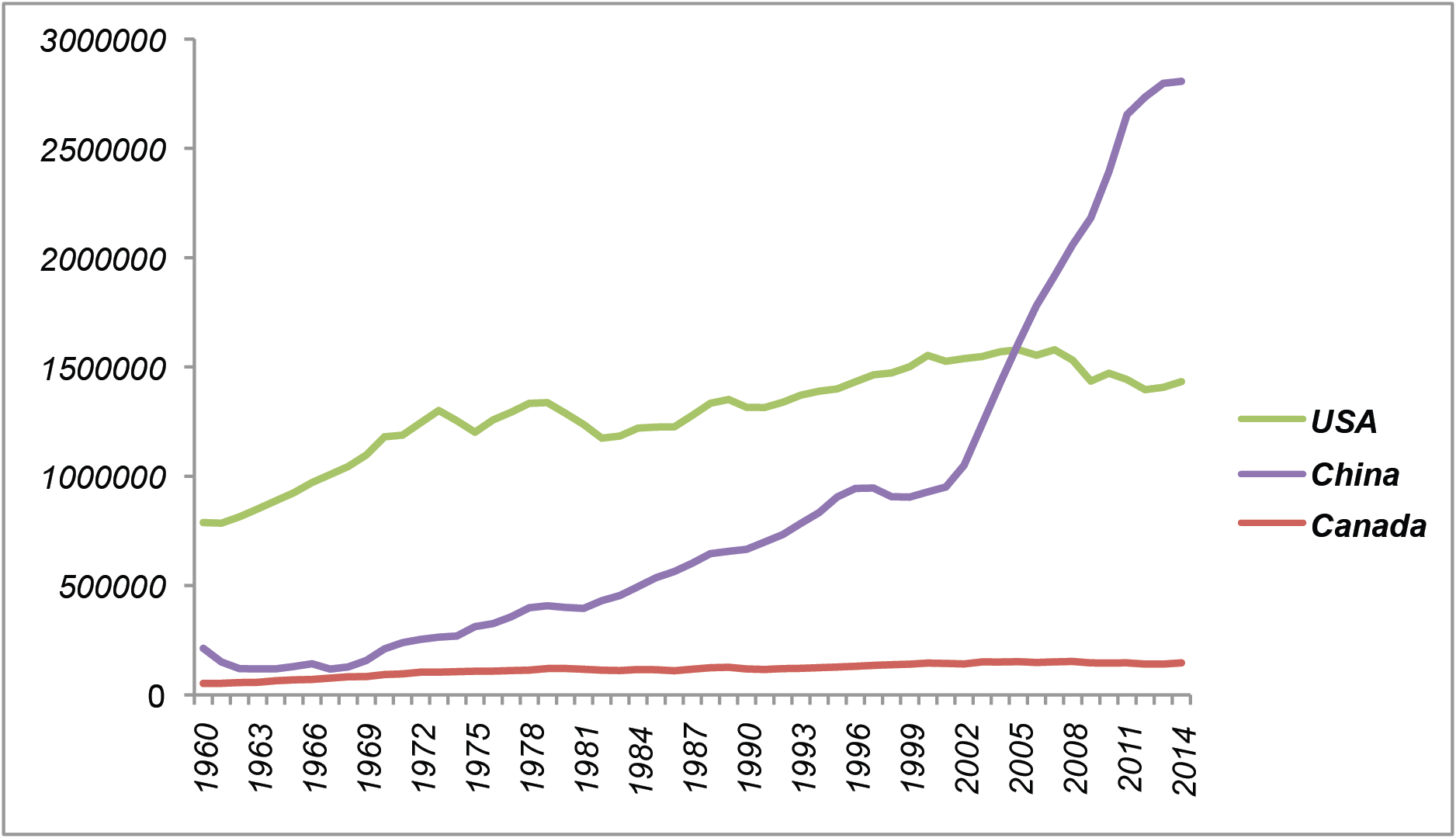
Full sized image here.
The full infographic can be found below, or by link here.
Source: http://cdiac.ess-dive.lbl.gov/
Scale of maps: 1:20 000 000
Projection of maps: Robinson
North graticule: regular, pointing up
Data classification: Natural Breaks, manually sorted