Google My Maps Component
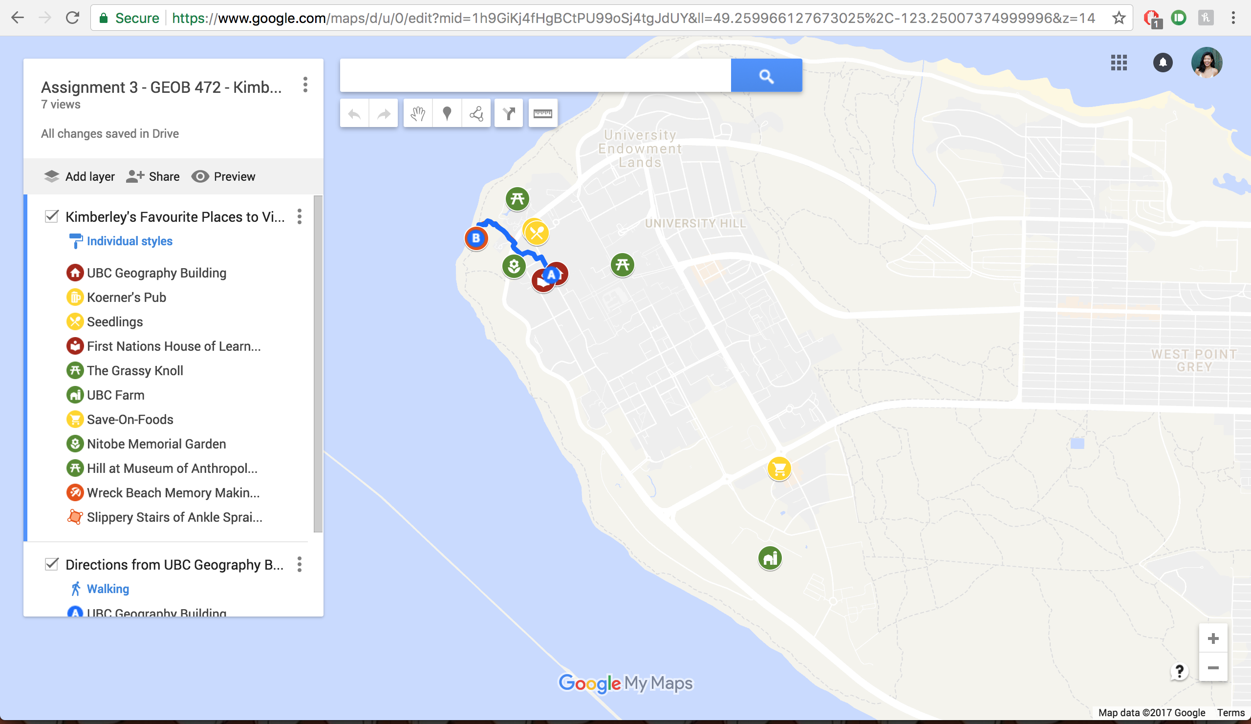
The link to my Google My Maps map can be found here.
The above map, made on Google My Maps, was created with lived experience studying, walking, and living on the UBC Campus throughout the past five years. I started by looking through my photos, also on a Google app (Google Photos), that geotags every photo I take. I searched photos from the University of British Columbia to jog my memory of places on campus that are of significance for me. Most of the pictures I took were of beautiful landscapes, food spots, or celebrations, so my map is indicative of those series of events. I created points for ten of my favourite spots on one layer, colour coded by landscape/nature points (olive green), restaurants or cafes points (yellow), academic learning points (dark burgundy), and points for pleasure (orange).
I realized that the standard and current base map that was being used was too polluted with other points, so I changed the base map to accommodate my personal points on the page, to make them stand out more. After that, I created my polygon, outlining an outdoor staircase, leading to an area of interest, my Wreck Beach spot.
CARTO Component
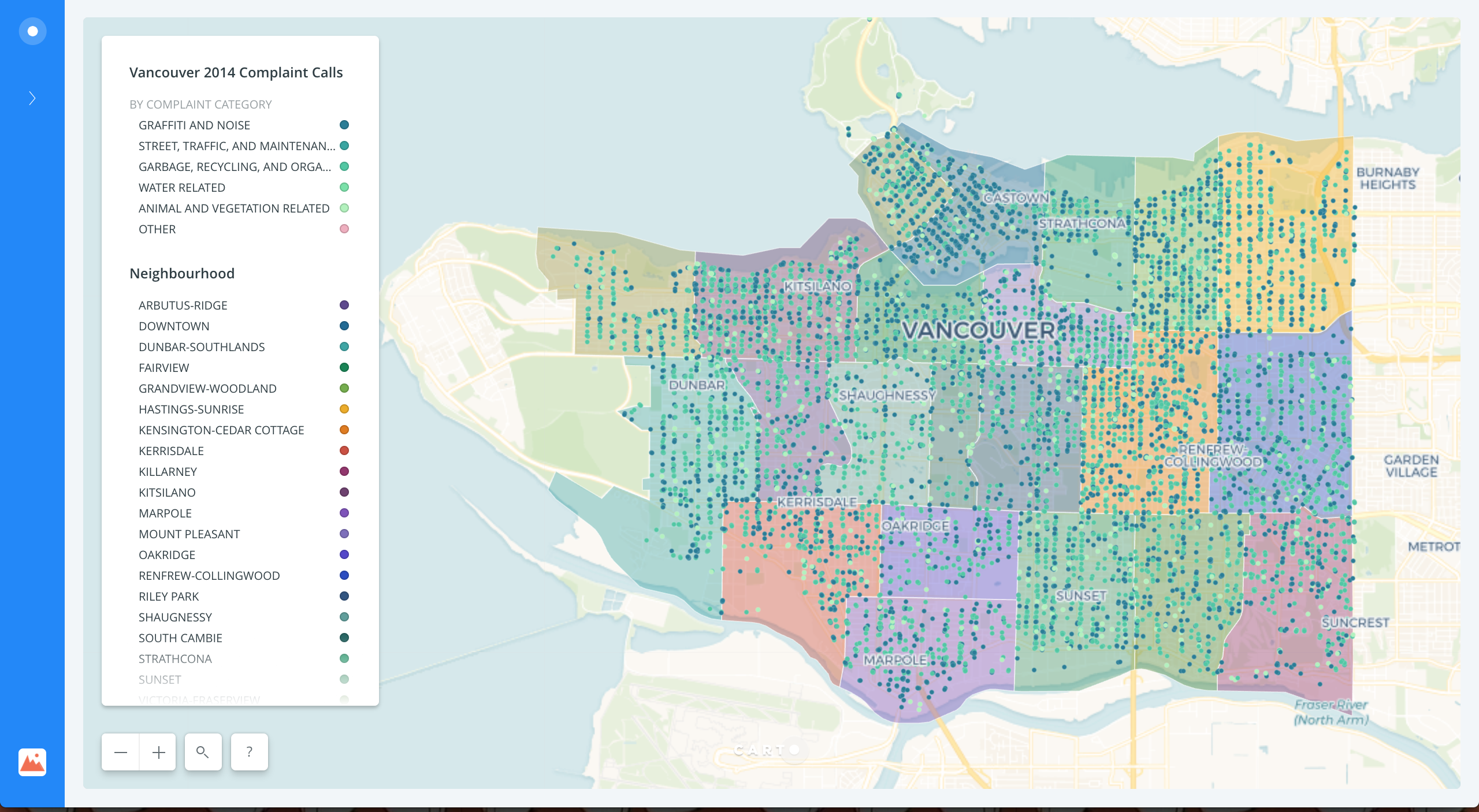
The link to my CARTO map can be found here.
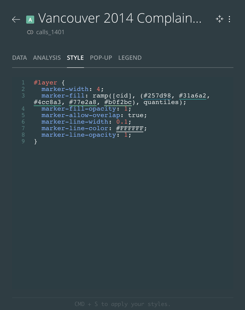
In comparison to Assignment 2 (Carbon Emissions Infographic), I found CARTO more generally aesthetically pleasing for a map user to see and use, but harder for a cartographer to create. The HTML skills that I have acquired in order to rearrange the legend, the marks, and the polygons were necessary, but hard to overcome. For example, I had to individually enter the colour codes and neighbourhoods to accommodate the grey polygons that originally showed up as any neighbourhood past Kitsilano, which required some basic understanding of HTML, and a little bit of debugging.
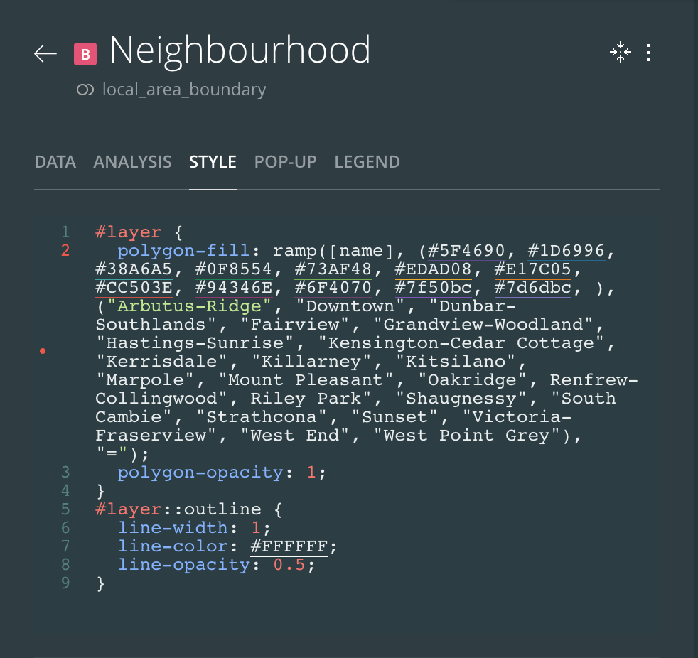
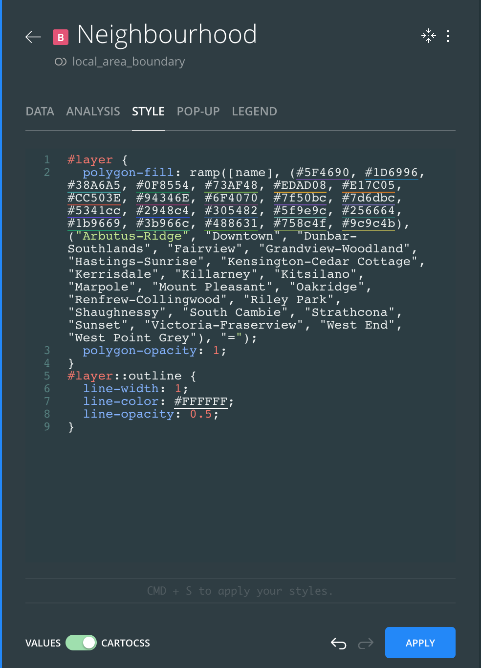
I also had to input another line of code into the calls_1401 style section to allow for the legend and colours of the marks to align, as shown below.
Opposed to the static infographic from Assignment 2, CARTO is able to allow the user to zoom into the different areas shown on the map, which allows for more detail to be present. In the static map, insets were quite useful, but could sometimes take up too much space or be hard to set lower in the visual hierarchy.
Both methods required sourcing information from other sites or people, and took a long time, but Adobe Illustrator is a more intuitive program to use than CARTO is, given the restraints that CARTO has in creating interactive maps with large datasets. This is a major limitation to most people.
From a user experience perspective, CARTO is much more fun to use. The action of being able to choose what one sees and to toggle from each category could be very useful, but the simplicity of a static map is also good for those who are less technologically savvy, or who need to print their maps for other purposes.