Data Visualization
Representing knowledge and information visually holds interest for me in every subject. Large data visualizations, like those found in the MIT SENSEable City Labs help us to understand large data sets in a way that is more comprehensible. I particularly found that the health visualization where they inputted and cross-referenced health problem connections from numerous personal health files in the United States allows us to see connections that we might have missed otherwise when dealing with the sheer volume of files involved. The interactive data object allows one to see connections between various categories of health problems, specific problems, and their relationship to each other, also divided by gender. The information becomes more meaningful in this visual form. Likewise, visualization methods in mathematics also allows students to develop a deeper understanding of concepts as opposed to a memorized computational process that is quickly forgotten. Computer simulations and visually-oriented applications, like Geometer’s Sketchpad and NetLogos, help students to see formulas and data in a different way that elicits understanding.
According to Finkelstein et. al. (2010), “properly designed simulations used in the right contexts can be more effective educational tools that real laboratory equipment” (pg. 1). In their study that focused on the impact of using computer simulations instead of real lab equipment in physics labs, the students were to “develop an understanding of simple circuits…, to develop the skills associated with connecting light bulbs, resistors, and wires in various combinations, and to collect data and make arguments about these circuits’ behaviors” (pg. 2). They found that the students who used the virtual equipment “performed better on conceptual questions related to simple circuits, and developed a greater facility at manipulating real components” (pg. 7). They also took less time to complete their circuit-building exercises. Thus, it’s possible that a simulation can actually result in faster, lasting understanding under the right circumstances.
Sinclair and Jackiw (2010) explore modeling practices with the application The Geometer’s Sketchpad which is a mathematical modeling program that can be used for a great many purposes, for example, geometry, algebra, graphing and physics. They seek to establish real-world referents to demonstrate that math is rooted in our physical environment. What appears to be isolated numbers and symbols on a page becomes a visual representation with greater meaning.
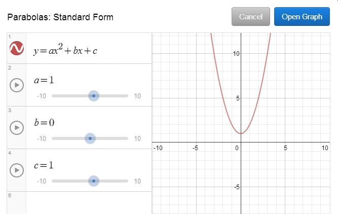
The Desmos site contains a quadratic graph where a person can experiment with the equation or graph and see the relationship between them. I have found such visualizations for linear, quadratic, and exponential equations to be very useful with students. They learn the relationship between the variables and the shape and position of the object faster and greater confidence. I find that Geometer’s Sketchpad is overwhelming with options that I don’t quite understand, so I would have to play with it more to be able to use it effectively with students; training on this application would be helpful. Desmos though is more straightforward and allows for exploration in a T-GEM cycle format with the right questions to guide their exploration.
References:
Finkelstein, N. D., Adams, W. K., Keller, C. J., Kohl, P. B., Perkins, K. K., Podolefsky, N. S., and Reid, S. (2005). When learning about the real world is better done virtually: A study of substituting computer simulations for laboratory equipment. The American Physical Society, 010103, pp. 1-8.
Sinclair, N. and Jackiw, N. (2010). Modeling Practices with The Geometer’s Sketchpad [Chapter 47], from R. Lesh et. al. (eds.), Modeling Students’ Mathematical Modeling Competencies. Springer Science+Business Media, pp. 541-554. DOI 10.1007/978-1-4419-0561-1_47