


Writing by hand:
Normally, I do all of my writing by typing. When I do use my hands to write, it is typically because I am writing a short note or list, or I am using my stylus on my iPad to write on the TV in my classroom. As a math teacher, this tends to be numeric and symbol based. As such, I found this task horrendously difficult. This was exacerbated by the fact that I am moving this week and no longer have a desk/table/ writing surface so I have set up a makeshift camp on the floor with an upside down bin. When I encountered errors in my writing, I crossed them out, added words in with little arrows or used arrows to indicate words were to be switched. If I was really determined, I could’ve opted for some white-out, but I certainly wasn’t about to head to a store to purchase some or bother ransacking a packed box to look for it. The most obvious benefit of mechanized writing is the legibility that is gained with uniform letters, and then the speed benefits. I’m a fairly sloppy typer, but I am significantly worse at writing. Some other added benefits- spell check, grammar check, editing and the wide array of stylistic choices available. I have one “font” available by hand and it is barely legible. Which reminds me of a quote from the podcasts… “if the book cannot covey information, if the book is mute, what does that say? […] a communication has to take place for this to really be media” 30:13.
Writing by potatoes:
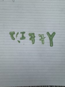
It is a little unclear, but my word is “Jiffy”. I’ll start by acknowledging a few oversights and errors I made.
- I forgot to reverse the letters
- I re-used a letter
- I only did it once
I have however included an image indicating the circumstances under which I am performing these tasks so I think that certainly, the effort was there. Creating the stamps was arduous to say the least, but I did improve with each successive potato. Likely the only intelligent thing I did during the task was utilize my time wisely and listening to the podcast whilst whittling a spud. The curvature required for some of the letters was very difficult, so my J looks like a T and this is how I sustained an injury. There is no consistency in the sizing, so the appearance of the word is a little off putting, it gives the impression of the work of a small child. The ratio of effort to output for this task was horrendous, and I would never dream of replicating it again. I do see the benefit of using potato stamps in an art setting, I’ll consider this if I ever find myself teaching art. I was amazed at how slow and difficult the process to use the letter press was, and even more amazed that there is in fact, a slower way to do it.
Hi Katy,
I wanted to respond to your post as I also decided to try potato printing for this task. Like you, I was initially unaware of the need to carve out the reflection of the letters. Luckily, I learned that after my first potato, so was able to correct that mistake early on. “Jiffy” is a great word choice, it made me curious about why you chose it!
Your point about the effort to output ratio required for this task was spot on. I found it quite eye-opening. It made me think about how under appreciated the art of printing is. In many ways that craftsmanship has been lost, but also, it sort of had to be.
I also enjoyed reading your thoughts on manual scripts. I did not do this exercise, so appreciated your take on the experience. Like you, I also appreciate the benefits of mechanized text over handwriting, especially when it comes to legibility. When I write by hand at work, particularly when jotting down clinical comments for students, it often ends up being pretty unreadable, especially if I’m writing quickly—which is usually the case. This can certainly be a burden for the person trying to read it.
I also value the speed of typing and the ability to easily edit. Since I’m not a natural writer, my process usually involves first getting my thoughts down on paper and then doing a lot of editing. I can’t even imagine what that messy process would look like on paper—it wouldn’t be pretty!
After reading your post, I started thinking about the benefits of handwriting compared to mechanized forms of text. Here are a few I came up with:
Accessibility: My kids don’t have phones or computers yet, so they use pen and paper more often than I do. Handwriting doesn’t need technology or electricity to work.
Personalization: Handwriting shows individual personality and style, which can get lost in typed text.
Versatility: Pen and paper allow for “the extras” like doodling, sketching, side notes, and arrows, which digital tools might not easily replicate.
I’m not sure if you would agree or can think of other points — it was a challenging exercise. (There must be more than this – right?)
I really enjoyed your post (your honesty and humor are appreciated).
Thanks
Steph
Hi Katy,
I loved seeing your potato printing! It made me realize how often I use stamps in my classroom without considering the need to create a mirror image. You did a great job creating your own potato stamps. While I’ve made stamps with Styrofoam, cardboard and apples before, making lettering is something I’d need to practice.
Your point about the effort-to-output ratio is spot on, and I chuckled at your remark about it being comparable to the work of a small child. What seems simple can indeed be quite tedious but carving out letters sounds like it would be a major challenge with 6-year-olds!
Printmaking is something I’ve done before but I tend to forget how time-consuming they can be. Nowadays, we can photocopy sheets of paper filled with text in seconds, but printing newspapers with traditional presses used to take hours or days! When I’ve done printmaking with kids using styrofoam or cardboard, it didn’t feel as tedious as carving out letters. Do you think this is because there’s more margin for error with other materials, whereas carving letters requires precision? You’ve also highlighted the importance of consistency in size in hand lettering, but do you think cursive writing would require the same level of precision, or is there room for a bit more flexibility?