Task completed using Voyager’s Golden Record Curation Quiz Data
The Process
This task was challenging for me. Having no prior knowledge in statistical data and network visualization, I wasn’t sure how to use or read the results given in Palladio. The Systems Innovations videos (2015) were helpful in giving me a bare bones introductory level understanding of nodes, edges, the network connectivity and visualization of data. Stages in my learning process included a basic understanding of:
- Nodes, edges, connectivity, undirected graphs, etc.
- Palladio
- downloading .json data
- network visualization
- making new attempts at regenerating graphs in Palladio and changing the results by concentrating on weighting nodes, changing facets, etc.
- reflecting on my new basic understanding of how Palladio works and the information it can provide
What I was able to understand was that the assignment’s data is demonstrated as vertices (nodes) and edges (relationship of 2 nodes) resulting in an undirected graph. The more connected a node, the more connectivity it has on the graph. Through trial and error with Palladio, I began to change some of the parametres of the data (target, source, etc.). Although I don’t understand all the functions, I do understand the significance of data to stakeholders in obtaining information that can be used for gaining information for a set purpose, or for decision-making if that’s the end goal.
The Data
The first geodesic graph that appeared was difficult for me to grasp. It appeared “jumbled” and “static” (screenshot #1).
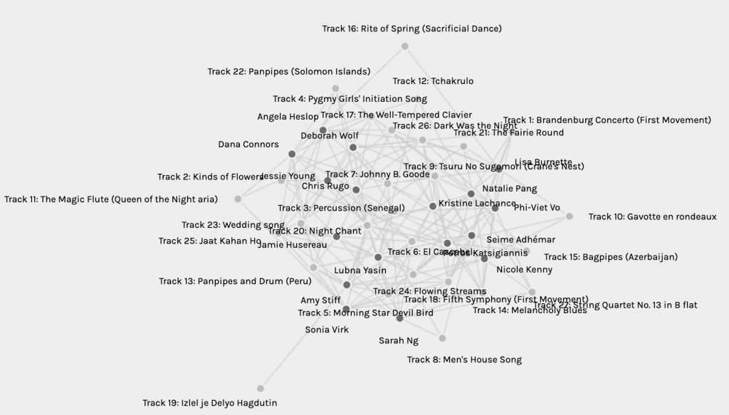
I searched for my name to see if I could make any sense from it — I couldn’t. Once I played with the facets, I determined that I was in modularity class network #1 with Deborah and Chris. I cannot clearly understand why we were grouped since I don’t see more commonalities in our song choices over that of any other participants.
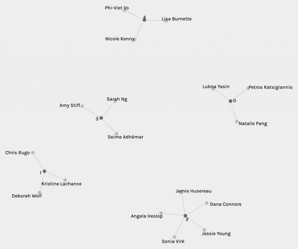
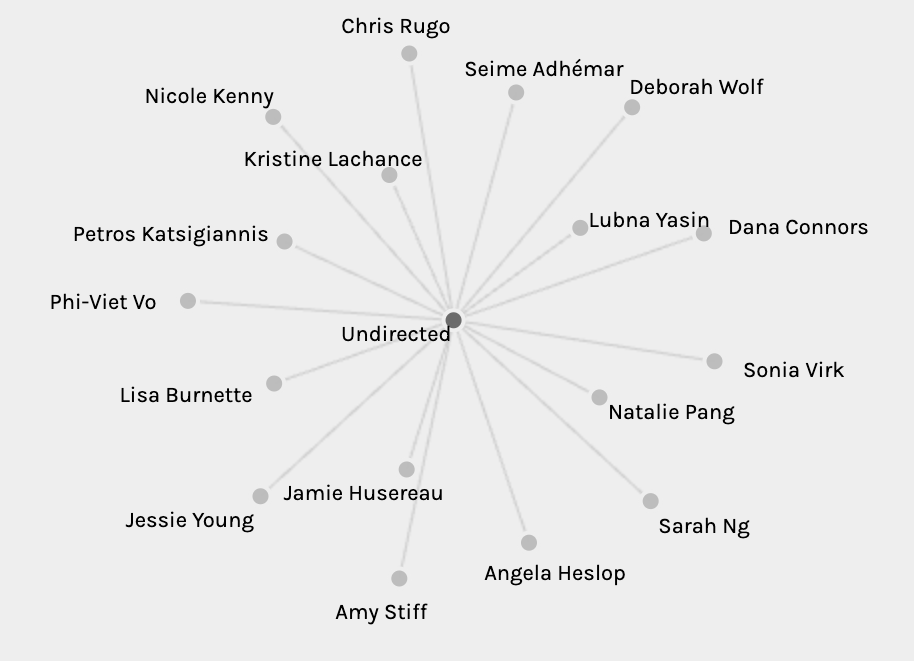
From the data, I think I’ve determined some basic structures. Each participant is a “source” and each song is a “target”. By choosing just the target the data shares which/how many participants chose specific songs. “Size nodes” provides a dot visualization that indicates how often a track was selected based on the size of the dot (screenshot #4). Data indicates that Track 20 had the highest selections, while Track 19 had the fewest selections with only 1 participant (Lubna Yasin) in Group 3. In #1 screen shot, it’s clear that Track 19 is only connected to Lubna.

In terms of the null choices (missing or unknown), I would think that without further data this cannot be interpreted with the current data. It would require additional information from and about the participants. There’s no sufficient information on why I chose certain songs over others.
Reflection
I would suggest that there’s not enough data to determine why any given participant chose a specific curation of songs. This would require additional criteria such as the use of a questionnaire to compile data on reasons for song choices. Since all participants for Task 8 were given an established list of songs, the data results are limited in that the data cannot make assumptions about participants’ behaviour or interests. The information collected is not driven by our internet search habits or social media “likes”, making it difficult to make any inferences, which may result in misinterpretations. Code.org (2017) video points out that, “Our interests, behaviours, activities change the relationship within the network constantly.” This is not evident in the information collected in this task.
Implications
The exercise of taking the Golden Record soundtrack provides an example, albeit benign, of how data can be collected. In terms of political implications, one might contemplate the purpose of the data collection. If this assignment were a real-life situation, we might consider who developed the question, and why. How might the collected data be used in a social or global context? In a real-life situation, the results could affect policy changes. Could the results affect the participants, the artists/songs, or the countries represented in some fashion? How might the data be manipulated? Based on the reason for collection, were the right questions being asked? Is the data being read and understood properly by those who are using it? Is there an ulterior motive for the collection?
Further Reflection
My husband and I run DJ’ing and karaoke services. We’ve been hosting weddings, family reunions, school graduations, company events, and fun dances for two decades in our community. For DJ’ing, we do our research and try to put together playlists that are representative of the attending demographic. This includes an initial interview with the organizer to discuss specific songs, styles, and genres to be included. Palladio could be a helpful tool for compiling a geodesic graph. Through observation, for example, by inputting specific nodes into the system (i.e. demographic of event crowd, song titles, artists, which songs had the most/least crowd approval), Palladio could target songs to specific demographic. The data could assist in creating improved playlists. Over time songs could be removed or added to develop a new graph so that the playlists remains current.
References
Code.org. (June 13, 2017). The Internet: How search works. Links to an external site. [Video]. YouTube.
Maslin, M. (November 22, 2019). The beautifully macabre cartoons of Gahan Wilson. The New Yorker. Retrieved from https://www.newyorker.com/culture/postscript/the-beautifully-macabre-cartoons-of-gahan-wilson
Music from Earth. (n.d.). NASA. Retrieved from https://voyager.jpl.nasa.gov/golden-record/whats-on-the-record/music/
Palladio. (n.d.). Retrieved from https://hdlab.stanford.edu/palladio-app/#/upload
Systems Innovation. (April 18, 2015). Graph theory overview. Links to an external site. [Video]. YouTube.
Systems Innovation. (April 19, 2015). Network connections. Links to an external site. [Video]. YouTube.
deb22
March 19, 2023 — 2:45 pm
Hi Kristine,
I can very much relate to your struggles with the data visualization! I found the same thing. It took me a long time to figure it all out, and once I did, I discovered the very same things you did in terms of the context of the choices. I’m curious about your experiences with DJ’ing. Do you find that the music choices vary greatly between demographics or all they similar in terms of being Canadian, similar socioeconomic status, popular music choices based on age, etc. Do you find differences in terms of cultural or religious affiliations influencing music selection? I enjoyed reading your post! 🙂
jazz101
March 20, 2023 — 2:57 pm
Hi Deb, thanks for the response to my post. In terms of DJ’ing and demographics, yes there is a need to be particular and aware of what a group will want to listen to. We’ve had weddings where all they want to hear is new country music; Grade 7 dances where you can play some 80s/90s, but mostly current dance music (minus explicit lyrics). You also run into evenings where you need two playlists (one for background dinner music where people want to hear songs that don’t limit their social time, and then later in the evening a playlist when dancing is the goal). I find in general if you can find songs that people relate to and are familiar with, music can span generations, geographies, etc. To date, we haven’t had any specific experience with religious affiliations asking to hire us, although situation would be the same. Ensuring you know in advance what might appeal to a demographic is key and needs to be considered. You don’t want to be the DJ or the band that only plays the stuff you like and ignores the requests of those who have hired you. My husband and I also hosted karaoke for many years, and we play live gigs. The same applies. If you put on a good show, people will have fun and have you back. When we play live, it can be more difficult because, although we play a wide variety of artists and genres, we can only play what we’ve rehearsed. Again, knowing our demographic makes it easier to rehearse songs that you hope will be appreciated.
Sarah Ng
March 19, 2023 — 6:05 pm
Hi Kristine,
Thank you for your insight on the data that we all contributed. I also found that the data set was hard to interpret, and even with the various filters, I’m unsure if my assumptions or lack of assumptions are correct. By the end of the assignment, I came to the same conclusion as you – I’m not able to make any conclusions as to why we picked the songs that we picked or why we didn’t pick the other songs. Looking at the world-wide-web, could the data set be altered to show favouritizm or de-fame someone?
jazz101
March 20, 2023 — 3:01 pm
Sarah, thank you for posting a response. It would take a lot more digging and more information from each of us participants to have some idea about our song choices. We’d learn a lot more about each other personally since music can be very personal and can help make connections to others.