Link 6: Task 10 Attention Economy
Linked to Brian Leavitt
 Linked to
Task Review
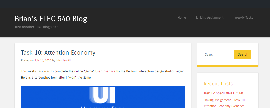
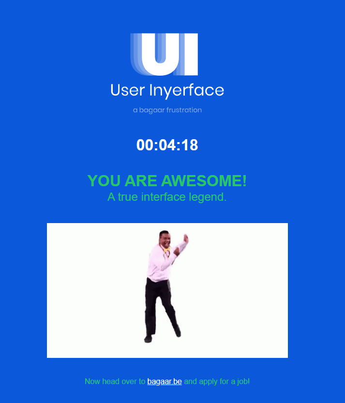
The varied responses to the week 10 task were shocking to me. I made a point in the beginning of the course to not “peek” at other posts until I post my own so that different perceptions will not influence me. This week was no exception. The task itself asked for a screenshot of the completed game.
To meet the requirements, you were required to include a picture. I wanted to go a step further. I enjoyed the game for what it was, an exhibition of the evolution of UI/UX design. There was an assumption that my fellow MET colleagues would realize this and see the frustrations as further proof of user interface design importance. A bagaar frustration was the tagline to this game and it forecasts what to expect throughout the experience accurately. The player is presented with a series of task that one would expect to complete when required to fill out an online form. Soon that player realizes that this experience is unlike any other and they must pay close attention not to allow their instincts to take control.
Reasoning
I chose to highlight Brian’s post on Attention Economy because of the detailed analysis of the game’s representations. This approach was opposite to my own. I looked at the task as a game and decided to share my musings throughout my time. I had just completed the week-long summer seminar on digital games and had two intensive writing code days. I was fortunate to have a coding partner who also found the humour when coding is buggy.
This humour followed me into my experience with task 10. Brian’s rationale for the game was very insightful. The critical analysis justified the challenges to a global audience. His descriptions of each game principle demonstrated his level of experience with UI/UX design. Instinctually, we know to look for the forward, back and home buttons on a webpage. We associate green with “Go” and red with “Stop.” When someone is trying to be creative, they still need to stick to the “rules” if you will. With my post, I wanted to share my humorous outbursts and joy through the frustrations.
I have since shared this game with other colleagues, as I feel it represents the importance of user interface.
User Interface Differences
Brian’s blog site is hosted on the UBC WordPress platform. His template is different than others in the course. His text on a white background is very similar to a book’s layout.
There is a top menu for easy navigation, and his home page is set up with a scrolling feed that displays the most recent post at the top. I believe this template is mobile friendly as it is center aligned and narrow. There is no “About Me” tab or post, and I go to Task 1 to gain more insight into Brian as a person. A recent comments block shows he has had many exchanges with our peers and is connected to the community. There are minimal images featured on this site. He is a strong communicator and does not need to rely on flare. This is different from my blog, where I have attempted to include multiple images, colour and headings. I spend my day at a computer, and it does limit my creativity, so I try to play within the constraints that I am given. Through other blogs, I have realized that playing outside the lines is accepted and sometimes can be very rewarding.