Juicy Couture 2012 Fall Campaign

Clothes were in dark tones with the leopard prints and patterned fur.

Leopard prints and the model’s pose portrayed wildness and fierceness.
The advertisements above are from the Juicy Couture 2012 Fall Campaign. The three of the posters portray the similar theme of wild and fierce. The leopard prints and dark tones in the clothing line has expanded Juicy’s reputation of just providing girly clothing lines.
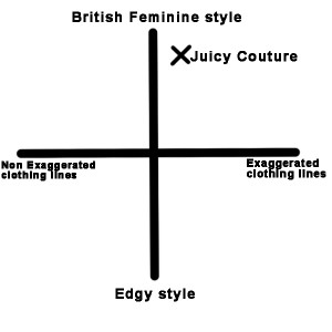
As shown above in the brand positioning map, Juicy Couture is a brand that provides British feminine styled clothing. The products are ready-to-wear without extreme exaggerations. They tailor preppy trends and provide back-to-school products for younger customers. Stores are also decorated with pink and golden colors to emphasize on the femininity that they promote. However, with this fall campaign, Juicy Couture is moving towards the bottom right quartile with increased exaggeration and a stronger edgy style. The leopard prints and dark tones reduced the princess styled femininity in previous seasonal collections. Juicy expanded its style without losing its branding as their signature heavy accessories remained consistent. This attracts a wider range of consumers with high disposable income. They are able to constantly diversify their product line to compete with other brands and also to tailor to unlimited consumer needs.

Leave a Reply