What a nightmare. It took me two playthroughs to complete User Inyerface! As if the timer and related pop-ups weren’t distracting enough while I tried to navigate this monstrosity, I kept getting system pop-ups for software-updates and for a canceled daily school-meeting. Oh, and I started getting strange Credit-Check emails and my AntiVirus alerted me of a possible Trojan at the same time.
Hopefully, that was all just a coincidence.
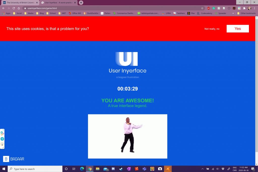
After dealing with all of that, I resumed User Inyerface a second time and progressed much more quickly (the first round was nearing nine minutes when I restarted my computer to deal with the possible Trojan). This is because I mostly entered gibberish into the text fields. The final “level” was by far the most dastardly and felt the most like it was INTENTIONALLY badly designed.
ways in which the GUI was designed to manipulate my attention and responses:
General Annoyances:
- The whole time, a bold timer ticks up near the top of the screen.
- At one minute intervals, the timer will trigger a pop-up.
- The button on the pop-up locks it in place, while the tiny “(c)lose 2020” will remove it.
- It has an X-like fullscreen button in the upper right corner.
- There is a repeating animation of 1-2-3-4 below the timer, whose constant cycling does not inform you of what page you are on.
- There is a small fraction above the page questions that reports your progress.
- In the bottom-right, there is a useless help-bot. The large button on it at least makes it disappear for a time.
On the very first screen, there a series of misdirecting signals to navigate to the next page:
- First you look the giant green button (it says “NO”).
- Then you look at the last words of the last line that are highlighted “next page”.
- That doesn’t work, so you click the underlined “click“.
- Finally, you click the wholly unremarkable “HERE” (which, additionally, does NOT change your cursor into a cursor/finger, as most links do).
On the second screen,
- You must remove the existing text from the text-fields.
- The email domain is a drop-down menu, which does not include .ca but does include file formats such as .jpg.
- It uses a checkbox for a negative-statement (opt-out) that is customarily written as a positive-statement (opt-in).
- The large blue button, normally a NEXT, is actually a CANCEL.
- When you do hit “Next” (which is an unobtrusive grey) the page may not respond…
- You need to read the password rules below. They are all in green, whether or not you match the criteria— that is, until you match them all, at which time a red (very hard to read on the blue background) line will appear saying that “your password is not unsafe”.
On the THIRD screen,
- You will first see an animated rendering-avatar image.
- There is a large blue button to download the avatar.
- Above it, in faded grey, is the “upload” link.
- It then asks you to choose 3 interests from a long list of all-checked items. The final one says “Unselect all”.
- The three items directly above this are “Cinnamon”, “Mullets”, and “Select all” (in order of clicking upwards from “Unselect all”).
- You can just make out the tops of the buttons at the bottom of the screen without scrolling. However, the right one (green) is “Cancel”, and the left (blue) is “Next”.
On the FOURTH screen,
- Textboxes intermixed with dropdowns
- The Country dropdown shows you the flags in black-and-white (they colourize when you mouse-over them), and does not list them alphabetically.
- Numbers that are tickers or badly-scaled sliders (e.g. 0-200 for age). You cannot just type in your answers.
- Your Age and Birthdate must match to progress
- For Gender, you are given binary Male/Female options. Also, clicking either will simply swap your choice. It uses the same blue/white as the rest of the page, making it difficult to identify which is actually selected.
The Final Level: CAPTCHA
- You will be asked to select images for a random theme (eg. glass)
- The theme always has multiple interpretations in English (eg. drinking glasses, eyeglasses, and panes of glass)
- You cannot immediately see the tick-boxes for the last row
- I don’t want to spoil it, but for the sake of stating how bad this design is: the slider on the right of the questions defaults to the bottom, you have to move it UP.
Our attention is precious. Whether it is on the physical or digital planes of our existence, we only have so much to spare.
My partner, who has been working “essential service” retail during the pandemic, laments that no one sees the signs they put up. They could have 30 brightly coloured messages on the front door and posted in other highly-visible messages, and yet people will still come to the till with cash in hand (only recently has the store begun to accept cash again).
My colleague’s students complained that they could not find the turn-in link on her website (it was always the giant pink text on the assignment page), while I had to train my own to press the light-blue “Turn In” button on Teams.
I too am prone to not seeing the tree for the forest. One of my most mortifying life experiences was when I accidentally budged into the line for a free day at the Vancouver Art Gallery; all I saw was a throng of people, I did not realize that the groups were actually forming a queue. (I very politely went to the back of the line once I was informed of my grievous error).
Design is critical. Bad design makes your audience (eg. students) check out before they spare a second glance. There are signals that have become a universal form of communicating online (see my notes on Page 1 and its breakdown of the hierarchy of attention), forming a kind of navigational literacy. Breaking from these standards has risks of confusion and attention-loss, and should be used with care.
I am so glad someone else found this an exercise in frustration. I went back 3 times before I solved it. I am still not sure how I got past the “terms of agreement box”. Did you attempt to request help? Your experience sounds slightly different than mine – I had not Trojans or popups and my reCapta boxese were click on the “bow” as in bowing people, bows in hair and hunting bows. Now I wonder what triggers the differences. I went back a 4th time to play within the game and am tempting to try a fifth. By offering a more difficult experience, they did draw our attention to how complacent we can become as we automatically click in agreement without reading fine print. If that was their aim, is it really a “bad design?
Hi Rebecca!
… I cheated on the last page. I got so frustrated trying to figure out where the hidden-row of checkboxes were. I did request help, though I suspected it would not go anywhere. I ended up watching a youtube walkthrough to figure out where the checkboxes were on the bows page (though I think my word was “glass”?) and kicked myself for not noticing the sidebar within the box (rather than the big one on the site).
You make a very good point. Their design was not bad… it was excellent. Excellent at encouraging frustration and highlighting how much design we take for granted.
Hi Laura,
I, too, hated this. I think you hit on the point of this – it is intentionally badly designed. Perhaps ‘badly designed’ is the wrong phrase – it is intentionally designed in a way to get you to quit or not complete it. While this is obviously a design we normally want to avoid, it makes me think about things that are designed in a ‘bad’ way intentionally. Terms of Service are a great example. While there has been a movement recently among some companies to try to make their T&Cs more user friendly, readable, and understandable, they are often seemingly written in a way to discourage people from reading them in their entirety. Do you think we need to mandate ‘good’ design, meaning good-intentioned design?
Hi Brian!
You make a great point about other things that are designed to make you disengage. I wish I could remember where I saw it… probably on some videogame update, but the T&C’s had a tl;dr section! What would have made it even better would be if they had linked the summary-points to their relevant sections in the main text.
I hope the world moves towards mandating good-intentional design. So much of our time is spent sifting through information, and a quick copy-paste of some of those T&C’s into something like the Hemingway App can reveal they are not written for the common reader. I just did a test with the T&C’s from VistaPrint, and HA graded it as post-graduate level writing! The amount of energy spent, not just in reading it, but in parsing out its meaning regarding your information and intellectual property, will cause most people to blindly accept without reading.