Hello Network, my old friend
I can connect with you again,
Because our new modem has arrived.
After that lightning strike our house survived!
(Please excuse my terrible parody. I’m just very excited to be back online after two weeks untethered!)
I was boggled when I first saw the cats-cradle of a network that our music choices formed on Palladio. I spent a while experimenting, to get a feel for what I was looking at. Tugging on nodes, switching the data targets and sources, narrowing things down to just one track and its connections, etc. Every time I thought I had figured it out, I found something new that unraveled my understanding of how our data was interconnected.
tl;Dr, please
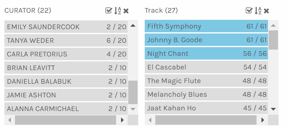
My first observation was that my closest neighbours were Jamie and Linda! I wasn’t very surprised by this, as we have overlapped ideas before.
And then I wondered who I was furthest from— Tyler! I limited the map to just the two of us and found that, even though we were as far apart as we could be, we still had one song in common (The Magic Flute). Closer inspection revealed that several of his songs were ones that I enjoyed; chief among them the bagpipes, which I was sorely disappointed did not fit my criteria. I tinkered some more and found that everyone is connected by the three most-picked songs. So much for six degrees of separation!
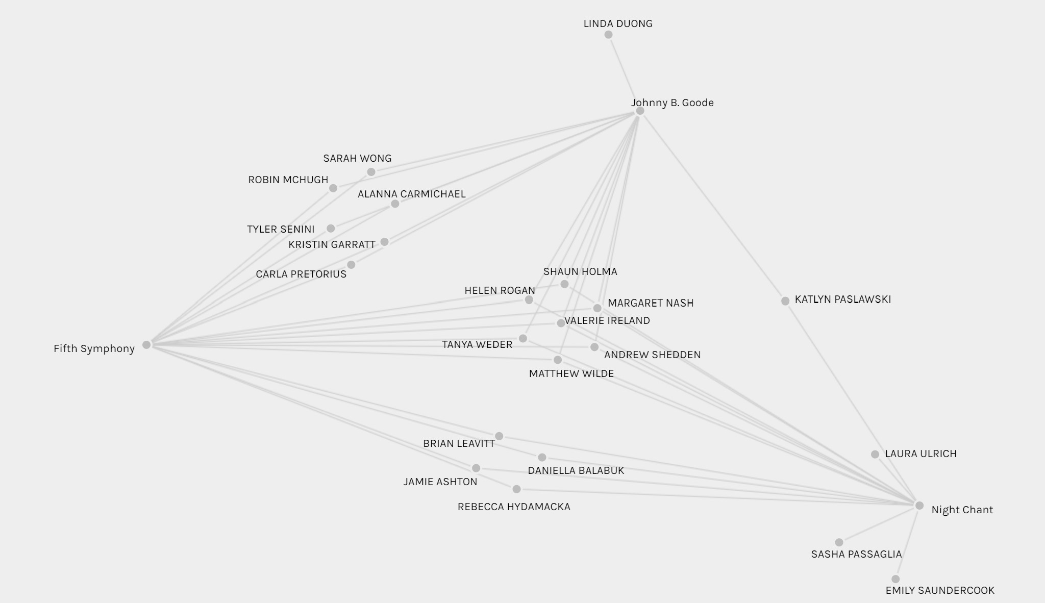
I reset the map back to normal, and my eyes trailed up to that outlying path near my name, leading up to the Men’s House Song. I wondered how that track could be anywhere near me. When I was curating, I put two songs on my blacklist, my definitive discards, my absolute no-ways. This was one of them. The other was Rite of Spring (a song that sent me back twenty-five years to a childhood nightmare). Rite of Spring was across the map from my node; its distance may have made me think the null-data had somehow been revealed.
How, then, was the Men’s House Song so close? Only one person, Daniella, chose it. On her blog, she describes it as “whimsical, fun, and energized”, which… I agree with. Admittedly, my reasons for vetoing it were biased by feminism (the irony that I chose the Pygmy Girls‘ Initiation Song is not lost on me— perhaps I should have included the other for balance). Turns out, Daniella and I have six songs in common (which is more than I share with Jamie or Linda!)
In fact, the person I have most in common with is Brian (seven songs) who is even further from me on the map than Daniella.
If I have more in common with Brian than anyone else in the class (closely followed by Daniella, Sasha, and Tanya) why do we have three other people between us on the map? If this were a visualization of our political leanings, I would assume based on what I see that Jamie and I have the most values in common.
Perhaps as a whole, we had more in common than other groups? I had noticed that we curators seemed to clump together, separated by the tracks on the map. Below, you can see the three “neighbourhoods” circled in purple.
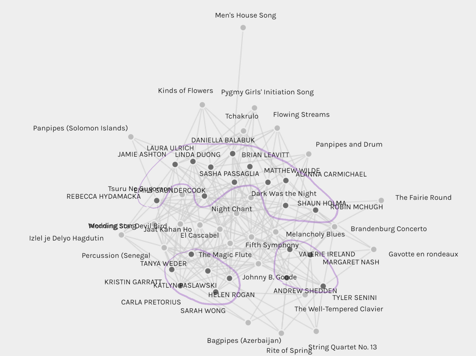
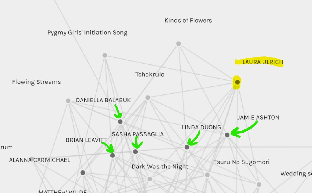
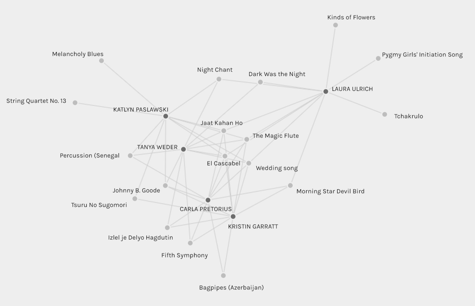
I set the view to only include those in my own neighbourhood. Other than a few outlying tracks (Daniella: Men’s House Song; Robin: Bagpipes; and Shaun: The Fairie Round) our choices overlap. Below is what I saw when I limited my view to just myself and those in a different neighbourhood. They form a tight-knit group, with a lot of overlap and only three outlying tracks amongst them.
What about the songs themselves? Did the visualization sort them into neighbourhoods as well? I highlighted a screenshot with the most binary criteria I could think of: European or Everywhere-Else. You can see this below. Blue marks European songs (and Settler-American), while Yellow highlights all others.
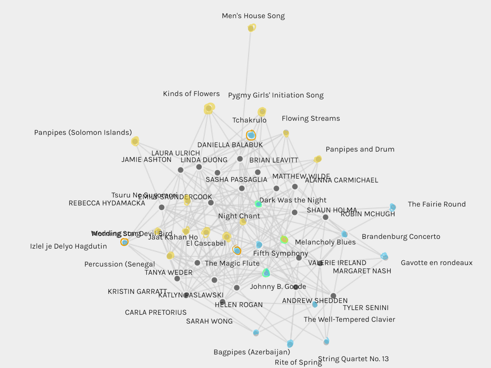
Interestingly, the instrumental-European songs are all clearly grouped together, on the periphery of the map. This suggests that they were not commonly selected— or rather, we curators limited our choices to only one or two of them, with the exceptions being Tyler and Andrew who are sitting in the heart of this Western Empire.
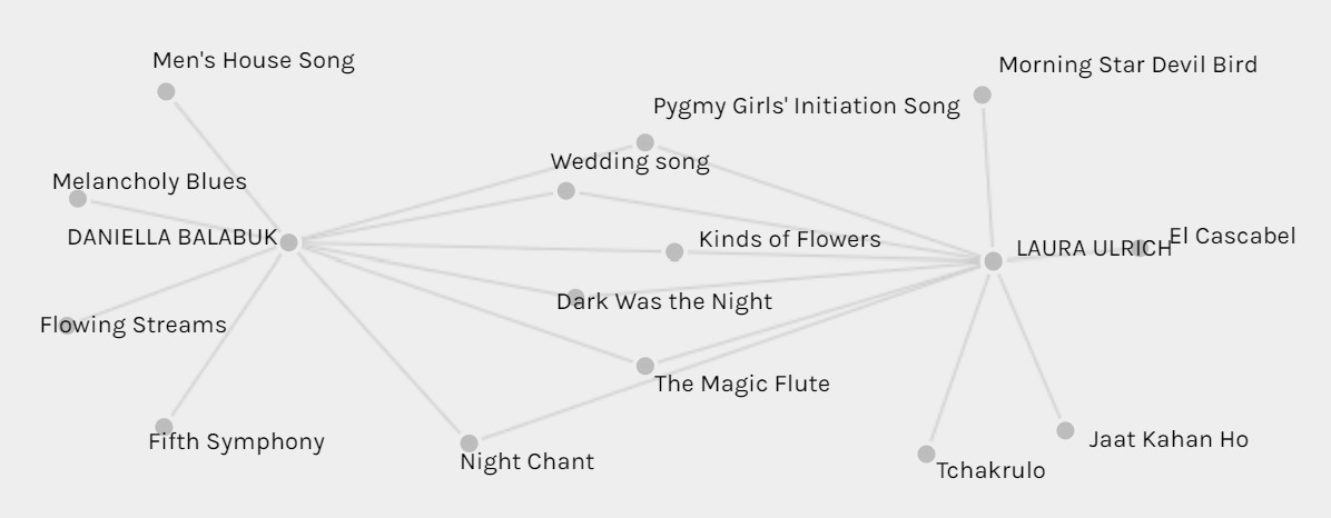
You may have noticed that I marked some songs with rings. This was me hedging my binary-criteria. While Izlel he Delyo Hagdutin, Tchakrulo, and The Magic Flute (which are sung in Bulgarian, Georgian, and German respectively) are European (Georgia is technically Eurasian), they are distinctly different from the rest of the selection. Similarly, Dark Was the Night, Melancholy Blues, and Johnny B. Goode are all Settler-American, which again is a class onto its own. I found two things intriguing here. First, that the Izlel he Delyo Hagdutin and Tchakrulo are deeply entrenched in the Everywhere-Else ranks, suggesting that their uncommon languages make them more Worldly. And second, that the American songs all sit along the border between the two musical neighborhoods (including Night Chant and El Cascabel).
tl;dr
- Those closest to me are not the ones I have most in common with.
- We are all connected through the top-three songs.
- One of my vetoed songs were near me on the map, because I otherwise had many songs in common with the person who picked it.
- The map clusters Curators into “neighbourhoods”, which generally have more in common with each other than with those from other neighbourhoods.
- The map also clustered instrumental-European songs together. Interestingly, American songs formed the boundary between these and music from Everywhere-Else.
In Conclusion…
The visualization is a curious enigma. It is not easy to comprehend; it must be manipulated and annotated to tease out the underlying patterns. To take it at face-value could lead to shallow or utter misunderstandings about the choices we made.
The visualization lacks any background behind our individual choices. There is no data showing if choices were based on qualitative or quantitative criteria. There is no influence from null relationships, specifically no repulsion between curators and the songs that they vetoed (if any).
The visualization leads me to assume that I have more in common with our closest neighbours, though further investigation shows this may not be the case. I assume that shared songs were selected for shared reasons, though there is no data here to support this. For instance, I assume that the band of curators in the center of the Everywhere-Else neighbourhood were, like me, focused on global representation, while those in the Instrumental-European neighbourhood were more considerate of aliens who may not hear as we do.
The visualization can be misinterpreted. Names sometimes cross-over unrelated nodes, making it difficult to read. By toggling the size-node option, the nodes scale very differently depending on whether they are set to size according to “number of untitled” or “sum of group/weight”. With the latter setting, for example, I can make it appear like Group 5 (Sarah, Kristin, and myself) have far more clout than the members of Groups 1-3 (our size, it would seem, directly relates to our group number). I find the lack of repulsive weighting to create an interesting effect; if this were a map of political values, it would create an impression that one’s proximity to a particular value reflected a penchant for it, even if that was a value they would vote against.
Like most texts, data visualizations need to be viewed with a critical mind. To take them at face-value may lead to reading what you want to read. It could make you miss-identify like-minded individuals, and it could hide the common links between you and those who seem your polar-opposite. By making a visualization interactive, like Palladio does, it helps us pick at the threads that bind us all together.
*waves back*
Hey Laura,
I thought this was really cool. I had never even considered a neighbourhood analysis, mostly just assuming that dot placement was random!
I loved reading through this, and found that you highlighted some NB points (again, more succinctly and beautifully than my amblerants of writing) including:
critical minds
Visualisations being enigmas
The lack of quantitative vs qualitative distinctions
Potential misinterpretations and assumptions
As usual, walking away from this feeling like I now have a richer understanding than before. Thank youuuu 🙂
Hi Jamie!!
You’re very welcome 🙂 I was really just reaching for anything that could make sense of that tangled web!