
I realized that I’ve put a self-imposed constraint on my blog organization (i.e., use of categories and calling the tasks “Task #”). Because of this, I can’t post Task 10 or 11 until I do task 9.
I noticed that our class’ RSS feed doesn’t offer a nice hierarchy and because my naming conventions often use numbers, it might be overwhelming for others to comb through many posts to find what they want.
July 12, 2020
I think I got out of my rut. This is the bottom half of my infographic:
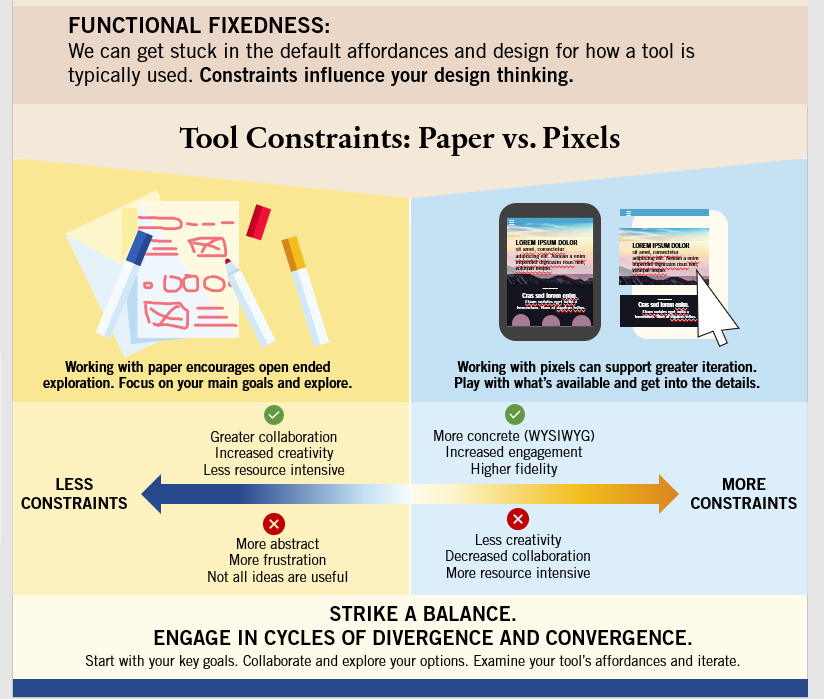
It was super fun to draw these things in PowerPoint. I’m also happy with the colour contrast.
I’ll likely have to go back and forth with this because I want to put my references directly on the infographic. I know some people do a “cheat” where they embed a link or a QR code, but I don’t like it. I’d rather people be able to directly read the references rather than take an extra step to get relevant information.
July 11, 2020
I don’t think I’ve made much progress. I made some cosmetic changes but am really struggling with the rest of the infographic. I need to go back and flesh out my content before returning to PowerPoint.
July 5, 2020
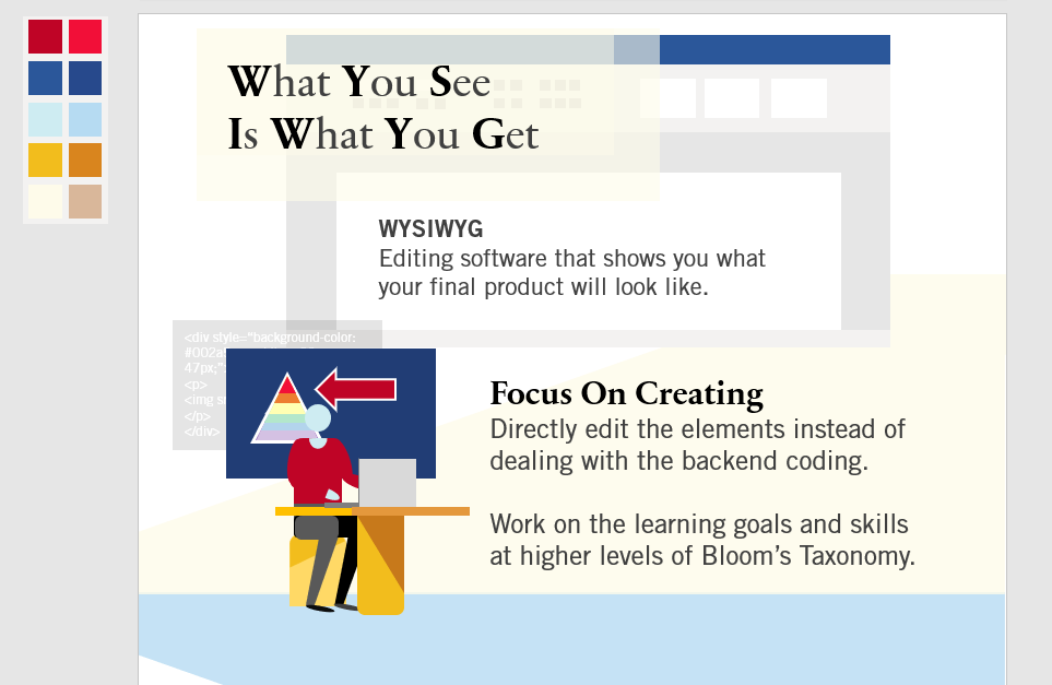
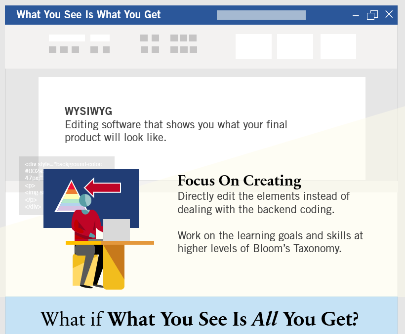
I’ve chosen to examine WYSIWYG (What You See Is What You Get) and will examine the role of constraints on the design process.
Commentary
Tools:
- PowerPoint 365
- I’m going to “draw” everything in PowerPoint. Yes, it did include that person and all my unusual polygons. Part of this is the point of my WYSIWYG exploration and how users are unaware of tools beyond the default
- Adobe Color to create a colour palette
- I normally use a navy blue, teal, red, yellow, light blue (#e6f2f7), and light blueish gray (#f1f3f5) for everything, but have decided to deviate from this
- I really want to challenge myself to use better colour contrast
Font Pairing
I’m noticing that my constant use of Articulate Rise has made me build with a sans-serif and serif font. I’ve started to picture things in Merriweather and Lato (oops!).
In this case, I’m using Sabon Next LT and Trade Gothic LT Std. A similar pairing and I frequently use Trade Gothic at work.
Observations
I’ve been sketching a lot and have noticed that my infographic work reminds me of a website (a very long scroll) so there are similar design elements. I decided to pause with my current work because I don’t have a lot of space left.
I really need to re-think the “meat” of the content and how to present it. I think I have enough space left, but need to consider where I’ll put the references and how to format embedded citations if at all.