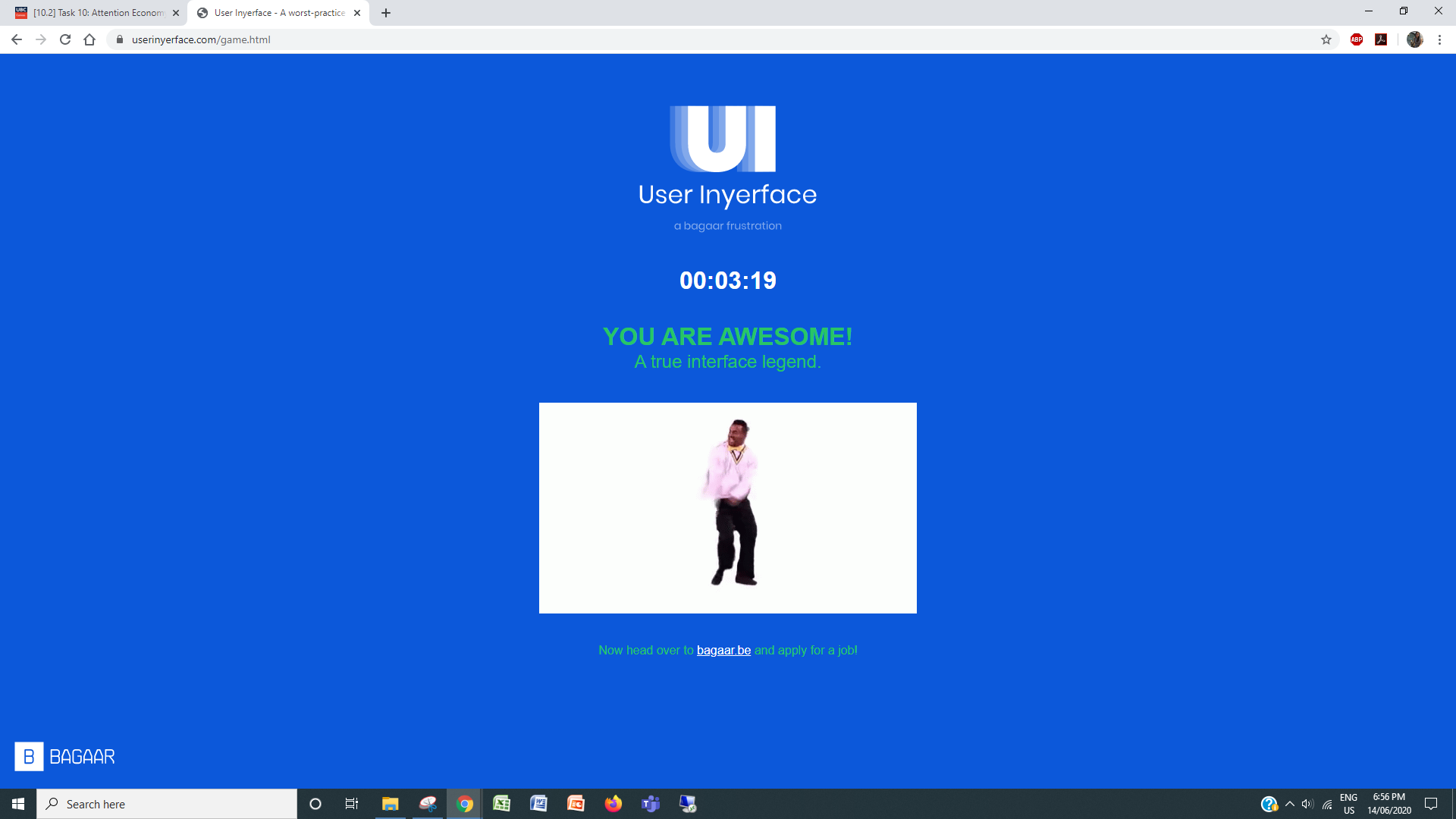
I really enjoyed playing User Inyerface! I assumed that a troll built the game and I had to play within their logic.
What tripped me up in some points of the game were that I started to trust the logic only to get betrayed:
- inconsistent text fields
- deceptive check boxes (select three)
- I start unclicking them and then later find that one of the options is Select All!
- large buttons that don’t have commands you want
- unusual arrangement of numbers, months, and dates
- I laughed when the country drop down had images of flag
When I had to fill out my address, I decided to change it to my work address because its number is 35 versus having to fill out my home address which would have made me click over 3000 times. NOPE!
I thought the CAPTCHA would use consistent troll humour so I did a visual scan of the options and implemented my strategy.
User Experience Choices in Mobile Games
User Inyerface really highlights the constant demand for our attention. We expect interfaces to be intuitive and honest. However, our instincts, behaviours, and competing priorities can be exploited for other purposes.
I play Animal Crossing Pocket Camp. It’s a mobile game based on being a camp manager for your animal friends.
I started playing in 2018 and have experienced how the user interface has changed to push for more micro-transactions.
Initially, the game was peaceful and I would run errands, personalize my camp, craft, and participate in the seasonal events. Some of the game elements that I originally loved and have been changed to pressure me into obsessively playing.
Goals and Events
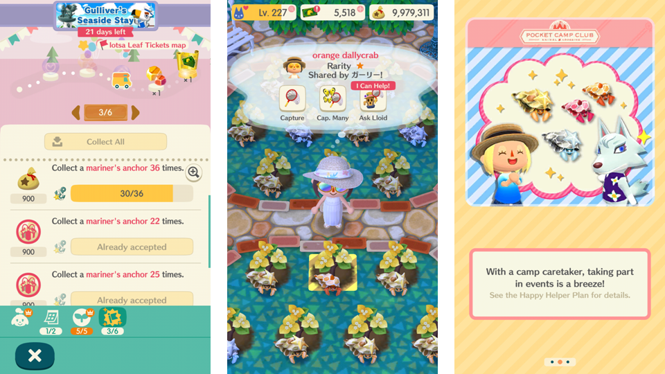
The game has always had short goals/events. These checklists encourage a completionist mindset that is not attainable unless you use micro-transactions. The game has bells (in-game currency) and leaf tickets (premium currency). Leaf tickets can be collected through completing goals and through daily log-in bonuses, but they can also be bought using real life money.
I’m a free-to-play player and I’ve given up on trying to complete collections because it is impossible to do without using real money.

The current game play has a larger themed event with three smaller events within them. Collecting the limited time items supports you in building a more exciting camp. Currently, the seasonal event is themed after a Seaside Stay and there’s a gardening activity where you can collect Santorini like amenities.
In an ideal case, a free-to-play player will garden every three hours to collect the critters that are attracted to our event flowers. You will share back and forth with friends to collect more event flower seeds and catch more critters. This is a slow process, so you can speed it up using flower food or leaf tickets. You can also guarantee catches by using leaf tickets.
Most recently, a subscription service is available so that you don’t have to play. You can assign an animal friend to complete the event for you. Of course, this also costs real life money.
The game is using these goal checklists to encourage us to continue playing because there’s another prize coming up. You feel obligated to complete each of the smaller events because they lead to your progress in the overarching themed event. Missing out any of the smaller events means you won’t finish the larger one. As well, the closer you are to finishing an event, the better the prizes are.
Loading Screens
Micro-transactions are frequently advertised. Although we can get cool items through regular game play, targeted premium items that match a current event are also released. You can really enhance what you can do if you have these premium items.

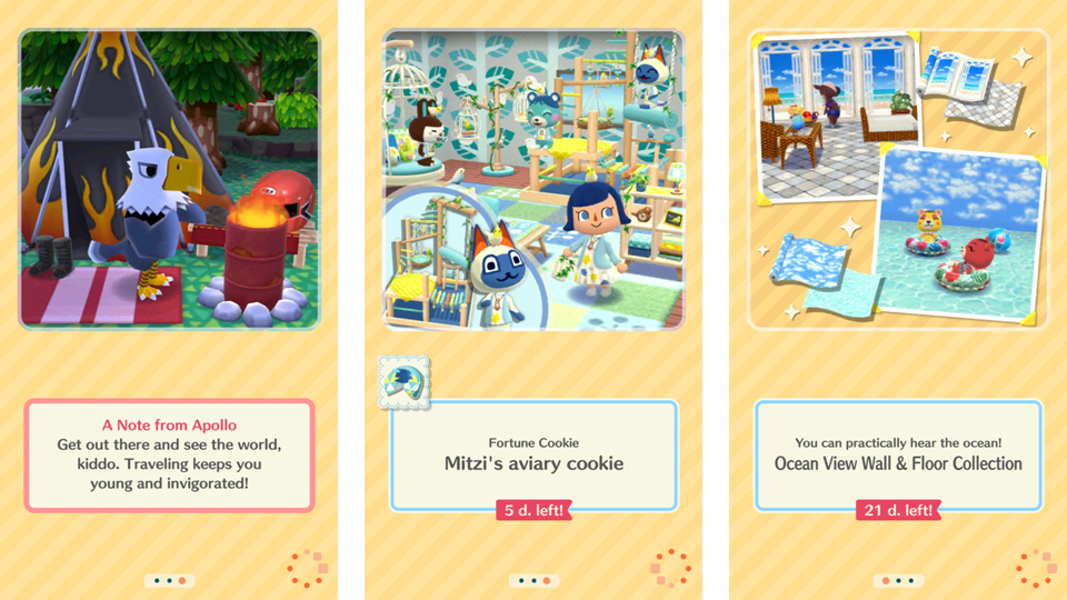
Early in the game’s lifespan, we would get cute and friendly loading screens. For instance, Apollo the eagle would share a note or you’d get a game play tip. However, these types of loading screen is less common. In its place are more loading screens that push micro-transactions. These might include, fortune cookie notes (a gacha system), premium theme collections, and the monthly subscription service.
Push for Play
Early in the game play, I played to chat with my animal friends, craft items, and personalize my camp. Now these things are chores. I’ve reached a point where I have very few craftable items left and really just participate for the seasonal events. My bells have been meaningless for over a year.
If I don’t have to, I don’t even talk to my animal friends. There was a Quality of Life update for Pete’s Delivery Service. Essentially, I can complete all the errands from the map screen rather than having to visit each individual site and talk to each animal. These updates are a reflection of how the game has changed to support our completionist behaviours rather than focussing on the original game appeal. The peace is gone and there’s just constant stress to play.

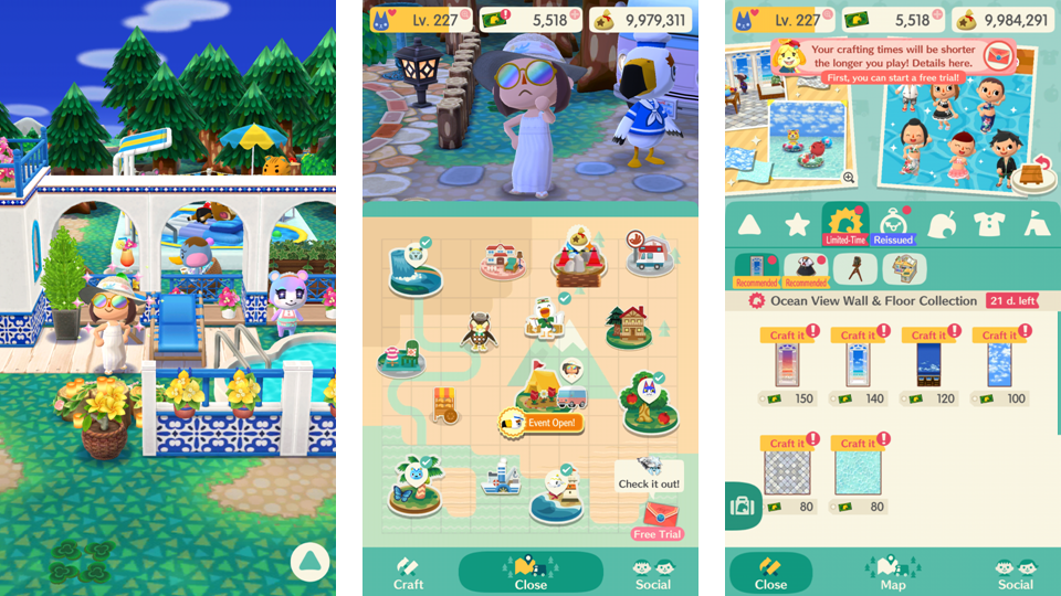
The crafting menu originally showed you slots for crafting and the landing screen was on the bell furniture and then the favourited furniture. Now, we get pushed to the limited-time premium items and see ads for these items and the premium subscription service.
On my map page, there was a recent user interface change back to an earlier state. In the previous update, any playable action (e.g., errands can be completed) would be highlighted with these huge red exclamation marks that would also move. They were littered across EVERYTHING on my screen and just made playing more stressful and overwhelming. It felt like we were being shouted at and the only way to get rid of the notifications was to tap on all of them.
Overall Experience
It’s interesting how the rearrangement of the original game elements have made it a very compulsive experience. The constant notifications, what we see first, and the ever present carrot really make you want to continue playing even though you don’t have to.

Hi Linda,
I think it’s so interesting that you connected this task to mobile games. We are so compulsive in our actions online – clicking here and there with really no deep thought as to should we or shouldn’t we. Games, in general, are made to grab our attention from start to finish, and even after we’re done – the creators make sure of it because if it isn’t totally encapsulating and there isn’t buy-in from the player, then the game doesn’t take off. Your mention of our completionist behaviours plays really well into this task too as not only was the task to screenshot us completing it, but the inyerface game tasked us with “finishing” the game as fast as possible. If it had, on the other hand, been to take our time and read through everything, I think we might have not made such impulsive moves or been as frustrated (as some of us were ;)) Great connections, thanks for the post!