The living experience is extremely complex, built upon innumerable interactions between humans and the surrounding environment. Thus, recreating this complicated experience on paper or virtual form can bring about considerable limitations for understanding reality. Furthermore, when individuals are bound to social and political perspectives, in many cases these inherently become reproduced in visual representations. But without these representations, we will also be lost, losing grasp of individual position in society and in our environment. It is thus crucial for the map reader, to realize these limitations of visualizing reality through map creation and for the cartographer to be as transparent of their intentions to not misinform the reader. As John B. Harley (1989) states it is essential to be conscious of the “omnipresence of power in all knowledge, even though that power is invisible or implied, including the particular knowledge encoded in maps and atlases” (3).
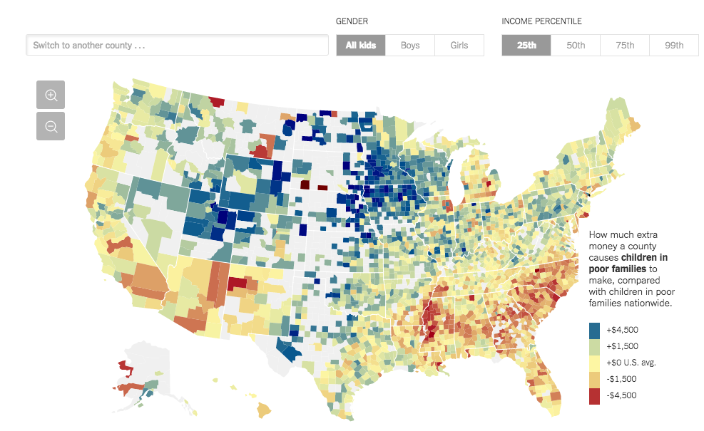
Among these issues and conflicts of interests that can be rooted in mapping and data visualization, the interactive map titled “The Best and Worst Places to Grow Up: How Your Area Compares” published in “The Upshot” section of The New York Times, is a well produced and throughly considered visualization of the patterns in the relationship between the location where a child moves to and their income mobility in the future.
Acquire/Parse/Filter/Mine:
The map was created by the graphic editor team at The New York Times (NYT), by Gregor Aisch, Eric Buth, Matthew Bloch, Amanda Cox, and Kevin Quealy based on data and investigation by The Equality of Opportunity Project led by Raj Chetty and Nathaniel Hendren. After a quick overview of the Equality of Opportunity Project through a hyperlink provided within the webpage, the data itself seems reputable based on thorough research techniques of high level economic investigation. Although in some cases we must be careful to not be overwhelmed by the ethos of science and justify data just because it uses science and numerology, in the case of this study and to based on my understanding of the data, I judge that the data is an justifiable calculation. The original data collectors Chetty and Hendren also clarify their positions on their data, stating clearly in an annotation in their paper “The Impacts of Neighbourhoods on Intergenerational Mobility”, that “the opinions…do not necessarily reflect the views of the Internal Revenue Service or the US Treasury Department” (Chetty&Hendren, pg. 0).
Represent/Refine/Interact:
Overall, the interactive map does an excellent job in allowing the reader to visualize the patterns in the data based on geographic location. The interactive features on interface of searching and switching the focus to another county, switching between genders, and choosing the income percentile, gives the user the freedom to look at the data in the framework of their interest. One of the most notable functions of this interactive map is its’ interactive coordination with the text in the article that accompanies it. The article is interactive in a similar way of the map in that in certain sections of the text, the user is given the control to change the county of focus of the text, and sentences and graphs, and figures adjust to the chosen county. This means that the map creators are unable to control the specific region that the reader chooses to observe and reduces their ability to reinforce a specific argument.
An issue however is representation of the map despite gaps in the data collection. At first glance at the map, it seems like the data is well collected as the regions within the initial viewer setting consisting of full data. However once we zoom out 4x, to view the entire United States, the white space in the Central regions of the country is very obvious. From this, while the map visual makes it tempting to make the argument that there is a geographic pattern in that movement towards the interior of the United States is more beneficial for income mobility, in technically we cannot make this judgement as we are not given complete data. For instance with a closer look into the central region with little data representations, there are two regions, Shannon County and Todd County, that have some data. The popup explains that those two counties actually have the worst outcomes for income mobility for children, a contrast to the quick hypothesis I made. This signals to potential issues in making generalizations without sufficient data.
Intentions:
From looking at the map, a slight bias that can be considered is the centrality of New York State as the focus of the interactive map. Although we are given the interactive tools to adjust our county of interest, when we first access the interactive map on the webpage, the initial region of focus is always set as New York State. This means that whenever some one accesses the webpage, they will always be informed of the patterns of the vicinity of New York State, placing a hierarchy of understanding of New York State above other states. This bias is however justifiable, considering the importance of New York State in understanding opportunity and mobility, but above all, considering that this is written in the New York Times and thus is catered to a specific audience. As mentioned earlier, the core interactive feature of being able to adjust the county of focus reduces this limitation and still gives the reader freedom to explore all other states in context as well.
Suggestions:
Overall, I believe this map to have represented the complex data in easily understandable interactive web map, and substantiated further by a throughly written explanation article. Some suggestions that I could possibly make to reduce the biases of certain states to be focuses above others is perhaps considering a feature that allows the reader to choose their region of focus before being presented the map. This will allow the reader to immediately frame the focus of region before being immediately prompted New York State.