Question 1: UNHCR Statistics Page
In our current time of turmoil with instability of the Syrian Refugee crisis that has accelerated since 2011, collecting and understanding the data on the movement of populations is essential. To allow a deeper and comprehensive understanding of this complex data, the UNHCR has developed an throughly considered interactive interface that allows the data to be accessible by any user, and in addition, adds value to raw data by adding data parsing/filtering functions.
To begin, front page interactive visual on the UNHCR Population Statistics webpage is a very effective and easy to use visual to represent complex data on the situations of Populations of Concern. The interface is visually pleasing as the colour choice is excellent, considering the harmony of multiple colours representing different kinds of data.
The interactive features of the interface is very effective as well. Firstly, the functions of the interface is very simple and easy to use especially through the guidance of the initial prompt, the hovering function that provides definitions or detail on the term. The embedded filtering functions are also very useful, which allows to specify and filter to the specific population in concern, as well as the way the interface accommodates multiple types of populations at the same time. By displaying the data as a pie chart, the breakdown of population type of Populations of Concern is clarified. This function adds value to the data as it allows the user to compare and observe patterns in the information. While the piecharts may overlap with each other and make it hard to read the countries, the magnifying function in the upper right corner of the interface allow the user to zoom into regions and examine smaller countries as all. Finally, the ability to adjust the timeframe and a switch function that allows to represent that data in either percentage or population number is useful to frame the data within the users research concern, and allows the user to visualize relative and absolute patterns in the data.
Question 2&3:
Access to the original data downloaded from the UNHCR Population Statistics Website and my modified dataset with metadata is available by this link to the Google Sheets.
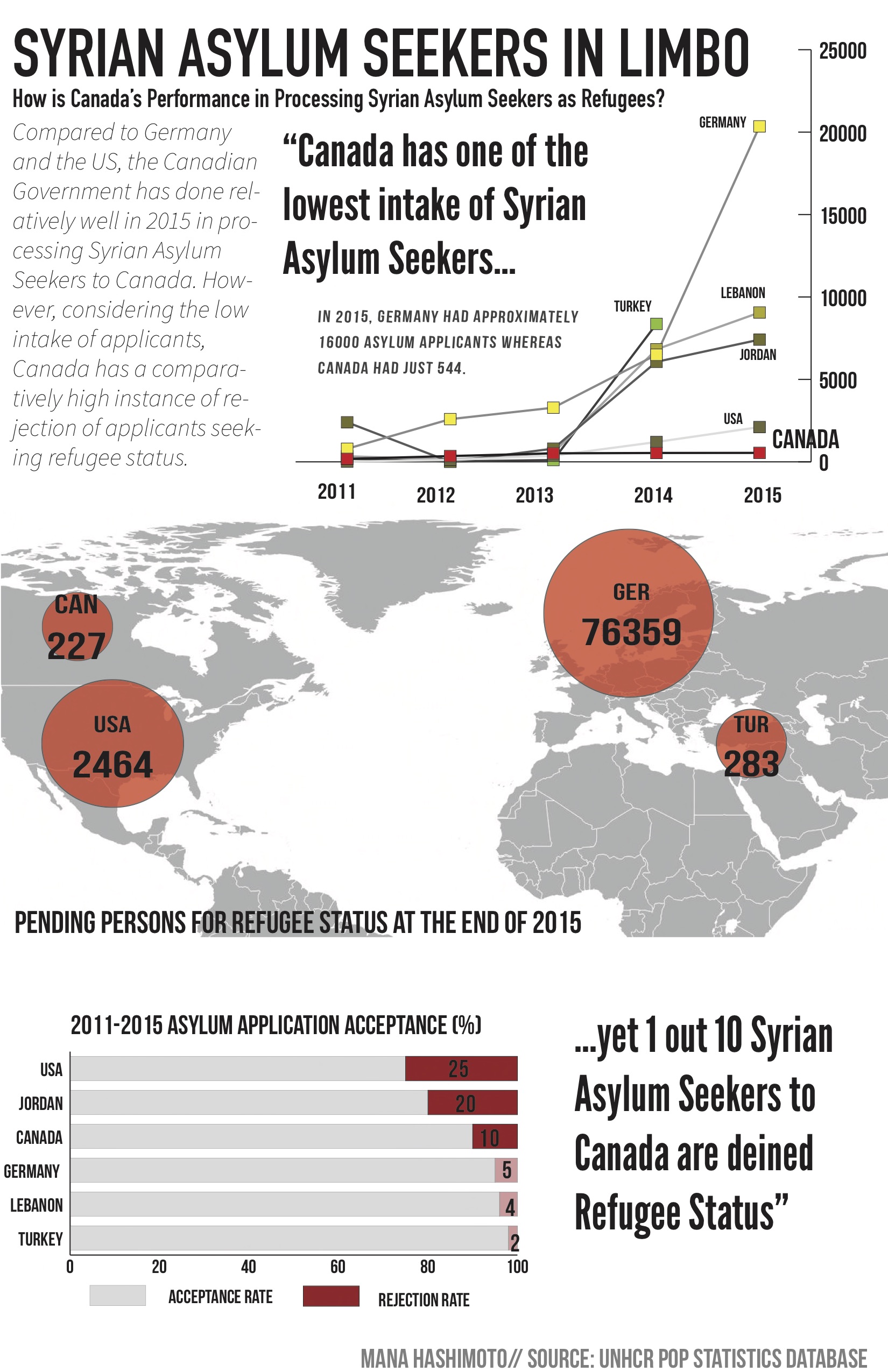
Question 4: Infographic
**Please note that this is my first time using Illustrator as I have not taken GEOB372.**