Author Archives: fatima mannapbekova
Coordinate Systems, Datums, Projections and Spacial Data Models
In these exercises I learned to use ArcGIS to explore spatial map data of Canada and Washington State in the U.S. while learning about coordinate systems, datums, projections, and spatial data models (raster and vector data). I also learned how to use raster landsat data in the before and after of Mt. St. Helen’s volcanic eruption in 1980 in order to review the listed properties above.
We learned to read the metadata of shapefiles, layer files and raster data sets in order to give an idea of nature, quality and limitations in the data. Metadata is essentially the data about the data and it is a good idea to read the description tab before starting to work on the data base. Our professor described it as “garbage in, garbage out”, if the metadata does not show quality then the analysis of the data (the map) will also be unreliable.
We then learned to measure the distance between two points by using the Select-by-attribute function on the map of Canada, from Halifax to Vancouver. Which I found was 39.849922 Decimal Degrees or 4, 441, 732.917 Meters
Spacial Reference properties include the Datum, which allows GIS to locate each layer/region in its proper location in the world. ArcGIS allows data sets with different spacial data references to be displayed and aligned on the same projection. This function is called Projection-on-the-fly. I learned to use this function as well as how to change the projection manually by going into the ArcToolbox, Data Management under Projections and Transformations. I did this to align Canada’s lakes and rivers, major cities and national parks. This can be seen under the Table of Contents in the image below.
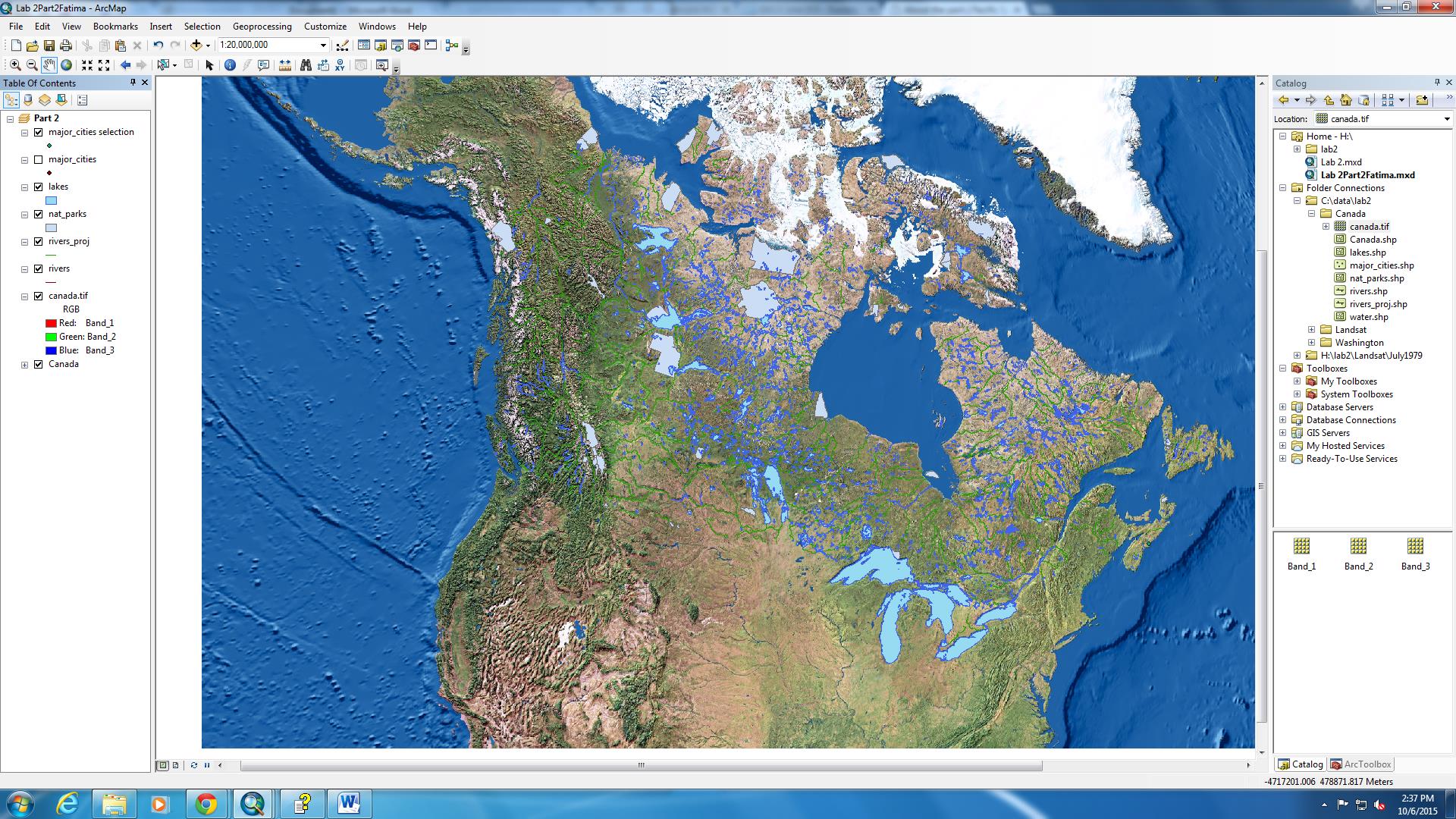
ArcMap Canada’s Rivers, Lakes, Cities and Parks all have different spacial references, but they have been aligned using ArcMap
In class that week we learned about Great Circles. Great Circles are widest possible circle that could be made with a sphere. This is the exact mid-point of a sphere because it creates the largest ring around it. An example of this is the Earth’s Equator. It is the exact mid-point between the North and South Poles. According to the National Geographic “Great circles are also useful in planning routes. The shortest path between two points on the surface of a sphere is always a segment of a great circle. Plotting great circles comes in very handy for airplane pilots trying to fly the shortest distance between two points”. The shape of the Earth is not perfectly spherical it is slightly flattened on the poles, this makes it even harder to be projected into a 2D surface. Maps are 2D interpretations of the Globe which is 3D. When the data is projected into a different coordinate system distance, area, and the angles of points on the sphere are also affected.
Spatial data is normally grouped into two types of data structures: vector and raster data. The type of data structure used also affects the type of calculations and operations that can be performed on a given layer. The raster data model represents the world as a regular grid of cells also known as pixels. This type of structure works well when you are dealing with phenomena that exist throughout a space and do not necessarily have distinct boundaries. Raster layers are frequently used to symbolize temperature, elevation, rainfall and similar type of phenomena. In the image below, I have used rastor data model to calculate the area of the three types of land covers.
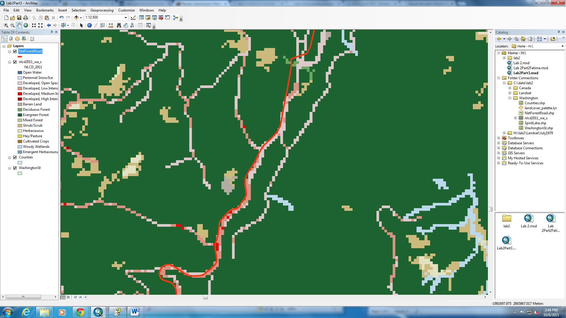
Land type and Area: Evergreen Forest 4755 km2 Shrub/Scrub 1438 km2 Herbaceous 391km2
Working with Remote Sensing Imagery
Landsat is a remote sensing program that has been continuously scanning earth since 1972. It uses sunlight as its energy source and measures the response of objects and surfaces on earth. There have been new satellites launched with better sensors as technology has evolved, culminating on Landsat 8 currently in orbit. Landsat can scan the same area of earth every 16 days. In the exercise we examined the changes Mt. St. Helen’s 1980 explosion had on the surrounding landscape. In the image below shows the change in the size of the lake near the volcano from 1979 to 2002.
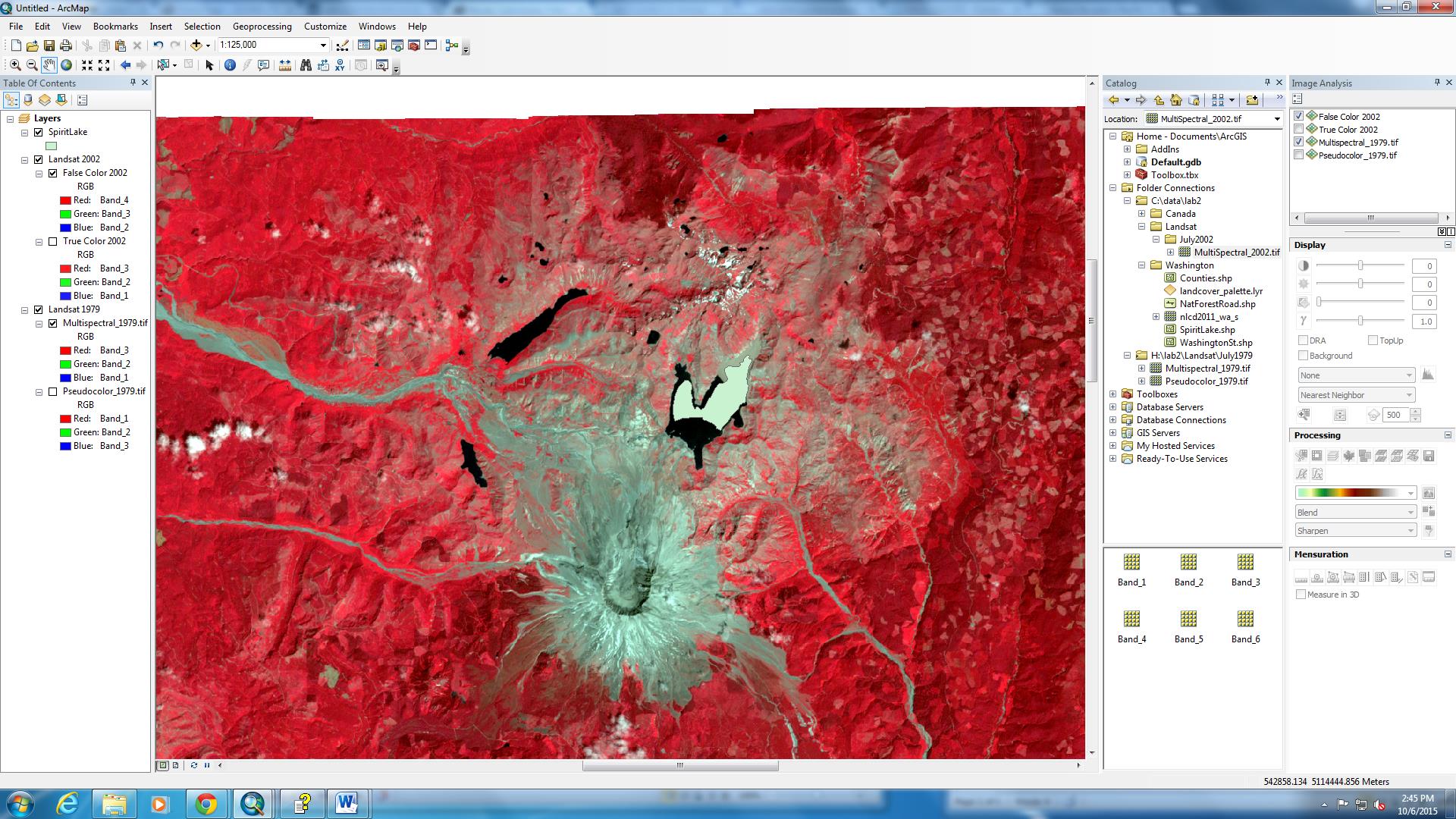
Mt.St Helena explosion affects on SpiritLake 1979 data in comparison to 2002 data.
Landsat data could also be used to see the change in the lake area over time. A good research question would be; By how much has the size of the Aral Sea in Central Asia changed each year from March-April since 1928, (or since the beginning of the Soviet Union) till present day in 2015? Data should only be collected every-year in the same seasons. Since the Aral Sea is a lake, it is prone to shrink during the dry season with high evaporation rates, and expand during winter for the opposite reason. So data should be collected at the same time on the year for more accurate results. As I continue to study geography, in the future I would like to work around the research and management of the Aral Sea Basin. And ArcGIS would be a good tool to visualize this work.
GIS Application
After completing the training for the ArcGIS software, we learned how to apply it to real world contexts.
Underneath is a map of the City of Vancouver residential break and enter which I got from the Vancouver Police Department website. The message of the map was to show the residential break and enters in Vancouver. The message was made clear through the bolded large title and through a zoomed in and focused map of the city of Vancouver. The time period written underneath the title gives a clear message of the time span of when the data was collected. In addition, each individual case of a break and enter is marked with a triangular point which is placed at the geographic address of the residence. This information can be derived by looking at the key on the bottom left hand corner. The key indicates more information about the meaning of the coloured areas around the triangular points on the map. However it is difficult to determine why these coloured areas take up the space they do and form a circle around each triangular point. This makes the message of the map difficult to understand.
Some of the geographical analysis and the tools they used were adjusting the scale of the map and panned their focus on the Vancouver area. They used rastor data and attributed this data based on location on the map. The lines of borders of regions in Vancouver were attributed by having a darker lines than the lines used to attribute the streets. Layering was also used and this is evident from the various symbols and line types that are present on the map.
The data is gathered from PRIME (Police Records Information Management Environment) and from the crime reported to the Vancouver Police Department Crime Analysis Unit (VPDCAU). There is no specific indication of who made the map, but the credits on the image are given to the VPDCAU. The map might have been produced for the purpose of increasing security in certain regions of Vancouver. Another purpose may have been used to see if there is a correlation between break and enter crimes and their location in the city. This then could be correlated to the living conditions and income of that neighbourhood/area. There is a small amount of bias because information is based on cases of report and based on observations. Not all crimes could have been reported to the police and observations could have been one sided.
Lastly, to analyze the accuracy of the data, the map is relatively simple so it is easy to determine the data. I trust the data; however I believe that it should have been collected over a larger time span to make the location of break and enter crimes more reliable. However it could be made more precise by including more information about the intensity of the crime reports. By looking at the map we don’t know what high intensity means relative to low intensity making it subjective to individual basis.

This map was taken from the Vancouver Police Department data and was used to understand the application ArcGIS software in real life.
ESRI Training
I took a web training course the ESRI website (http://www.esri.com/training/main) which is a GIS software company, to get a basic knowledge of ArcGIS. This tutorial has taught me how to display map features, add data to your map, manipulate data tables, create a map (layout) and how to save my map and associated data files.
I have linked my certificate of completing the on-line tutorial: Certificate
Planning for a Tsunami
For this project we were given a scenario that a potential tsunami that may hit Vancouver. Using the data they gave us, we were meant to map the areas that may potentially be damaged:
Scenario
You have been hired by the City of Vancouver GIS department. After geological events that have transpired recently around the world, your supervisor wants you to prepare a map that highlights the areas in the city that are more at risk from a tsunami. (Risk of tsunami in Vancouver is small due to Vancouver Island, however, there is still a risk, and the analysis in this lab could be applied to any coastal city in the world, or to sea level rise due to climate change). Although the height, speed and inland reach of a tsunami depend on many factors, we will simplify for this exercise that the immediate danger zone from a 10-metre wave is mainly to the low lying areas at, or below, 10 metres that lie up to 1 kilometre from the shoreline. The municipality is interested in the following information:
- total area threatened, listed by land use type;
- length of the roads that might be affected, broken down by road type; (highway, major road, local road, etc.);
- number of educational and health care facilities within the danger zone, if any;
- locations to put up tsunami warning signage
Here is the map I have produced: Potential Areas of Impact
Results
12.126% of City of Vancouver’s area is in danger. I found this through opening the attribution table of Vancouver Danger and got the sum of the area: 15889260.298512meters (1588.93hectares). Then, I opened the attribution table of VancouverMask and got the sum of the area which was 131033339.950334meters (13103.33 hectares). Dividing Vancouver danger zone from the overall Vancouver map and multiplying that number by 100 gave me the percentage.
ST ANTHONY OF PADUA, ECOLE ROSE DES VENTS, FALSE CREEK ELEMENTARY, EMILY CARR INSTITUTE OF ART & DESIGN (ECIAD), HENRY HUDSON ELEMENTARY would be under the danger zone.
To see this I:
- I clipped together Vancouver Danger and VancouverMask to identify the danger areas in Vancouver creating a new layer called Vancouver_Area_Danger
- Then clipped together Vancouver_Area_Danger with Vancouver Education in order to see what schools fell under the danger zone.
- When I tried to clip together Vancouver Health and Vancouver Area Danger, the attribution table did not show any data, implying there were no health facilities in the danger zone.
The GIS Journey
This is an overview of what I learned in the Geographic Information System (GIS) course in UBC. Taking this course has taught me the functions and applications of the ArcMap program. ArcMap enables users to create geographical representations of data, which helps the creator to visualize and advocate meaning through the results. This blog will show the various projects we worked on during class and what I learned through developing them.