Quantitative Data Classification

There are a number of different classification methods that you can use in GIS software to present your data and which method you choose may depend on a number of factors. The four most common methods are:
- Natural Breaks
- With the natural breaks method, the GIS software calculates natural break points based on the distribution of the data and classifies the data into these bins.
- Equal Interval
- The GIS software can also be used for the equal interval method where the data is separated into equal intervals based on the range of the data and the number of bins you choose.
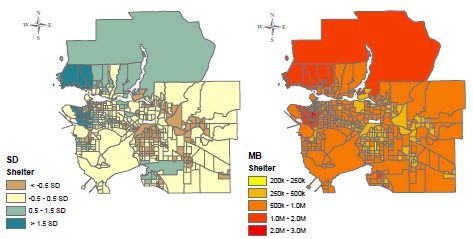
- Standard Deviations
- With this method, the GIS software classifies data based on how many standard deviations the values are from the mean.
- Manual Breaks
- For this method you manually select the breaks for the GIS software to use to classify the data. There are obvious potential ethical issues with this method as the classifications aren’t based on the data itself and you could select the breaks to bias the presentation of the data to meet your purpose.
For example for a journalist looking at this housing cost data of Vancouver, they would ideally want to use the most accessible and most ethical classification method which would be the Natural Breaks method. The equal interval method doesn’t do a good job of showing the difference in housing costs around the city and the standard deviation method might not be accessible or understandable for a significant section of the population. As mentioned the manual breaks method can manipulate the appearance of the data and so a more ethical approach would be to use the natural breaks method where the breaks are determined by the data itself.
Another example would be a real estate agent needing to prepare a presentation for prospective home buyers near UBC. They could choose a classification based on how they want to portray the area you are selling property in. I would avoid using the manual breaks method as you could manipulate the appearance of the map for any purpose you choose and there are clear ethical issues with this as you may be misrepresenting the data. One goal for the presentation could be that they may want to portray the area as more expensive and more exclusive, in which case you would choose the natural breaks or standard deviation methods as this makes the Point Grey peninsula look more expensive relative to other areas of Metro Vancouver. Conversely if they wanted to make UBC look cheaper for potential buyers, they could use the Equal Interval method as in this map UBC is grouped in the cheaper categories.