472 – Syrian Refugee Infographic
The Syrian conflict and associated refugee crisis has been ongoing since 2011 with many countries receiving applications from displaced persons for refugee status. While many Western countries have made pledges to assist these displaced Syrians, have their actions lived up to these words?
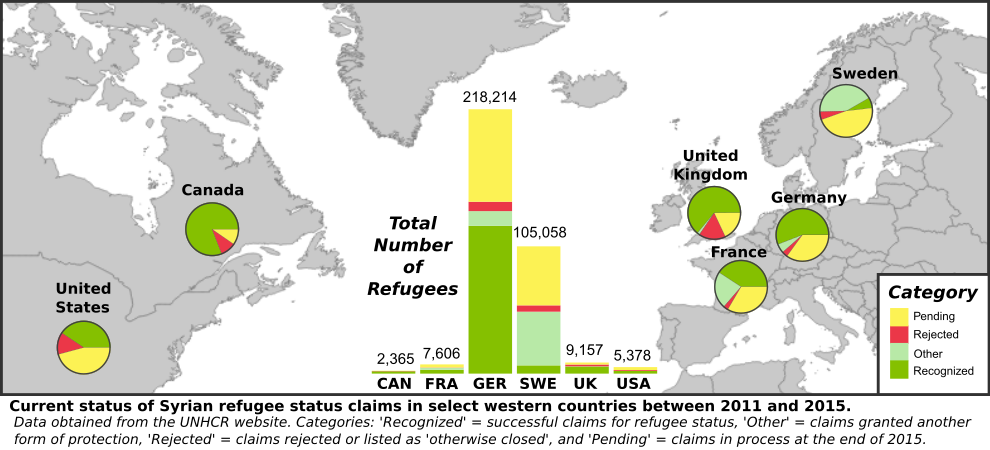
As part of an assignment for GEOB 472 we were tasked with producing an infographic that could accompany an article on the status of Syrian refugee claims in various countries, in a publication such as The Globe and Mail. The objective of this infographic was to help Canadian readers of this newspaper compare and contrast Canada to other countries when it comes to our response to the Syrian asylum seekers, with information such as the number of asylum seekers, and the number of claims processed, accepted, rejected, and pending by country.
Our data was obtained from the UN HCR website:
http://popstats.unhcr.org/en/overview.
Question 1: Comment on the UN HCR front page interactive visualization: and effectiveness as an infographic (interactive maps, graphs, text).
I find the front page interactive visualisation on the UN Refugee Agency website to be an effective infographic and a powerful tool which delivers a lot of information. The interactivity of the visualisation allows the reader to explore global and country specific breakdowns with respect to categories of ‘persons of concern’ and compare them to one another. Combining both the global map and chronological graph below allows the reader to explore both spatial and temporal patterns in the number of ‘persons of concern’ and individual categories such as refugees or internally displaced persons. The combination of these two approaches allows you to select years and explore the spatial distributions or inversely select countries of interest and then explore the temporal patterns in that country. When you make a selection, the other data on the visualisation either disappears or is faded into the background which allows the user to focus on the selection and is visually appealing. While the visualisation presents a significant amount of data that could very easily be overwhelming, the presentation does a good job of preventing it appearing as too crowded by using minimal text overlays and ‘clean’ colour choices with the light grey world map on a white background and colours of low saturation for the proportional country specific pie charts. The proportionality of the country specific circles is very effective in drawing the reader’s eye to the regions facing greater challenges in terms of persons of concern, and then the visualisation also gives you the option to filter the data by specific category to see what regions are facing the highest number of that category, such as refugees or internally displaced persons. When the visualisation first loads it overlays helpful comments with arrows to features explaining how they work and how to interact with them. There isn’t much to improve, however the global pie chart should be moved into a visible location rather than hiding it in the top left corner of the map where you can only see a portion.
Question 2: Query the UN HCR website to download the necessary raw data.
The raw data I extracted from the UN HCR website can be seen here: unhcr_popstats_export_asylum_seekers
Question 3: Modify data set ready for use in your infographic and include metadata.
Here is my final data after filtering and summarising the data using R: syria_infographic_data_refugeeclassification
For the infographic, the columns/categories of ‘Recognized’, ‘Other’, ‘TOTAL_NEGATIVE’, and ‘Pending’ were used to create each country pie chart, and these columns along with the total from ‘TOTAL_END’ were used to create the stacked bar chart.
Question 4: Produce your infographic to visualise your data clearly, concisely, and creatively. The visual MUST include (a) map(s) and (a) graph(s).
Here is my final infographic produced using Inkscape with preparatory work in QGIS and R which are all open source free software programs. I imposed pie charts on each selected country to show how they are dealing with the refugee applications they received between 2011 and 2015 (in terms of proportion of claims: recognised, given other protection, rejected or still pending). Then to add context to these proportions I added the main stacked bar chart to show how the countries compare to each other in terms of total applications received, for example how Sweden and Germany are dealing with over 10 and 20 times the applications of any of the other nations.