472 – Interactive Map Deconstruction – The Financial Inclusion Map
The Financial Inclusion Map:
This map was created by an interactive studio/company based in the UK called Kiln (https://www.kiln.digital/) to be published on the website of The Guardian newspaper. The studio has made many interesting and varied data visualisations that can be viewed on their website such as the carbon map (http://www.carbonmap.org/) and the digital divide (http://scidev.live.kiln.digital/digitaldivide/).
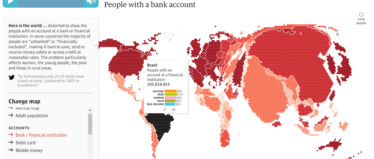
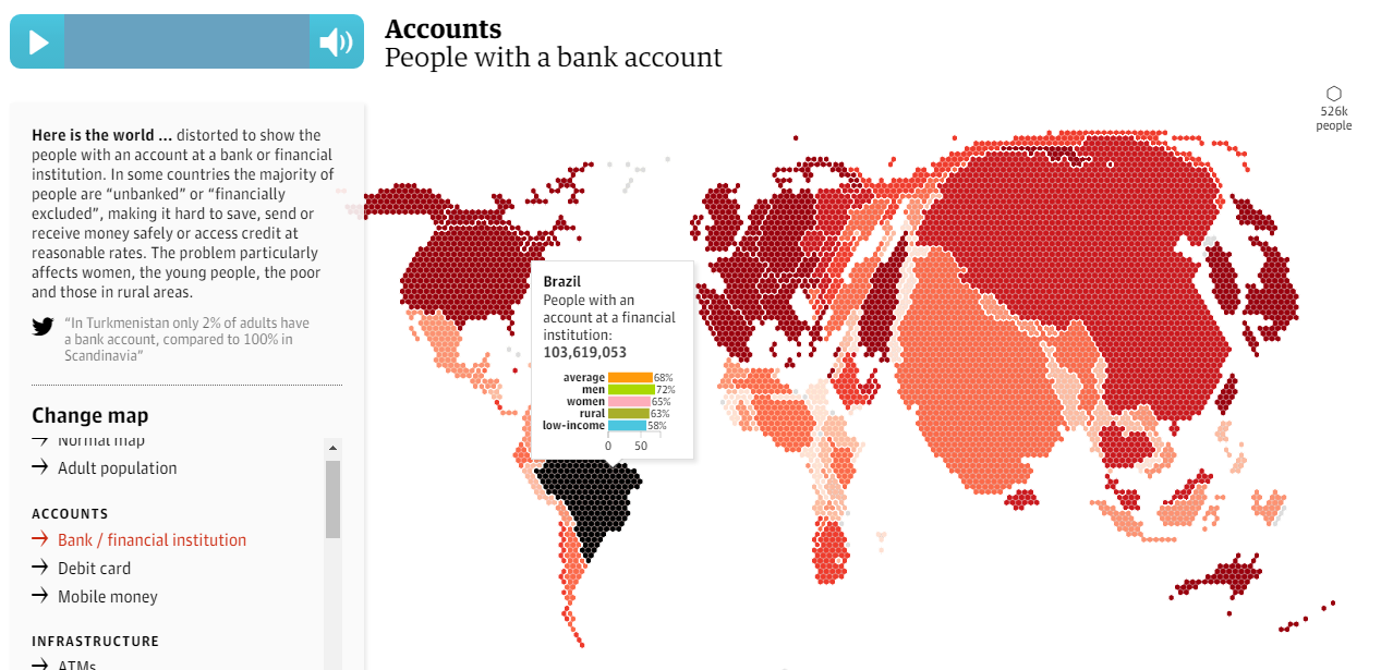
The author of the map and the data source are listed clearly at the bottom of the map with links to these pages. The data to create the map was sourced from the from the World Bank’s Global Findex database which holds information on financial inclusivity around the world. The World Bank is a respected international source and so this is a reliable data source to choose. Country level data is shown on the map and so no countries have been left out when filtering the data. Most data from the database can be visualised on the map with 17 variables in the six categories of: accounts, infrastructure, borrowing, saving and spending.
The map itself is a cartogram with the countries of the world displayed as shaded areas of a hexagon grid. When you first access the map, a tutorial plays to guide you through the functionality of the visualisation which is a great feature and reduces the amount of descriptive information that needs to be included on the screen. Each financial variable can be selected along the side of the screen, and countries are then resized on the hexagon grid relative to this data. There is also a second interactive option to change the shading of the map from simply by continent to per capita based on the data selected. The combination of these two options is a very effective visualisation method and a fair way to represent this data, with the size indicating the total number of the variable and the shading indicating the variable per capita (eg. debit card ownership). Country specific pop-ups add an additional component to the visualisation and interactivity when you hover over a country, showing a more detailed breakdown of that variable with: the country wide average rate, rate separated by gender, rate in rural areas and rate for low-income individuals. This is great additional data for the user to compare countries.
There are no obvious biases in the representation of the data. The use of a cartogram map design and the resizing of nations based on the variable selected reduces the bias of the eye being drawn to nations with larger geographic areas such as Canada and Russia, but adds bias in that countries with the largest populations such as China and India are large on most variables, even if there per capita rates are low. However I think this is still a fair representation of the world in showing how access to these financial services is distributed across the globe, and the user can make comparisons by seeing how the map changes when you switch variables. The lack of a zoom function prevents the user from being able to see any information from smaller nations with small populations, and so adding this function would improve the map but otherwise I think the overall visualisation is a fair and effective representation of the data.