User Inyerface
The entire game is ladened with frustrating design elements, such as misleading buttons, unclear instructions, and non-standard form fields, which made it difficult for me to complete the simplest of tasks.
Starting the game: Distractions and misleading information
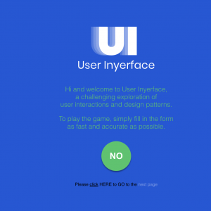
The first message of filling out information as accurately and quickly as possible puts a level of stress on the user. The big green NO button doesn’t help, as you feel the need to click a green button to move forward – some could misinterpret it as GO. Below the green button the “please click HERE to GO to the next page” message adds to confusion, where am I actually supposed to click to move forward; no hover feature that I am accustomed to.
Page 1: The Race Against Time
 Cookie Confusion: Who could miss the big red cookies display that pops up “This site uses cookies, is that a problem for you?” With the response options being Not really, no in small fine print vs. a big button with Yes on it. This is a different messaging than what we are used to.
Password Perils and Email Entry: Entering a password is a hassle. I have to delete the prompt message in each space to ensure the correct information goes in the right place. Reading through the password requirements adds another layer of stress, making me worry about falling into a password hack trap. The constant pressure from the timer and the “hurry up, time is ticking” message only amplifies my anxiety.
Email entry is equally frustrating. Instead of writing my email in one go, it’s broken into segments, forcing me to repeatedly delete prompt messages. This design makes the whole process feel disjointed and unnecessarily complicated.
To top it all off, there’s a pre-selected box indicating that I do not accept the Terms and Conditions. This adds another unnecessary step and further contributes to my overall frustration with the user design.
The Locked-Out Loop: About one minute into the game, I get locked out. Lovely. Panic sets in, and I think I restarted the game six or seven times, trying to go faster and faster each time. Instead of searching for a way to unlock the game, I resorted to using a Word document to copy and paste my password and email address. Brilliant, right? I thought maybe, just maybe, I’d get more time once I reached the next page. Spoiler alert: I didn’t.
Page 2: Victory at Last… Or Not
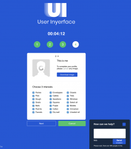 I did it! I finally got to page 2 in under one minute. I triumphantly clicked the blue download button, thinking I was making progress. But nope, I needed to upload a picture. Before I could react, I was locked out again. Fantastic.
The Marathon of Attempt: By attempt 25, I was desperately searching for ways to speed up the process. I realized that no extra time was granted once I got to the next page. So, armed with the copy-and-paste feature, I really homed in on streamlining my response on page 1. Page 2, I finally found the ‘deselect all’ button and for the ‘3 interests’ I had to choose I abandoned all accurate information, and selected the first three in the first column. Sure, the information wasn’t as accurate as they wanted, but the stress of the timer was getting to me. The green cancel button almost tricked me, but I’m onto their game now.
A Brief Triumph: Welcome to Page 3
 Finally, I made it to page 3 in under one minute. Copy and paste became my best friend, as did incorrect information and answers. But page three? Completely overwhelming. No amount of copying and pasting could save me—I was totally hooped.
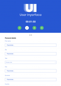
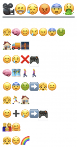
Placeholder Pandemonium: Page 3 continued to frustrate me with its random placeholders for required information. Depending on your screen size, the collected personal details appear in no particular order: first name, ZIP, title, city, then surname. Makes perfect sense, right? (see image)
Flag Frenzy and Birthdate Bother: Choosing a country was another delight, with a drop-down menu featuring black-and-white flags. Because identifying flags in grayscale is everyone’s favorite game. The birthday month selection is in alphabetical order, and the scrolling birth year selector is a moving target, changing constantly and making it nearly impossible to pick the right year.
Age Agony and Gender Guesswork: The timeline scroll for selecting age is equally maddening—you can’t see the number as you scroll. The male/female button is another gem, unclear about which option is selected, causing a slowdown as the title didn’t match the gender (forcing participants to choose a gender). And, of course, there’s that green cancel button, just begging me to press it. But now that I’m onto their tricks, it didn’t fool me this time.
Heart-Pounding Desperation: My heart was racing at 135 bpm, and I still had two more pages to go. I had to shift my focus from copying and pasting (beating the lockout system) to outright cheating. There had to be a cheat out there somewhere on the web, something I was missing. The page locking in under one minute couldn’t be anyone’s friend. What was I overlooking? Finally, with the help of Andy and David, the Unusable podcast: Playing a painful game of bad UX design, https://www.youtube.com/watch?v=oXz6mPlMNC8 , I was to proceed to complete the task.
Page 4: A Masterclass in Confusion
 So, it only took me five tries to figure out what went wrong—because obviously, I’m a genius. The page was a dazzling display of “check” in every conceivable form (checkmark, checkboxes, checkmate, check patterns, cheques for money). As if that wasn’t enough, I had to prove I was human by checking all the boxes with ‘checks’—because clearly, I could not be trusted without this monumental task. How could I have missed that the checkboxes were actually at the top of each picture? It’s not like they could have been placed more inconspicuously if they tried. And don’t even get me started on the three pages of verification. Because who doesn’t love a good, tedious exercise in futility?
Mission Accomplished
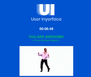
Against all odds and after much trial and error, copy nd pasting, and the odd cheat, I finally completed the task. Don’t let the time fool you, what really should have been tracked was the number of attempts.
Reflection
I believe the User Inyerface process aligns closely with the key themes presented by both Tristan Harris (2017) and Zeynep Tufekci (2017) TED talks. I see how their discussions of manipulative design strategies employed by tech companies to control user behaviour are reflected in the User Inyerface experience.
I think the deliberately confusing and tedious design of User Inyerface exemplifies the manipulation both speakers describe. I notice how every step, from misleading checkbox placements to excessive verification pages, seems crafted to prolong user interaction. This reminds me of Harris’s (2017) assertion that tech companies design experiences not for user benefit, but to maximize engagement time.
I feel that Tufekci’s (2017) warning about building “an artificial intelligence-powered dystopia, one click at a time” resonates strongly with the User Inyerface process. I see parallels between her concerns about how algorithms organize our access to information and the way User Inyerface manipulates user behaviour through its design.
I wonder if the User Inyerface experience might be seen as an exaggerated version of what Harris (2017)describes as the “race to the bottom of the brain stem” and what Tufekci (2017) calls “building a dystopia just to make people click on ads”. I think it demonstrates how design can be used to capture attention and data, even if it means creating a frustrating user experience.
I observe how User Inyerface illustrates the exploitation of design to manipulate user behaviour, prioritizing engagement over genuine user needs. I’m struck by how the seemingly minor yet profoundly frustrating tasks users must endure highlight ethical concerns surrounding engineered digital interactions, echoing both Harris and Tufekci’s (2017) warnings about the power of tech companies.
Reflecting on this, I believe the User Inyerface process encapsulates the central messages of both Harris and Tufekci. I feel it underscores the need for critical examination of how tech companies design user experiences. I think it highlights the importance of advocating for more ethical, user-centered design practices that prioritize user well-being over profit or engagement metrics, echoing Tufekci’s call for us to consider “what we can do in response” to these manipulative practices.
References
Harris, T. (2017). How a handful of tech companies control billions of minds every dayLinks to an external site. [Video]. TED.
Tufekci, Z. (2017). We’re building a dystopia just to make people click on adsLinks to an external site. [Video]. TED.
Waite, A., & Ball, D. (Hosts). (2019, August 26). Playing a painful game of bad UX design. [Video Podcast]. Retrieved from https://www.youtube.com/watch?v=oXz6mPlMNC8

 .
.  .
.